Overview
Arabic and Latin logotypes were developed for “The Teacher,” aligning with the film’s quiet tone and documentary realism. The goal was to create a unified title treatment that reads naturally in Arabic while pairing cleanly with the existing Latin serif.
Approach
- Analysed the Latin title’s voice: moderate contrast, soft wedge serifs, restrained rhythm.
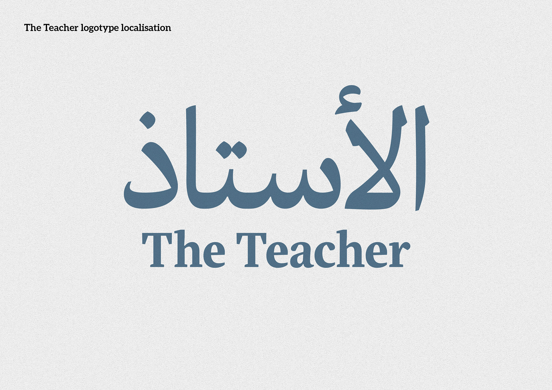
- Drew an Arabic logotype (الأستاذ) with controlled contrast, rounded corners, and simplified terminals to echo the Latin tone.
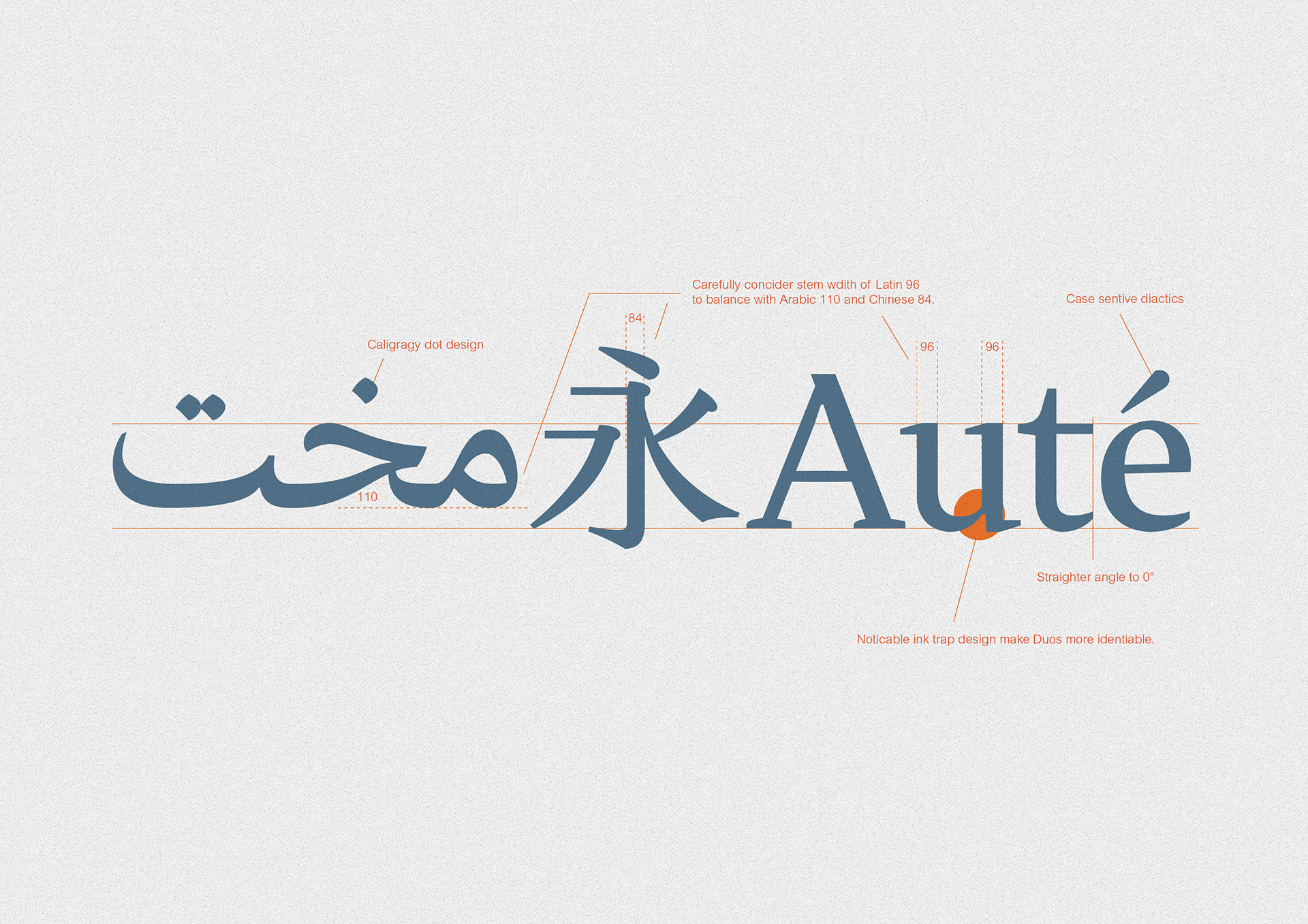
- Balanced proportions, x-height/Arabic tooth height, and stem widths to maintain visual weight across scripts.
- Normalised curvature and entry/exit strokes; refined dot shapes and spacing for legibility at poster scale.
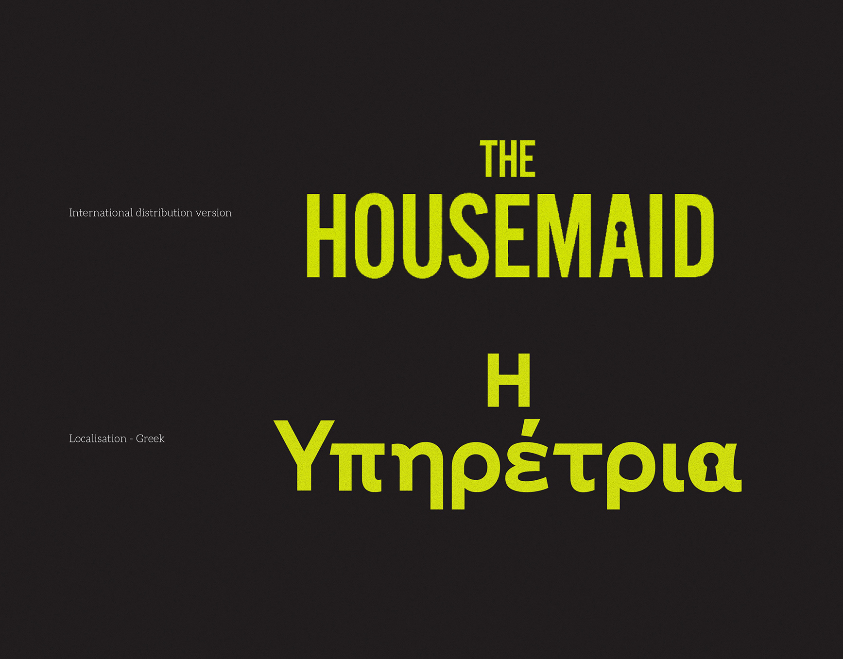
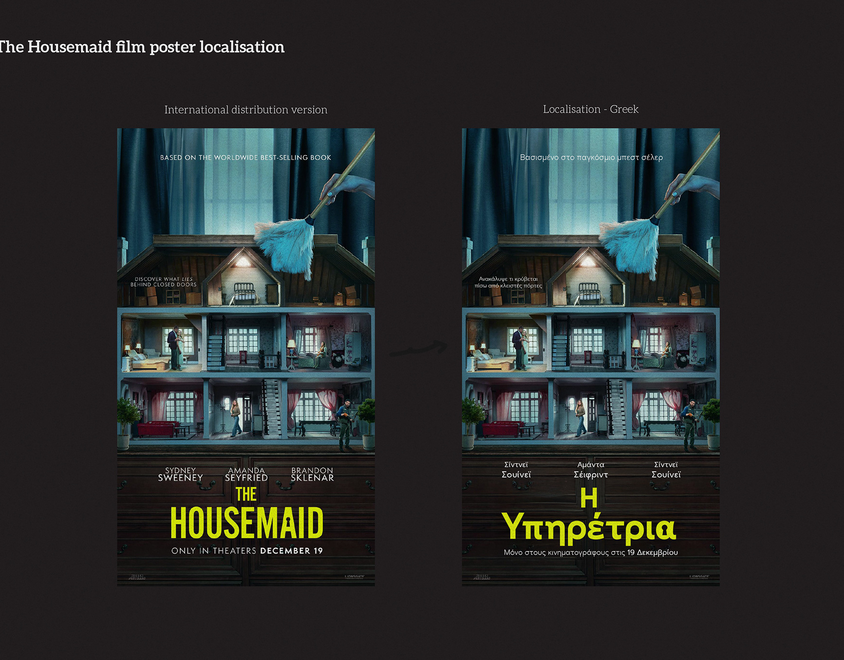
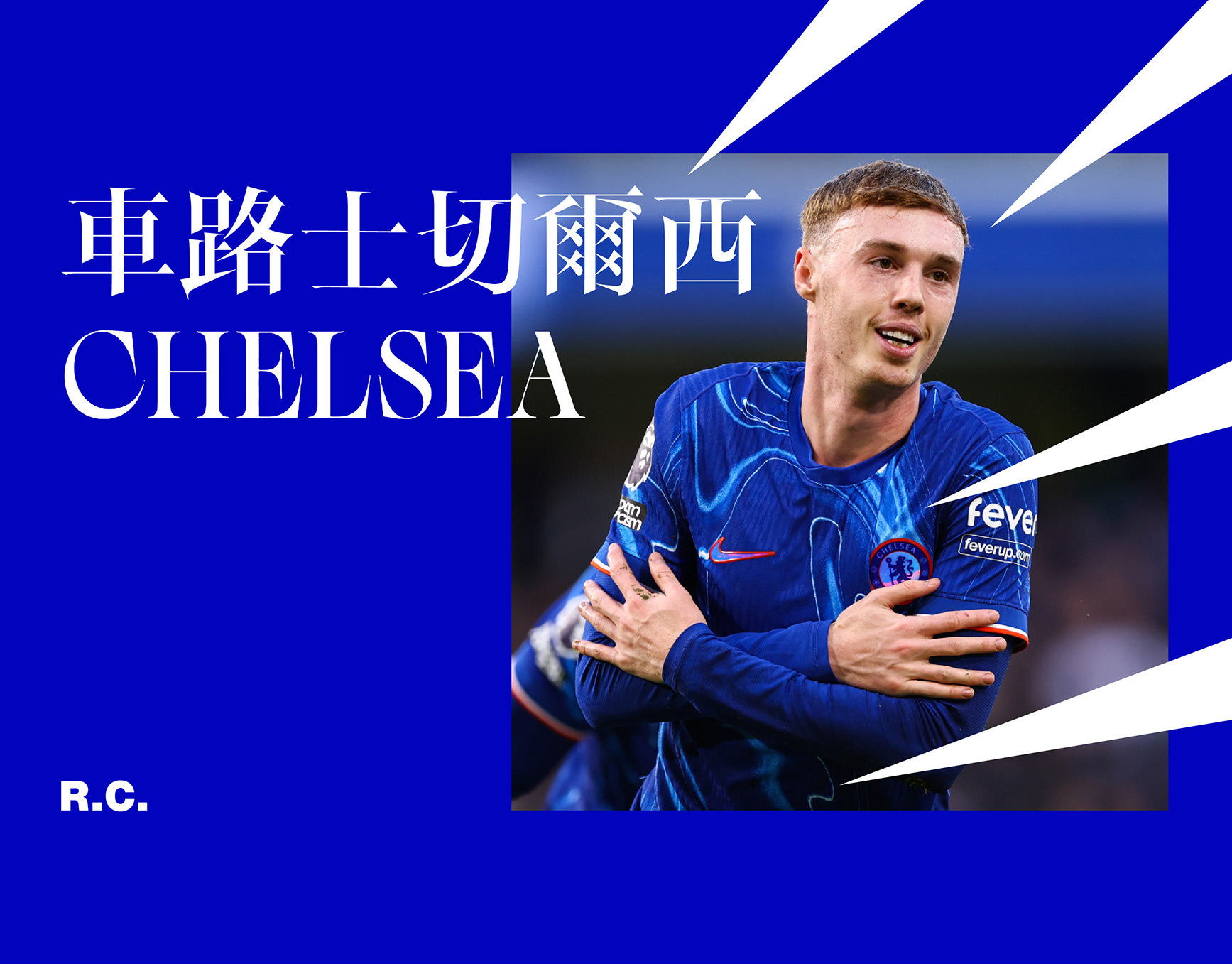
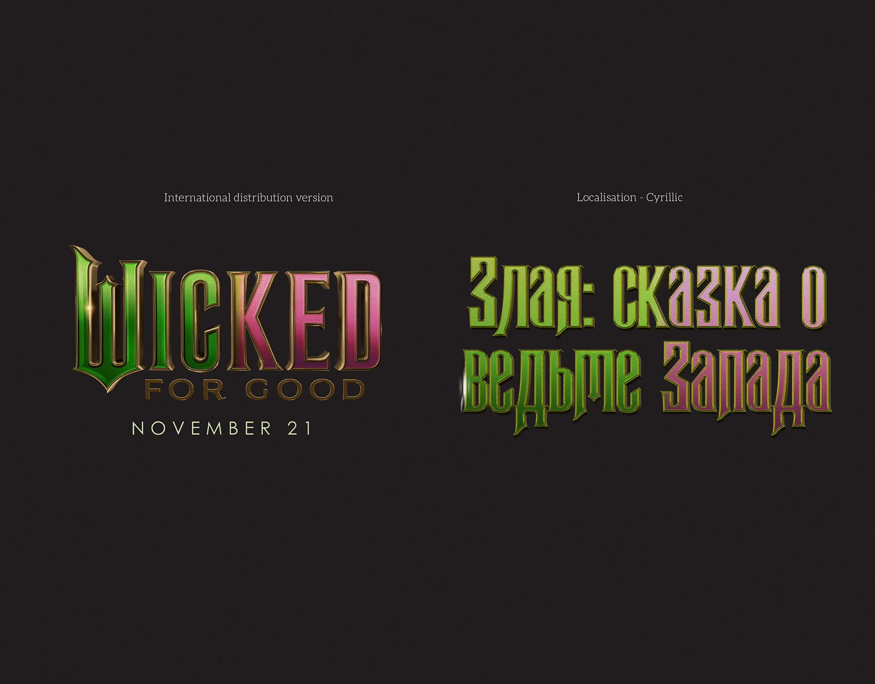
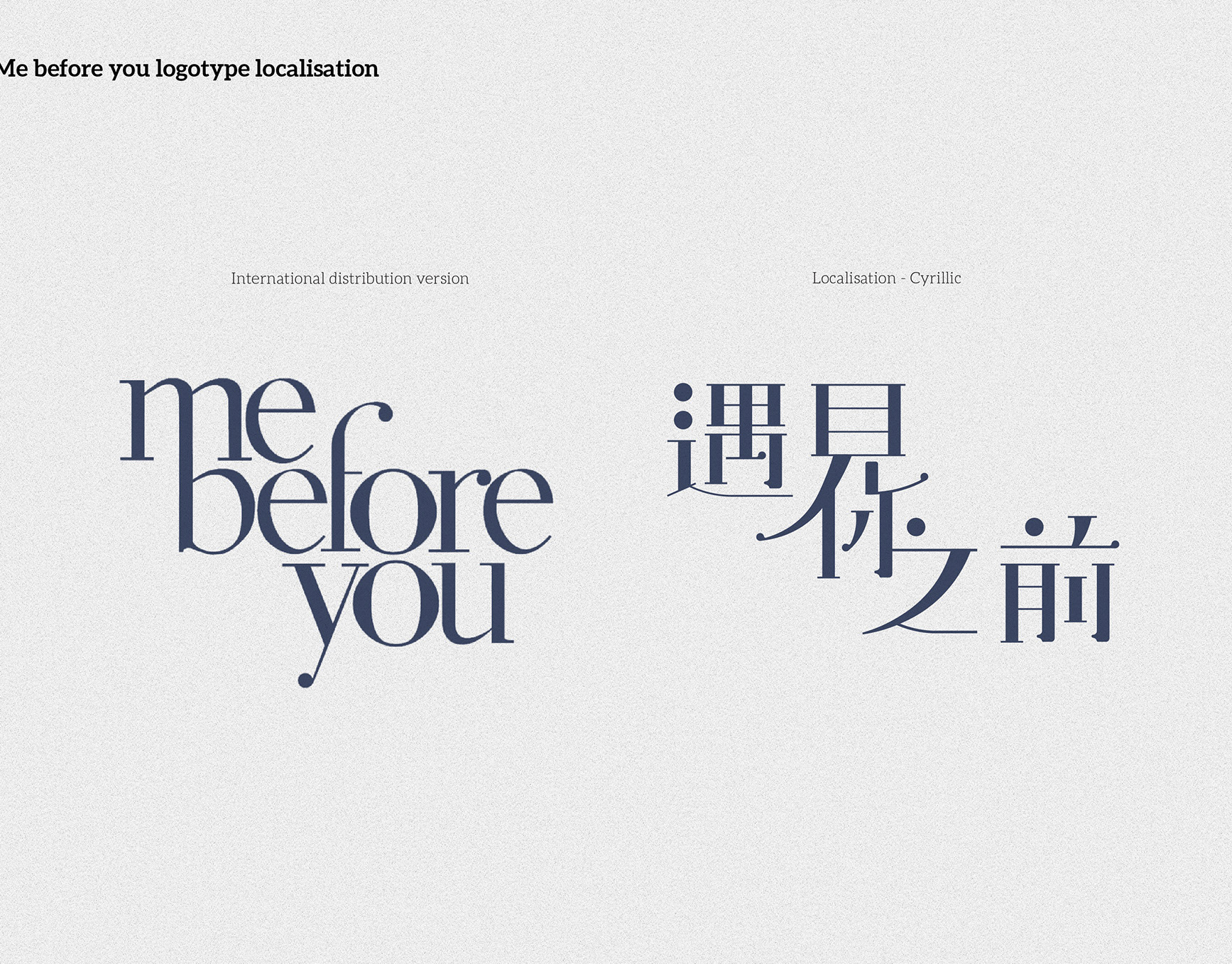
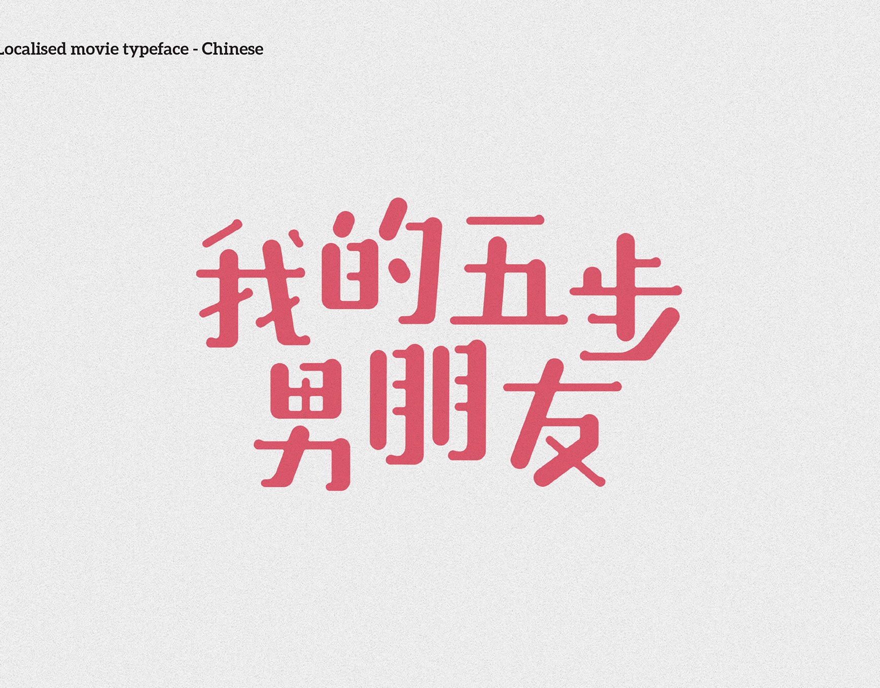
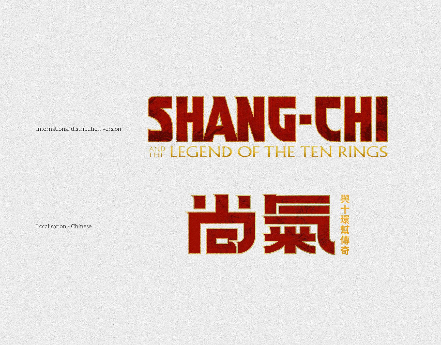
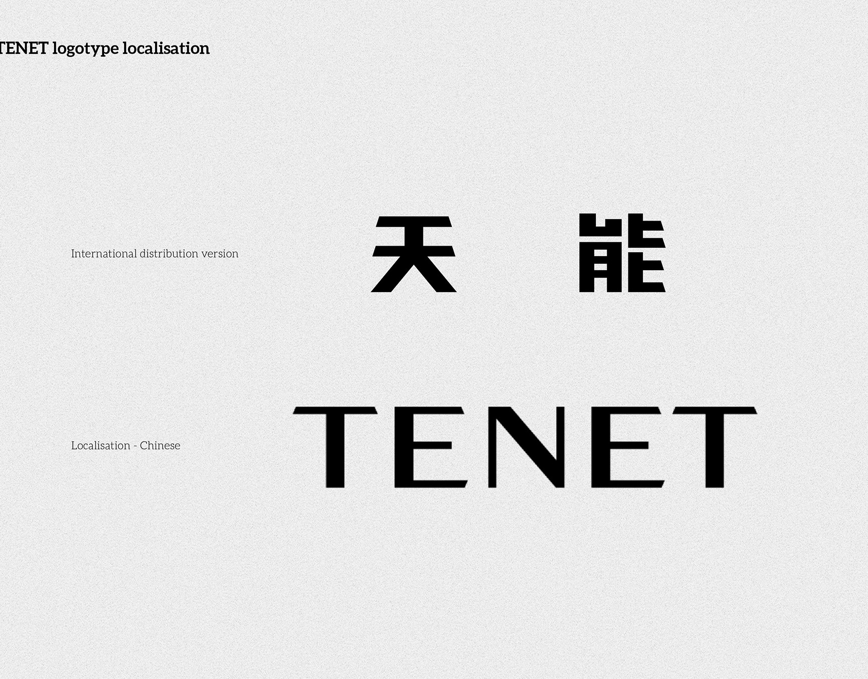
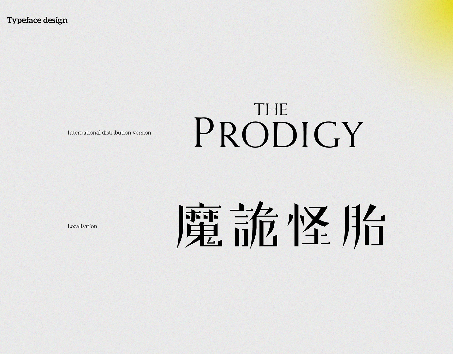
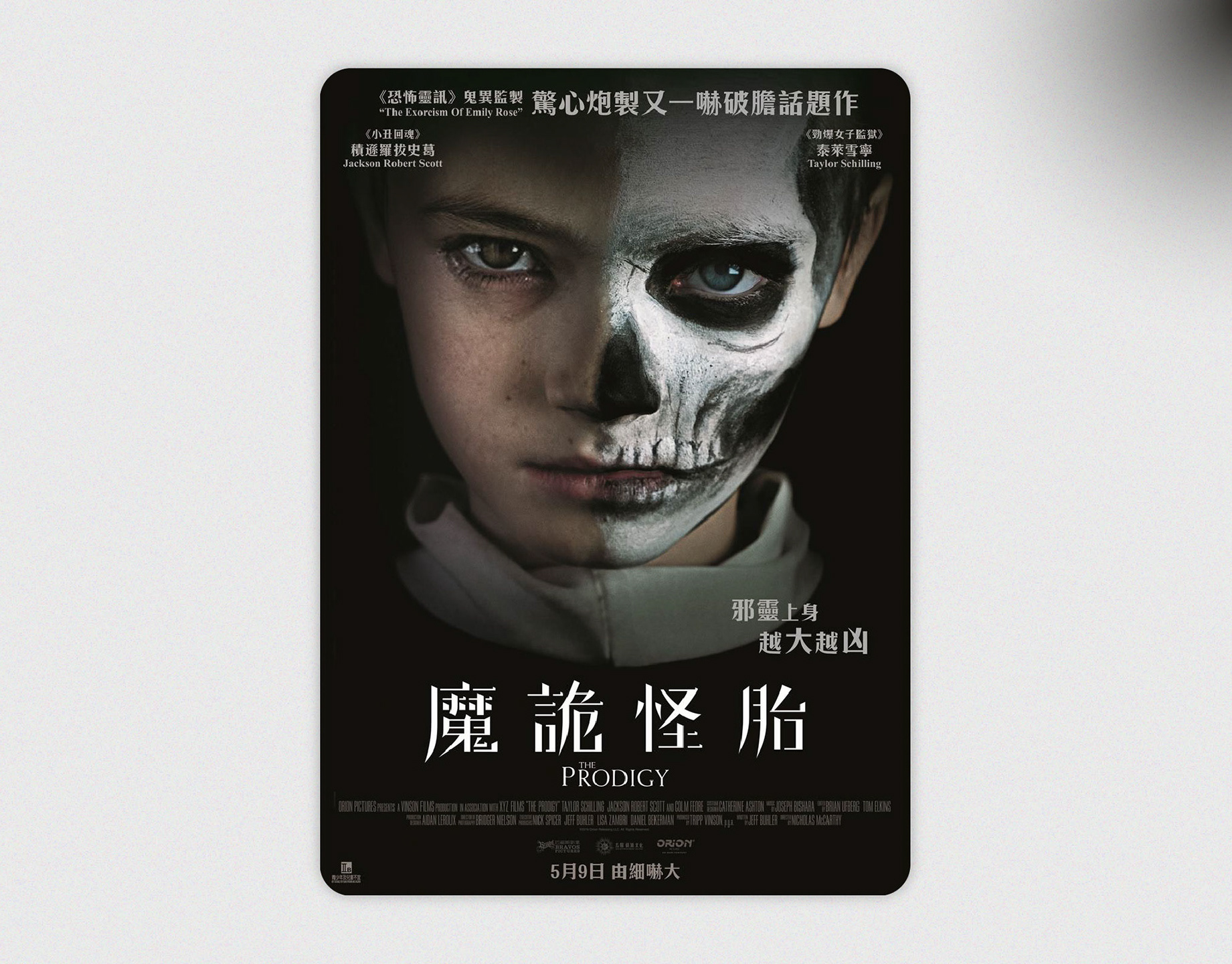
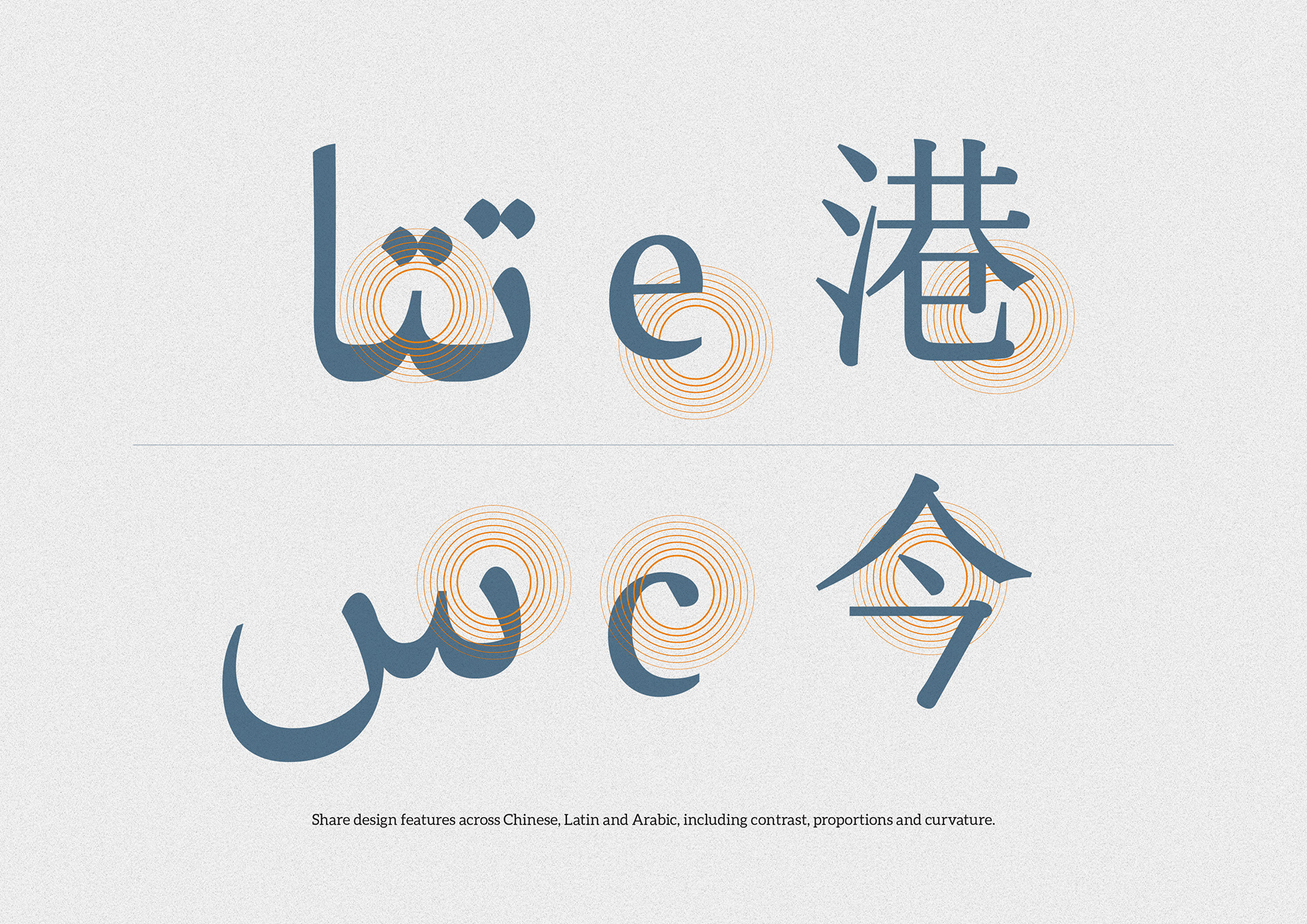
- Built a shared feature set across Arabic, Latin and Chinese (for case studies/notes): contrast range, curvature logic, counter sizes, ink-trap accents.
Deliverables
- Arabic/Latin lock-up
- Poster key-art adaptation
- Type detail sheets (metrics, proportions, feature notes)
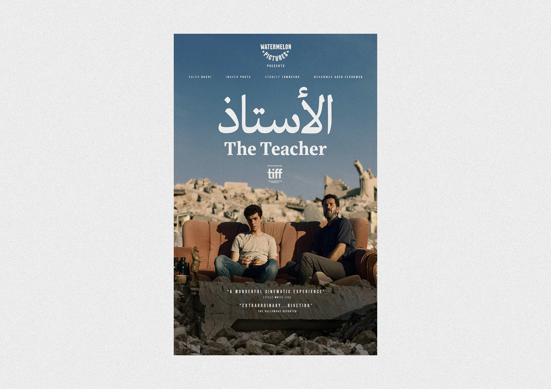
Image notes
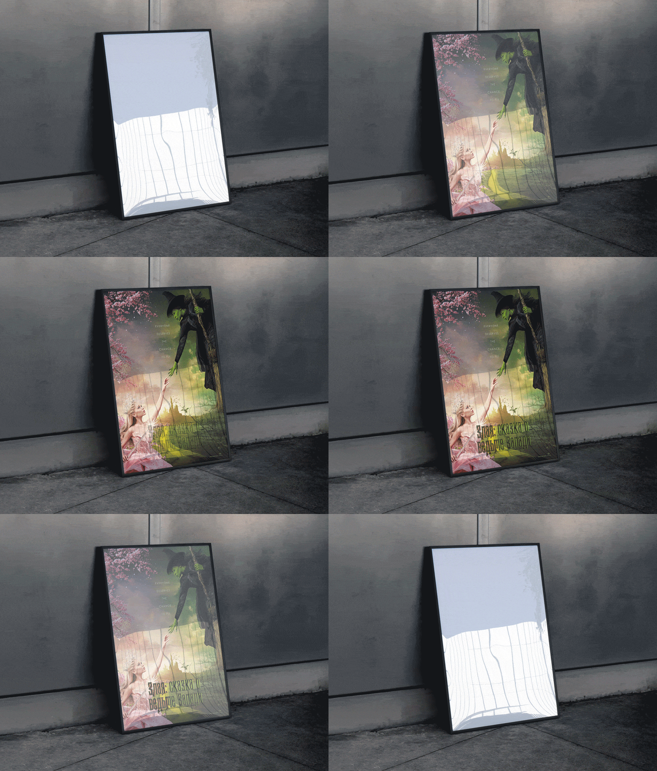
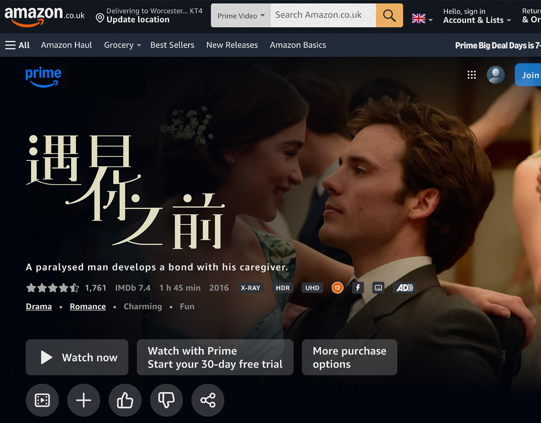
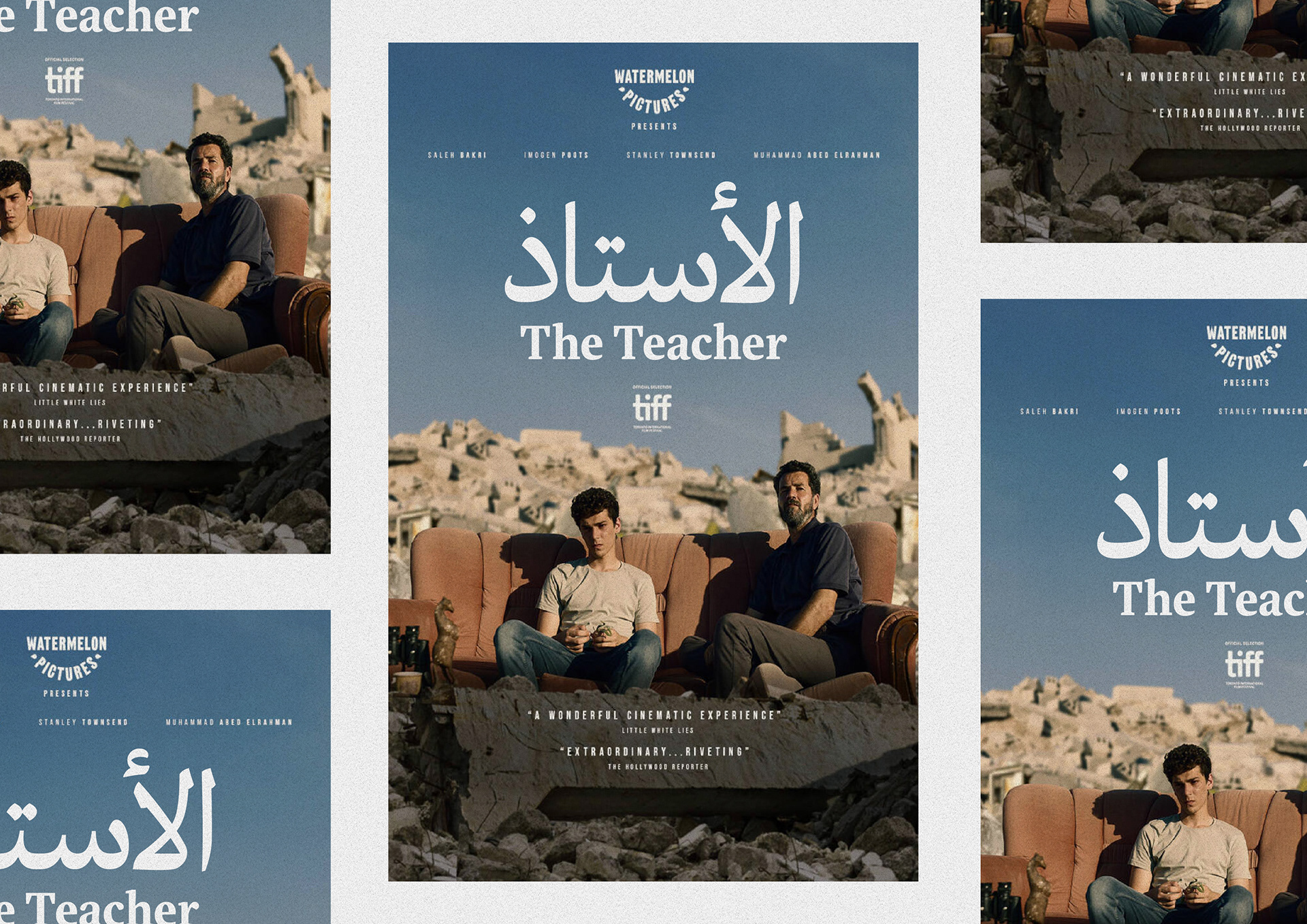
1. Poster applications — Arabic/Latin lock-up integrated with photography.
2. Logotype close-up — final Arabic and Latin pairing.
3. Cross-script feature map — shared contrast, curvature and proportions.
4. Technical sheet — measurements, dots/diacritics, stem calibration and ink-trap notes.Final one-sheet — festival layout with quotes and credit blocks.
《The Teacher》片名在地化(阿拉伯文/英文字)
簡介
為電影《The Teacher》製作阿拉伯文與英文字的片名組版。方向是維持紀實、內斂的氣質,同時確保阿拉伯文在視覺重量與節奏上與英文字匹配。
做法
- 解析英文字標的性格:中等筆畫對比、柔和楔形襯線、節奏克制。
- 繪製阿拉伯文「الأستاذ」標誌,控制對比、圓潤端點與簡化收筆,對應英文字調。
- 校準比例與粗細:牙高/x-height、筆畫寬度與內外白,確保兩種文字視覺一致。
- 統一曲線與起收筆;優化點、母音符號與字距,兼顧海報尺寸可讀性。
- 建立跨語系共通特徵(亦供研究用):對比範圍、曲率邏輯、空隙比例、墨阱細節。
交付
- 阿拉伯文/英文字片名組版
- 海報主視覺改編
- 字形細節說明(度量、比例、特徵標註)
圖片說明
1)海報應用——片名組版與場景照片的整合。
2)標誌近觀——阿拉伯文與英文字對讀。
3)跨語系特徵圖——對比、曲率、比例的共享設定。
4)技術頁——點與符號、筆畫校準與墨阱配置。
5)最終一張海報——影展版式與影評語、演職員資訊。
1)海報應用——片名組版與場景照片的整合。
2)標誌近觀——阿拉伯文與英文字對讀。
3)跨語系特徵圖——對比、曲率、比例的共享設定。
4)技術頁——點與符號、筆畫校準與墨阱配置。
5)最終一張海報——影展版式與影評語、演職員資訊。