Overview
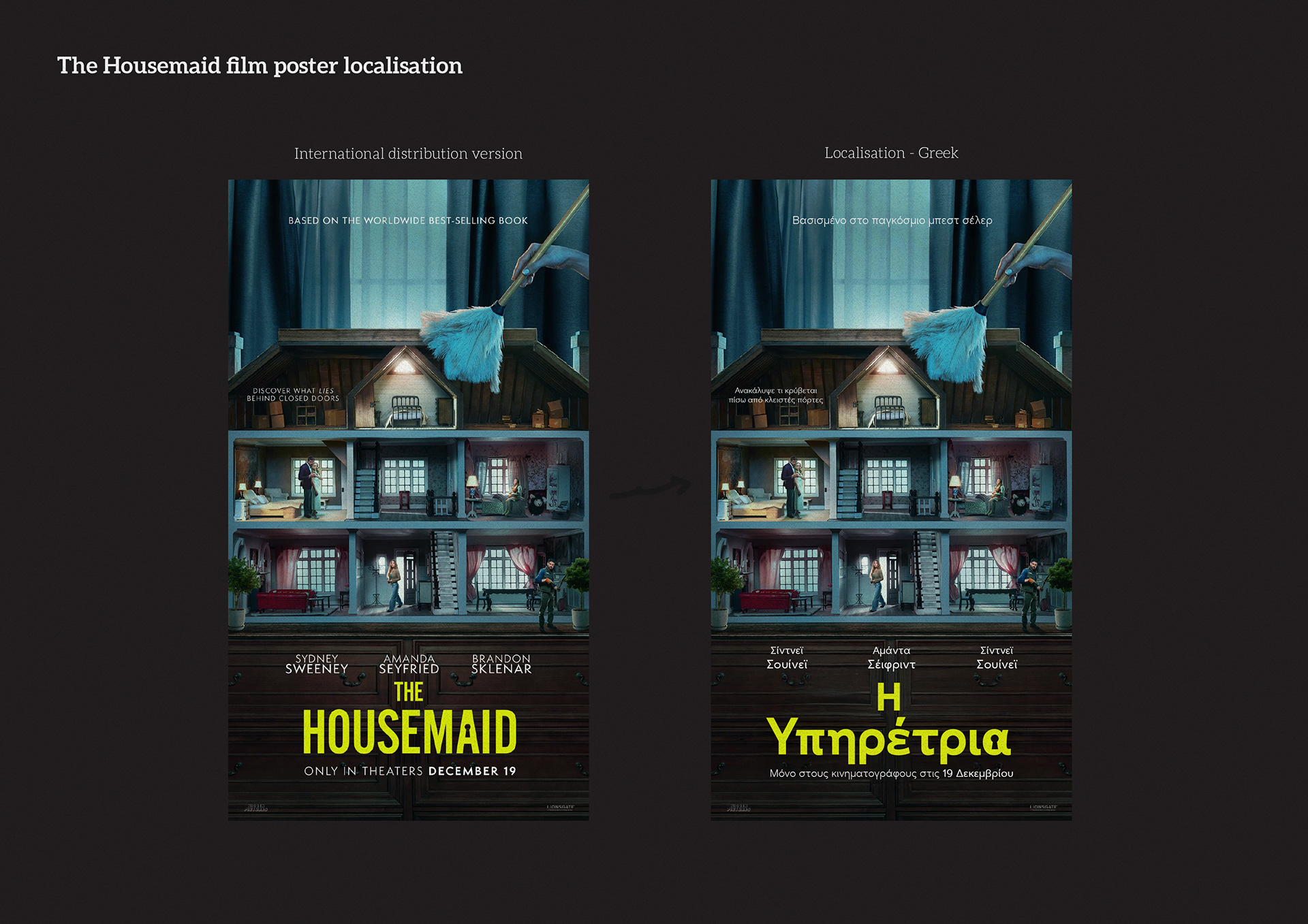
Greek localisation of the key art and title for “The Housemaid.” The goal was to preserve the thriller tone of the international artwork while creating a Greek title that sits naturally with the existing visual system and reads clearly in cinema and digital placements.
Approach
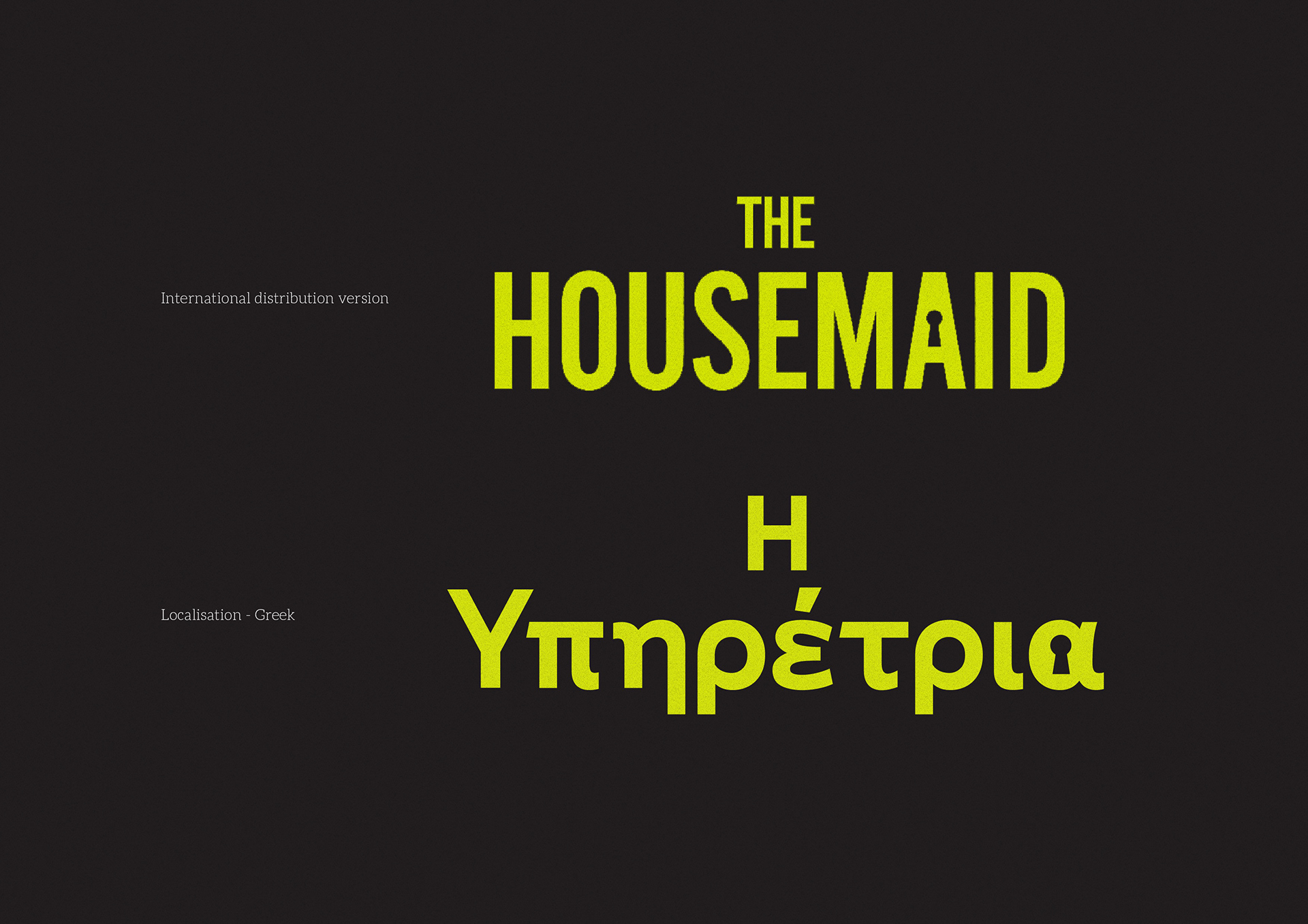
- Analysed the Latin wordmark’s features: condensed width, vertical stress, squared terminals, and the signature keyhole motif.
- Designed the Greek logotype “Η Υπηρέτρια,” adapting proportions and stroke modulation to match the Latin weight and rhythm.
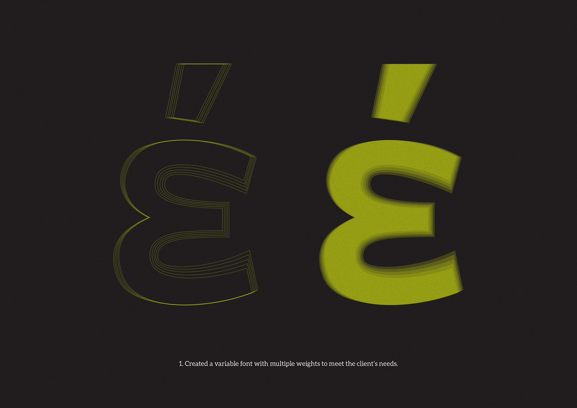
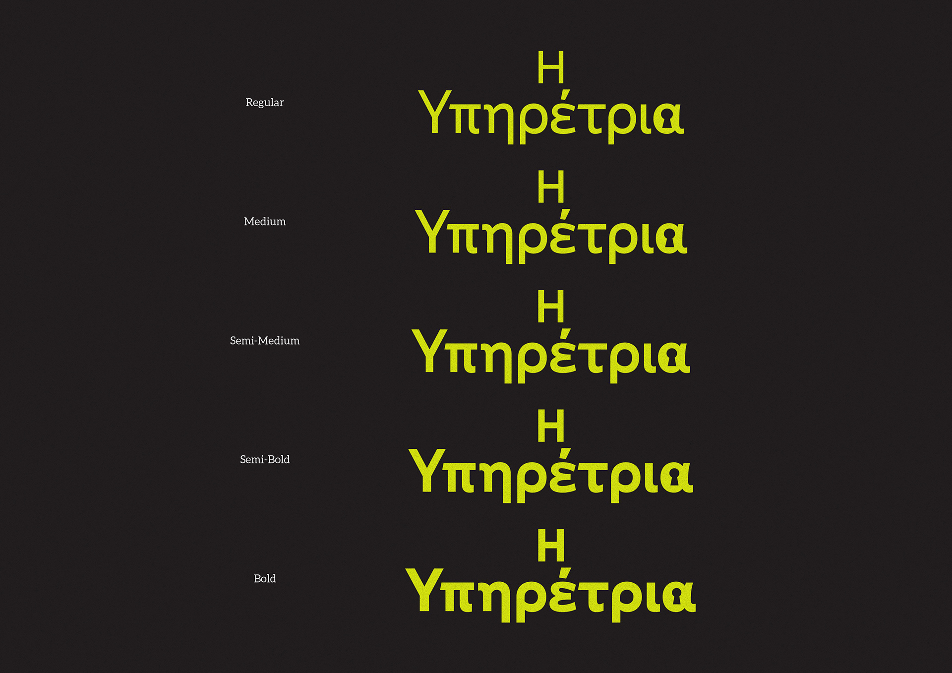
- Built a small variable weight range to cover trailer cards, outdoor posters, and smaller credit blocks.
- Applied spacing and core kerning pairs for Greek, with attention to monotonic diacritics and cap–lowercase alignment.
- Integrated the keyhole motif in letterforms where appropriate, without compromising legibility.
- Matched hierarchy and placement across headline, cast line, quotes, and release date for a consistent layout.
Deliverables
- Greek logotype set (primary, stacked, and horizontal)
- Variable font files (Regular → Bold)
- Kerning and spacing specification for Greek
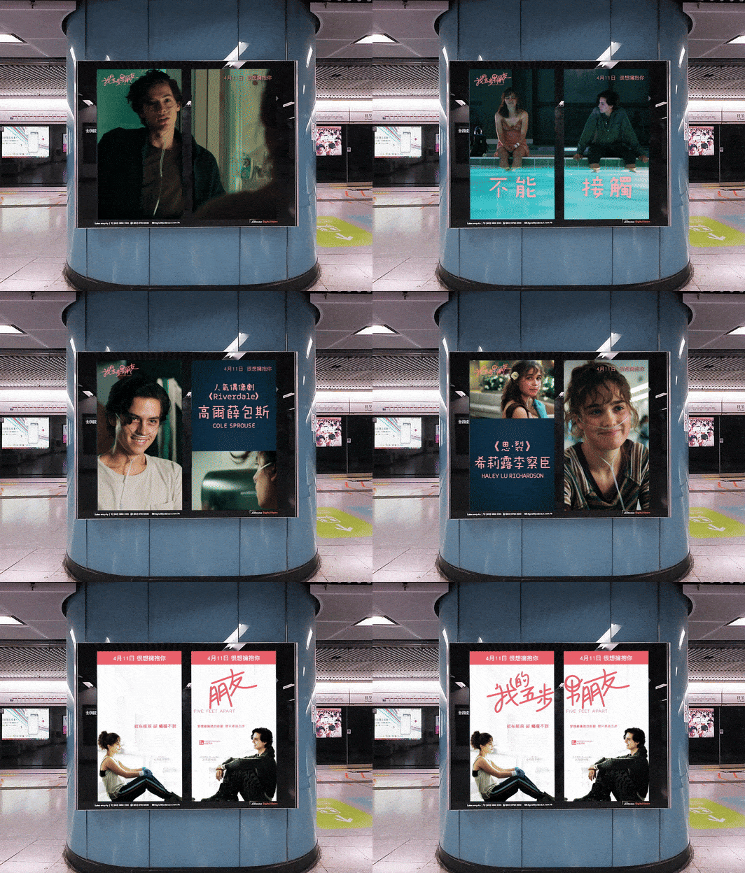
- Poster adaptations for theatrical and digital use
- Usage notes (minimum size, clearspace, colour, motif application)
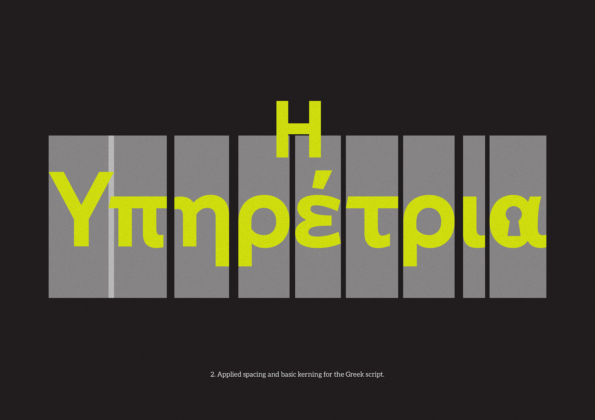
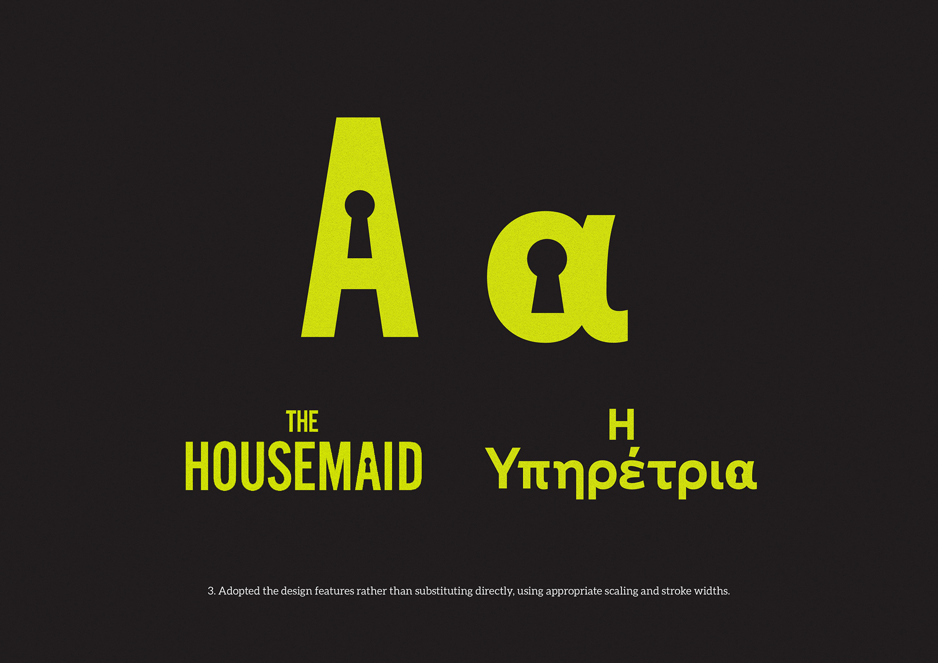
Image notes
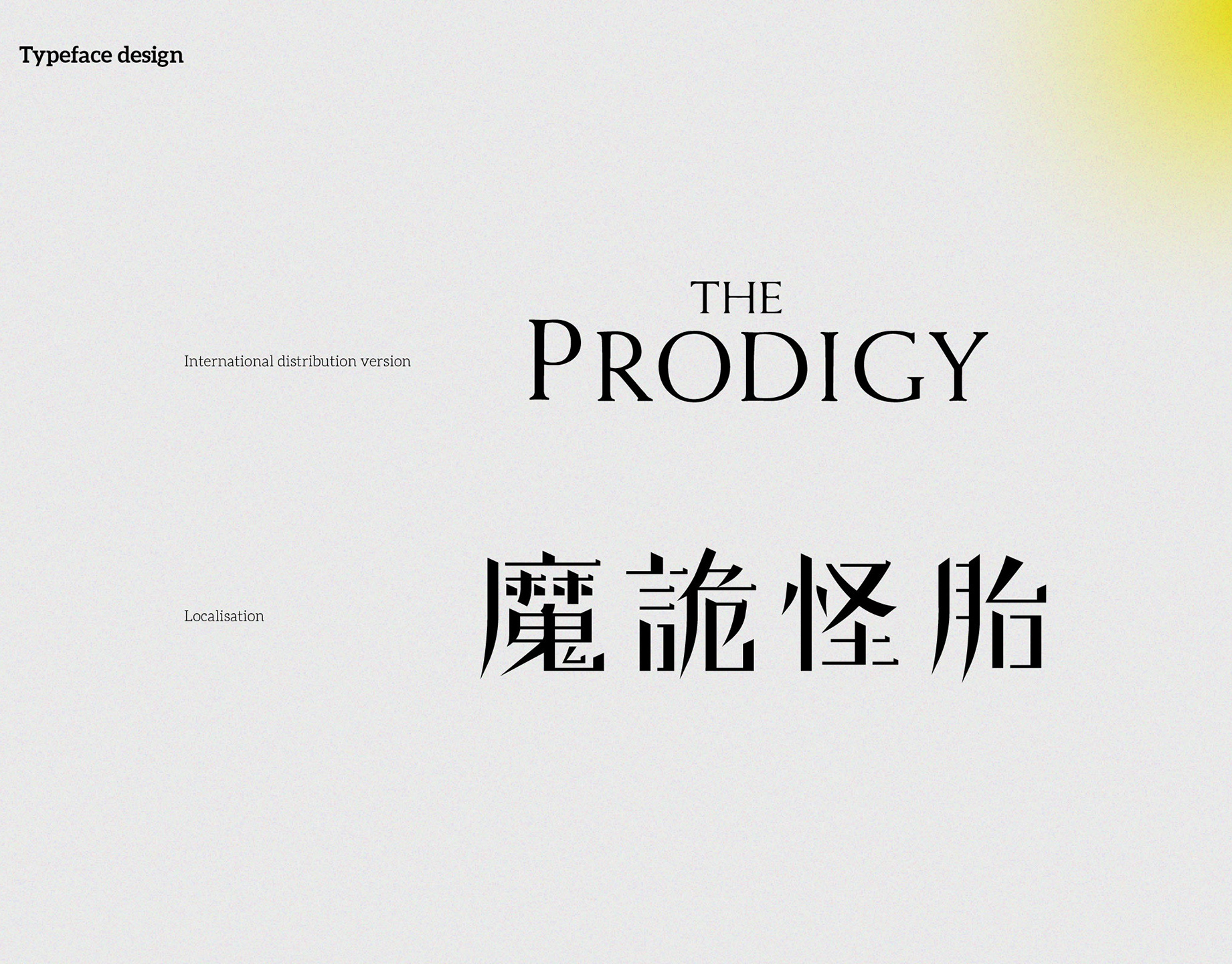
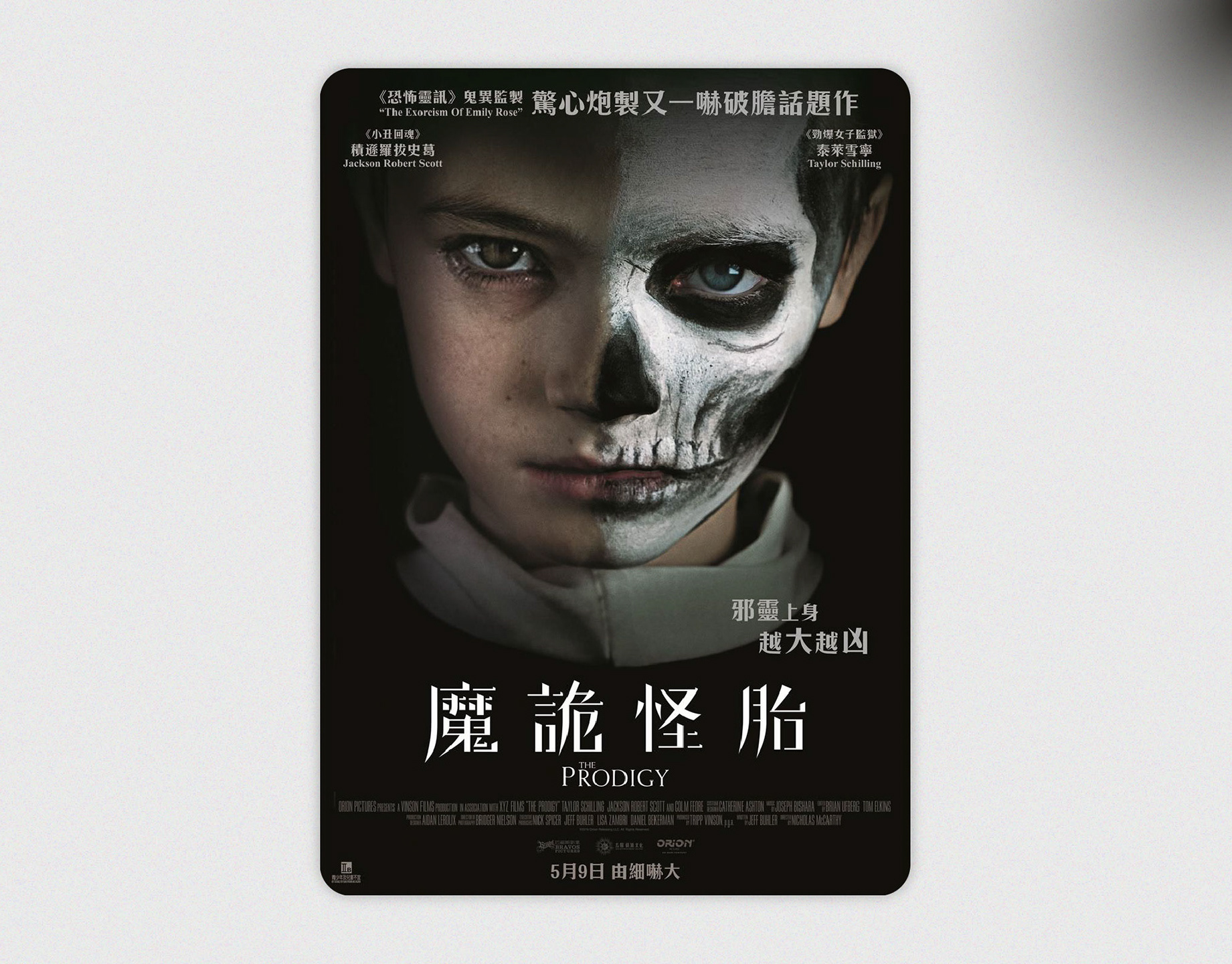
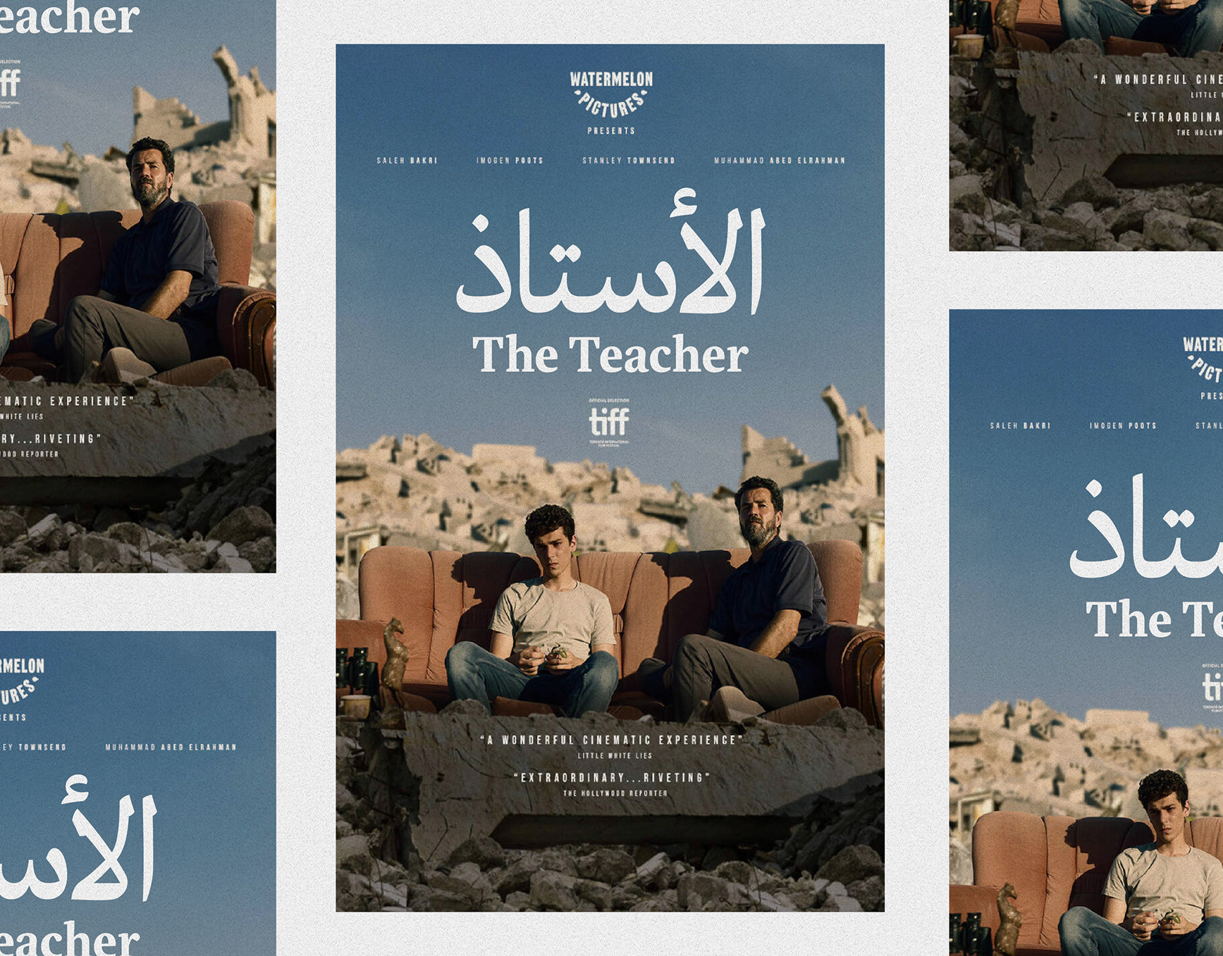
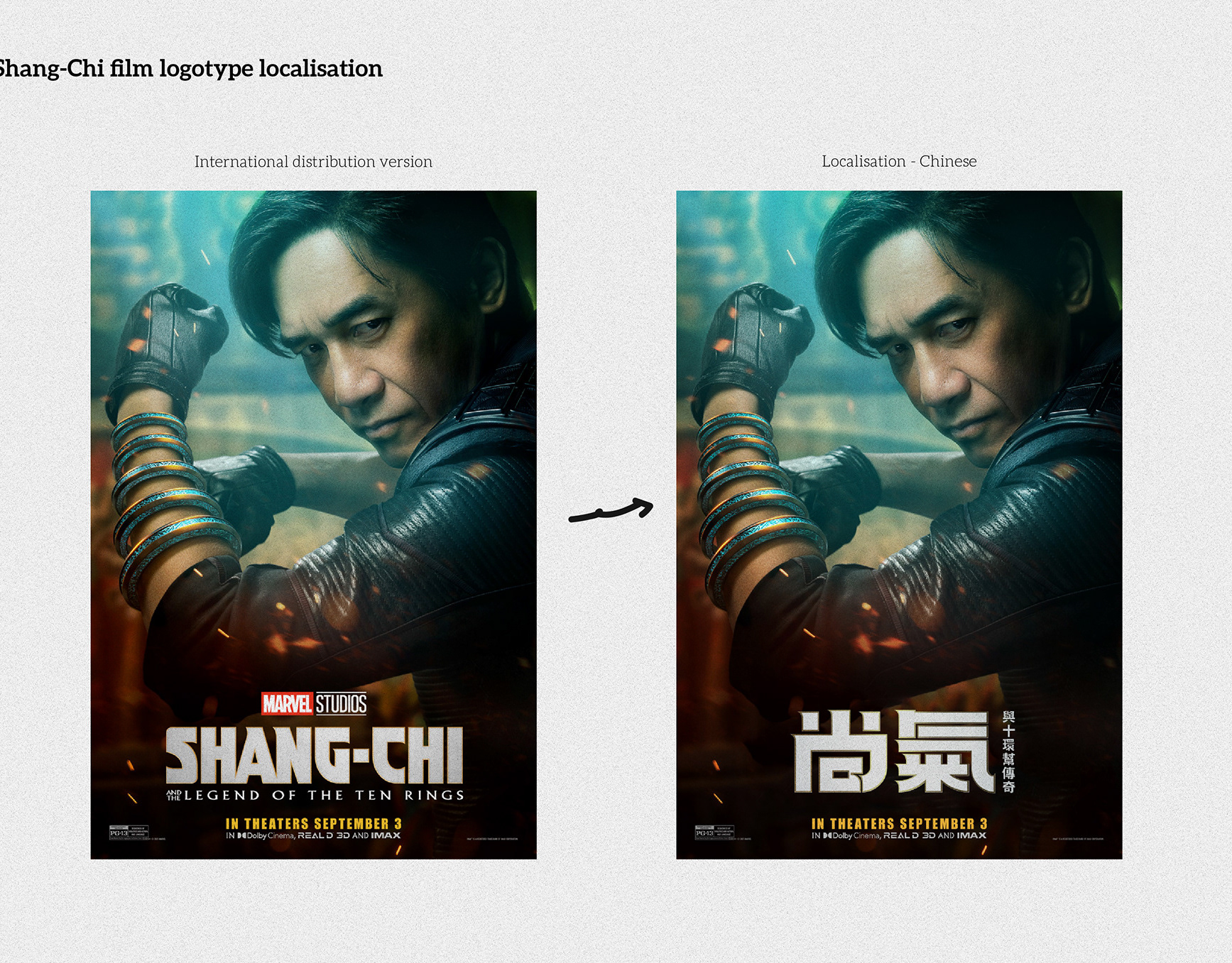
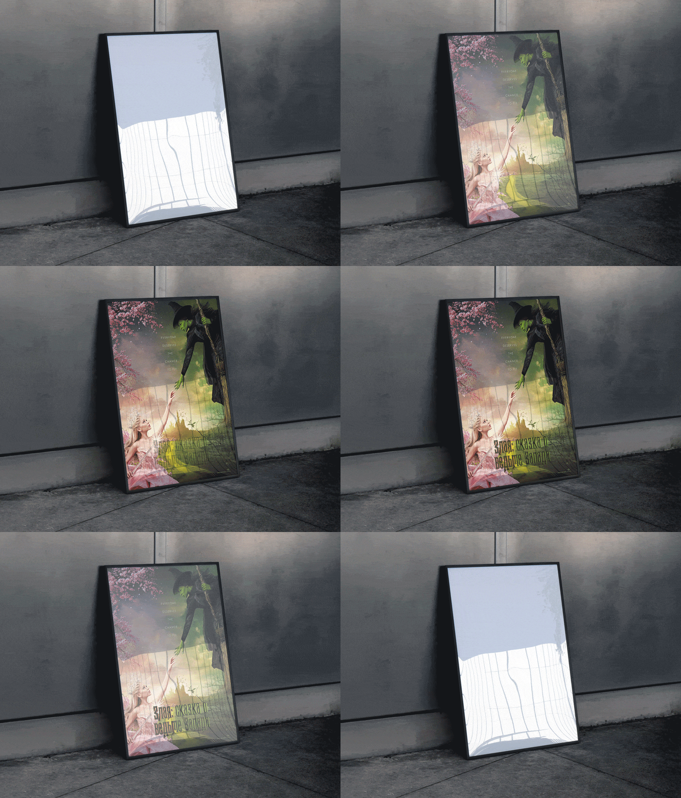
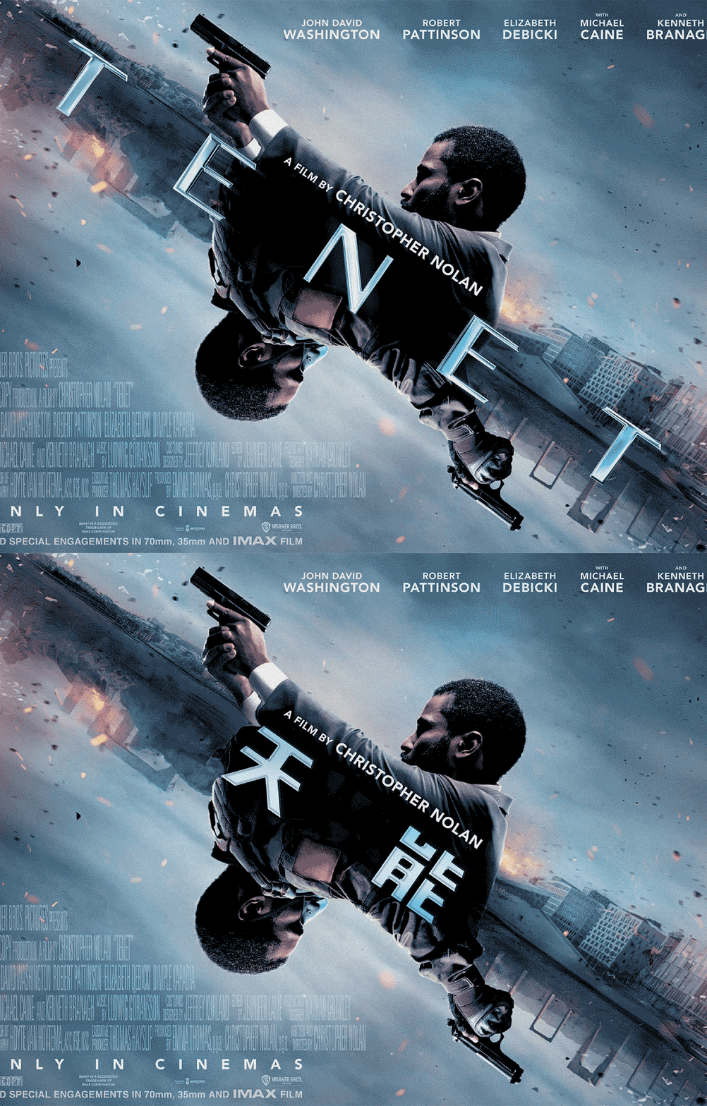
1. International vs Greek posters — side-by-side comparison of layout and hierarchy.
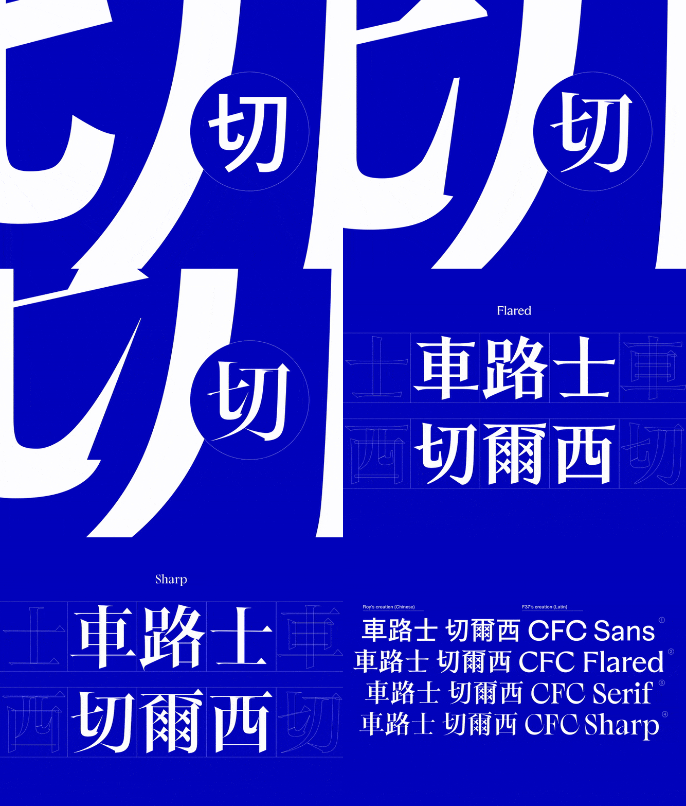
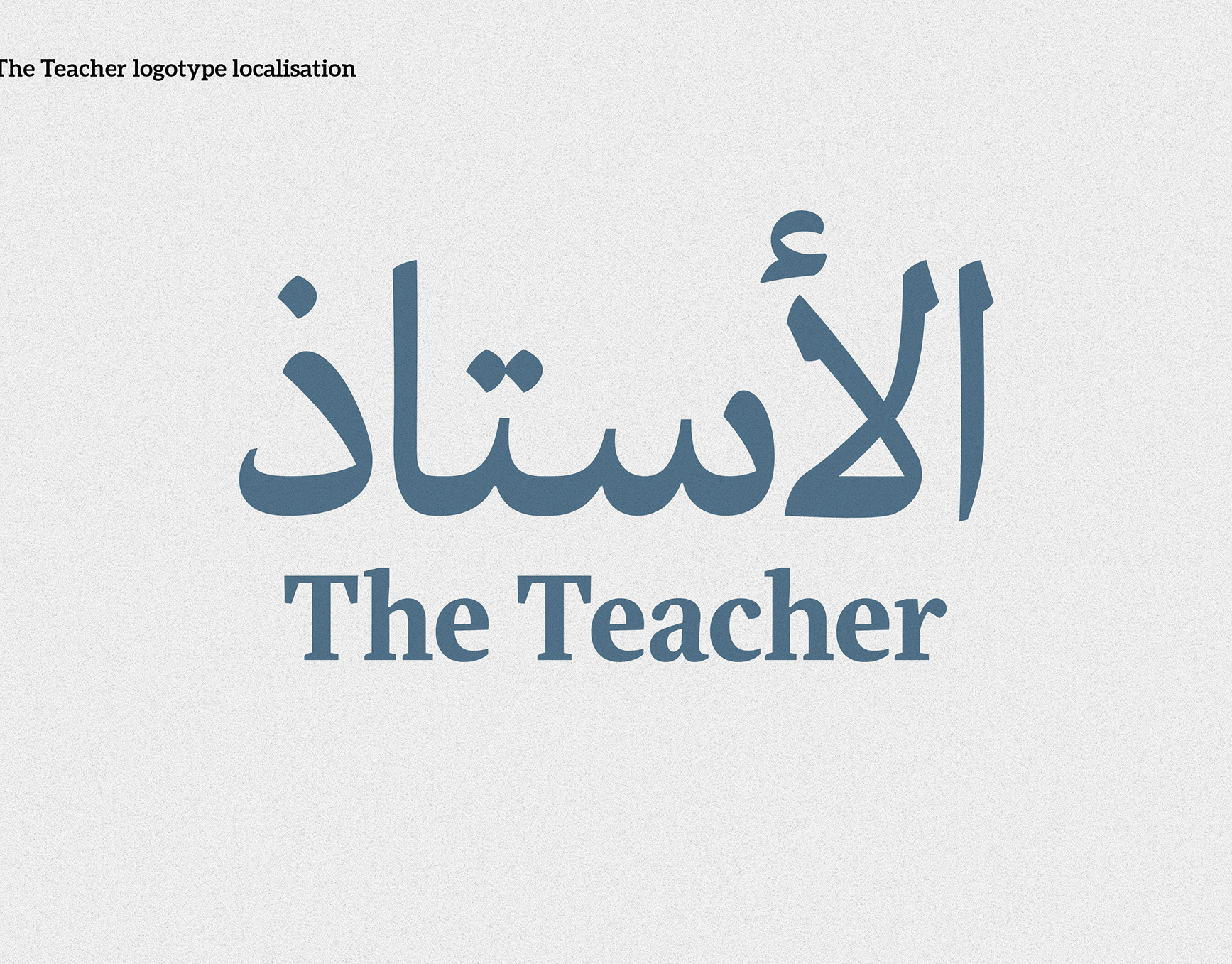
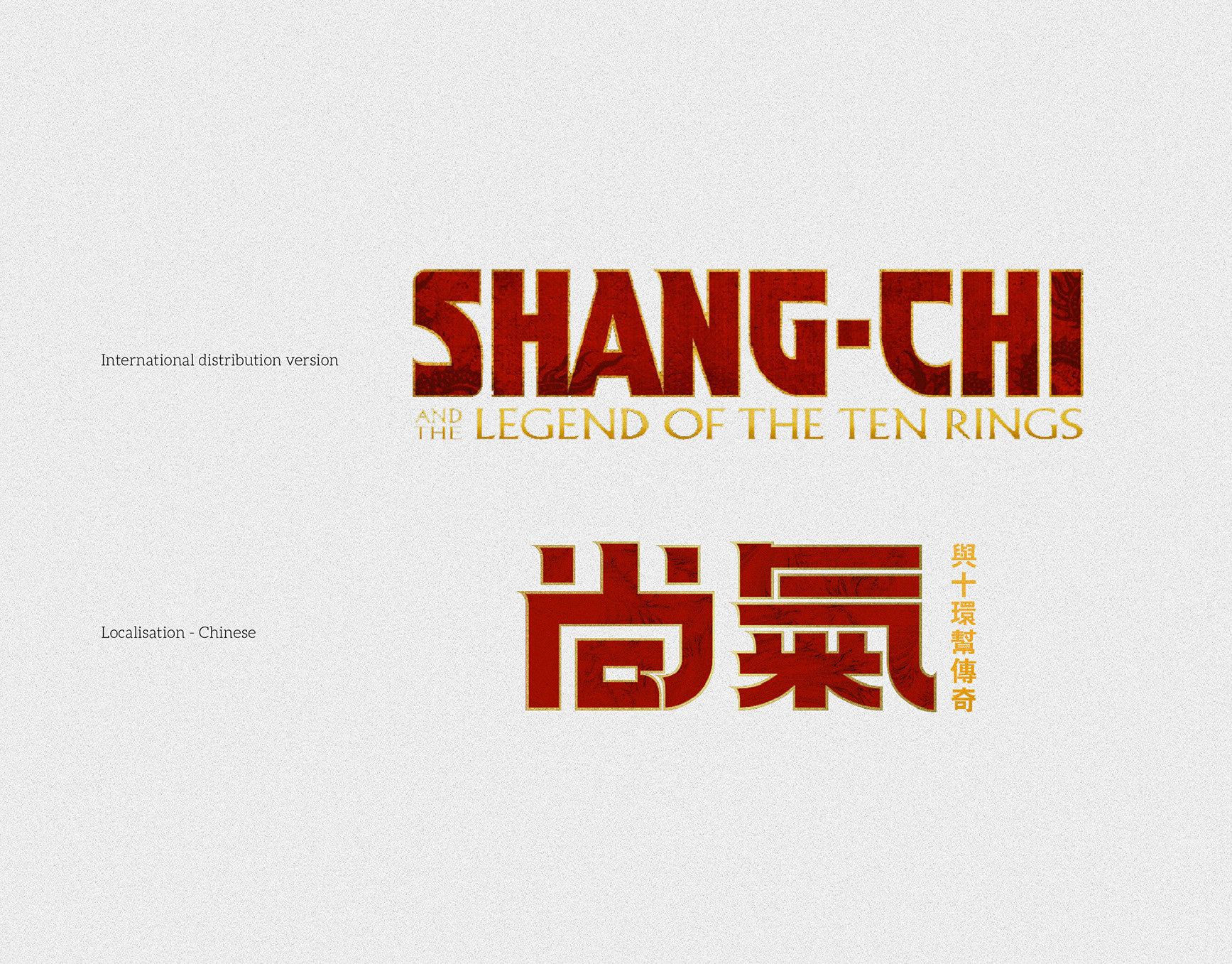
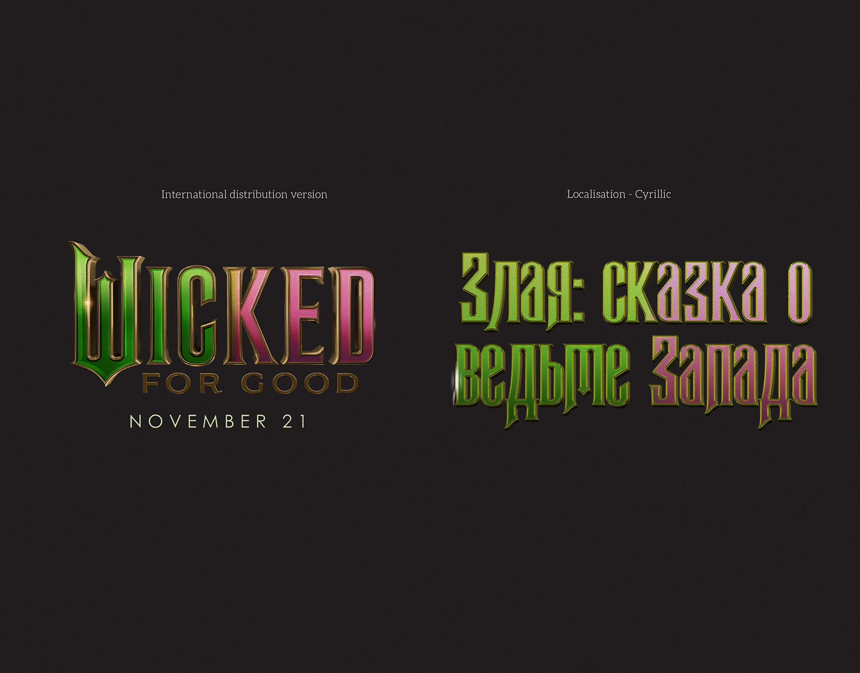
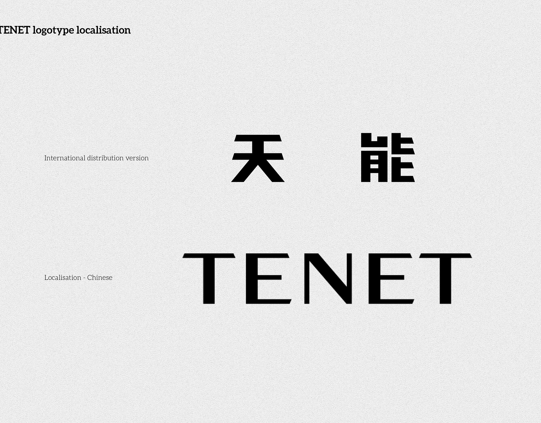
2. Logotype set — Latin to Greek translation with keyhole motif.
3. Variable proof — weight range developed to meet different media needs.
4. Spacing sheet — base side-bearings and primary kerning pairs.
5. Feature adoption — transferring design cues (not literal shapes) with scaling and stroke-width adjustments.