Overview
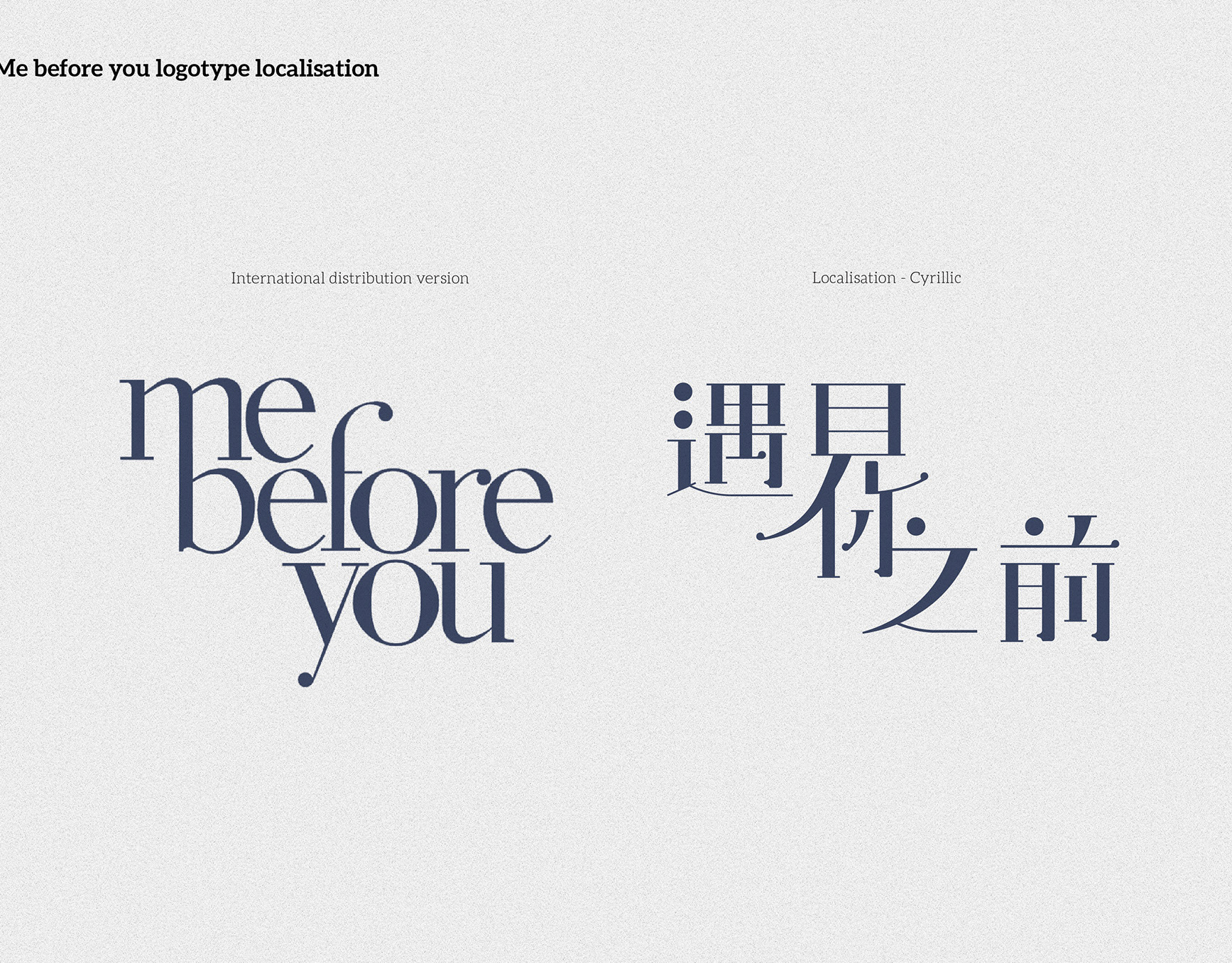
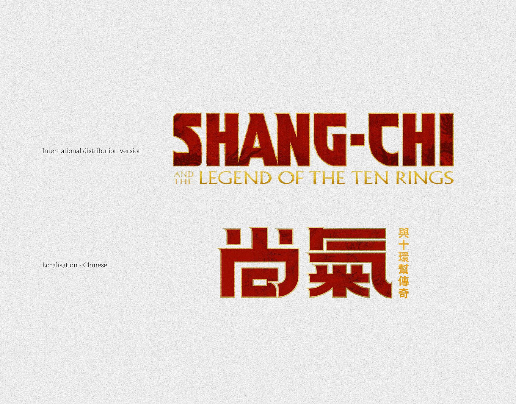
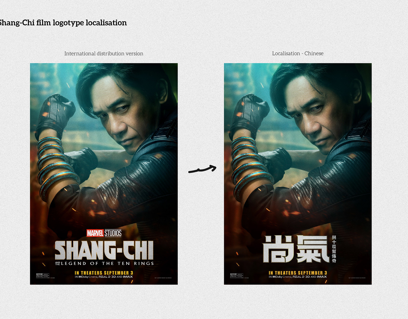
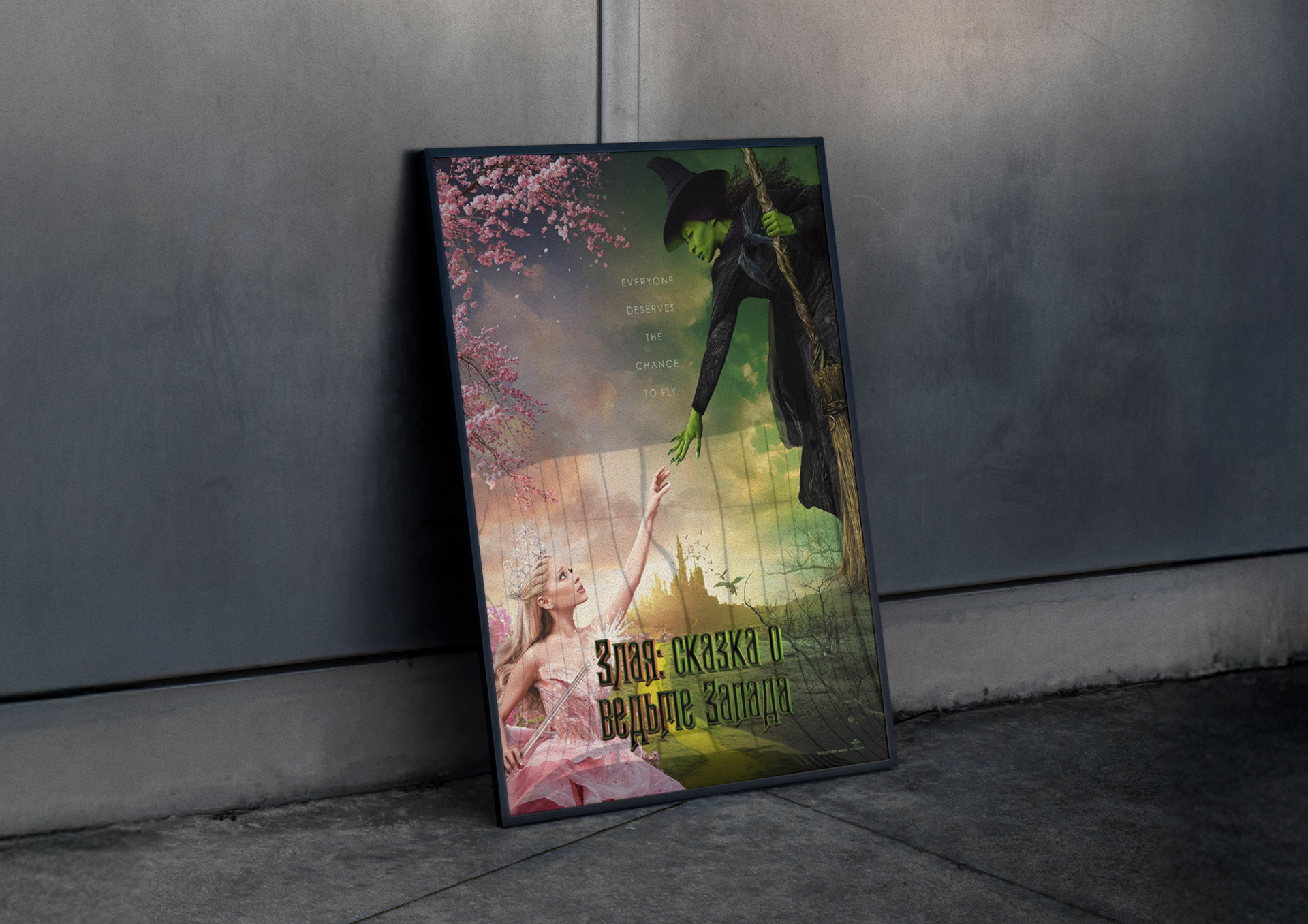
The film’s wordmark was translated into the Cyrillic script for the Russian market. The objective was to keep the musical-fantasy, gilded look of the original while ensuring clear legibility on posters and digital placements.
Approach
- Analysed core features: high contrast skeleton, Gothic-influenced terminals, metallic gradient, and bevelled relief.
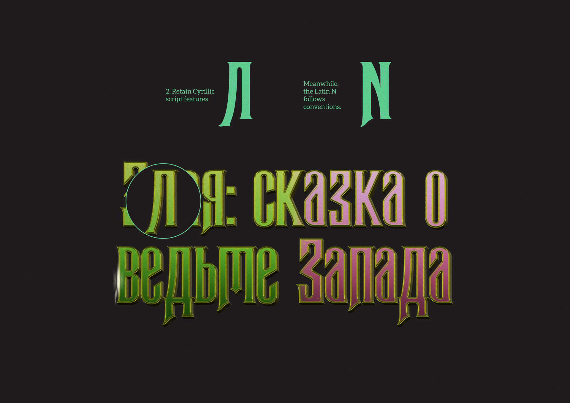
- Redrew letterforms to follow Cyrillic conventions (e.g., shapes and widths for Л, И) rather than copying Latin structures.
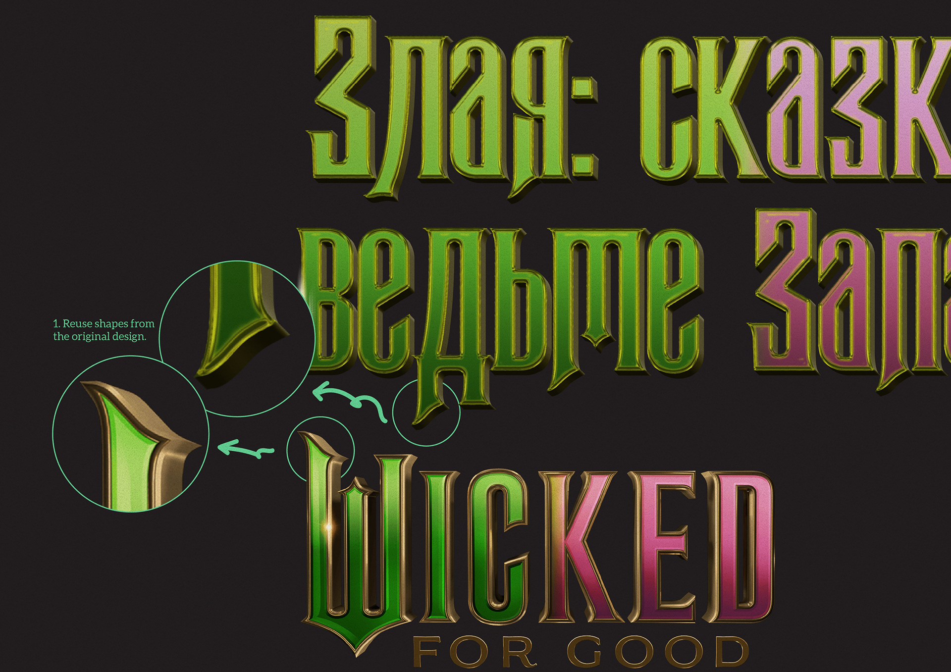
- Carried over shared design cues—edge outlines, inner highlights, pointed terminals, and recessed strokes—to maintain material consistency.
- Built headline and subhead weights; tuned spacing and key kerning pairs for multi-line, long titles.
- Optimised contrast, strokes, and outline for busy lower-poster backgrounds to preserve readability.
Deliverables
- Cyrillic logotype set (title and subtitle; single-line and multi-line options)
- Material/effects spec (gradients, outline, inner/outer glow, shadow)
- Spacing and kerning sheet for Cyrillic
- Poster adaptations for print and digital export
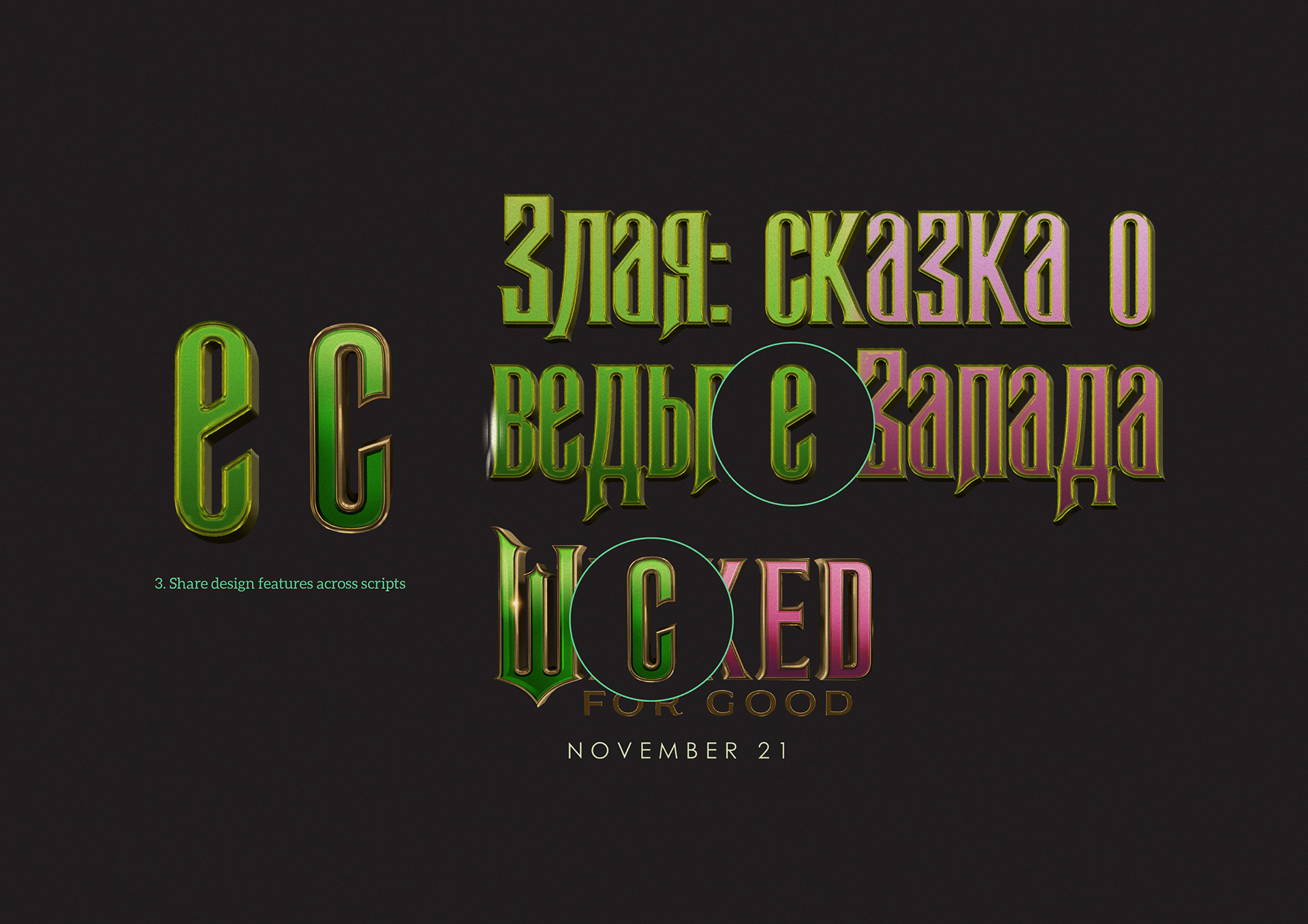
Image Notes
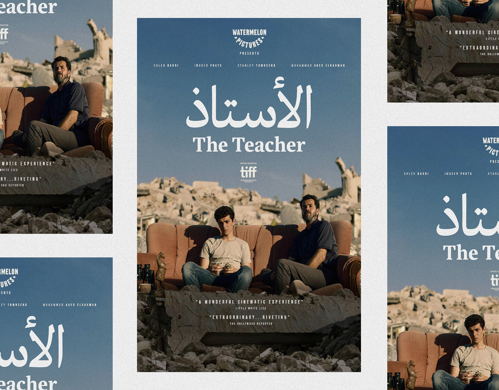
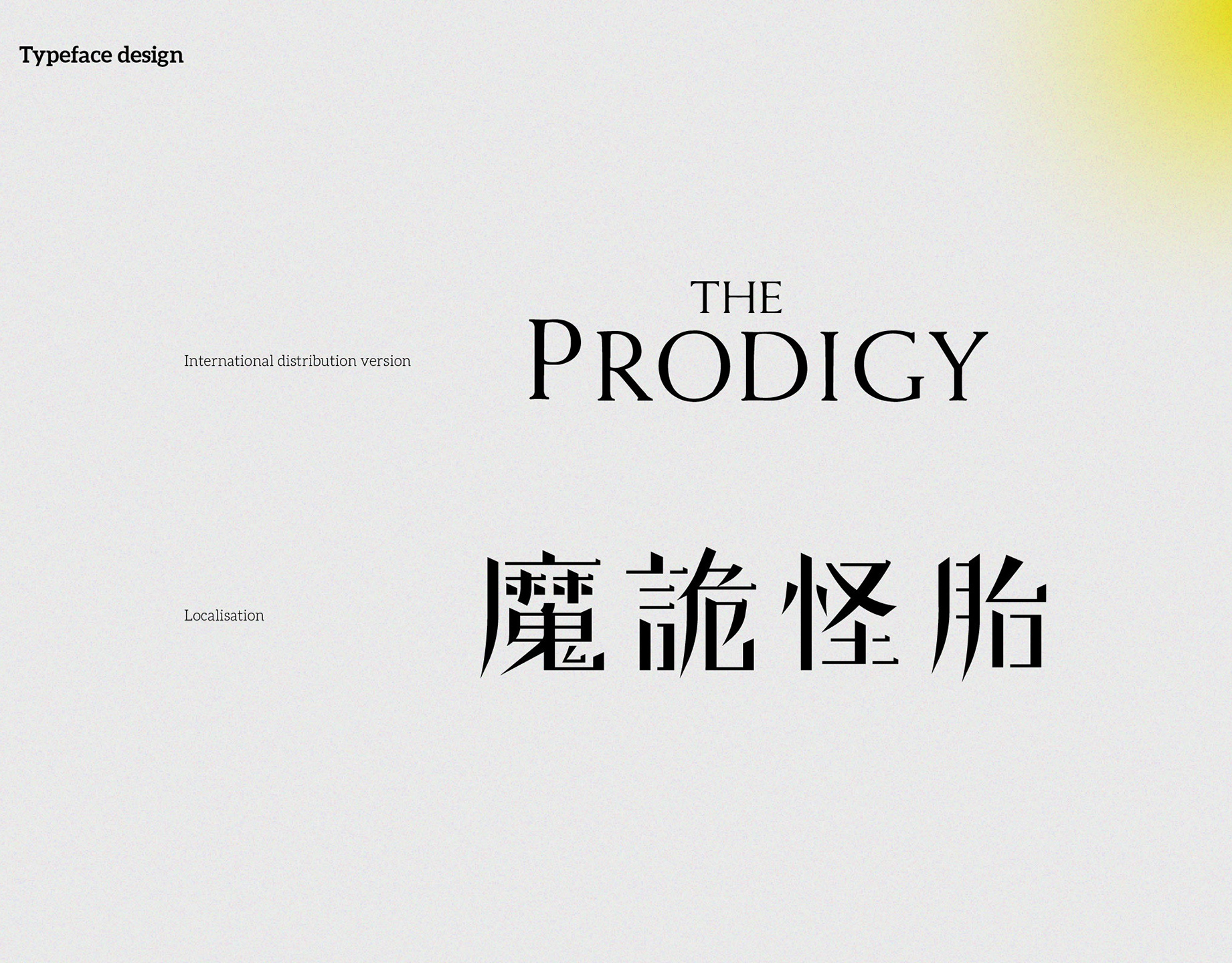
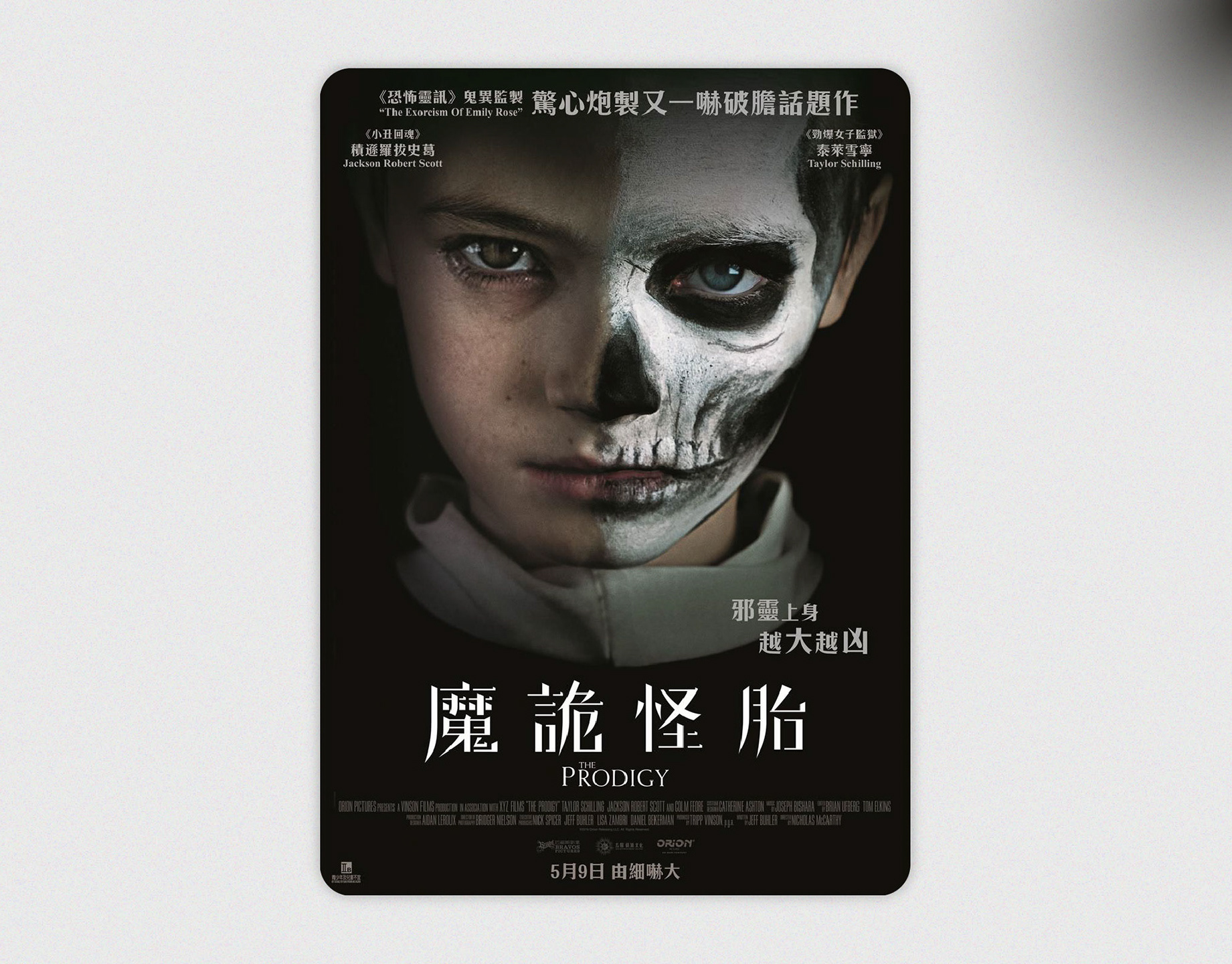
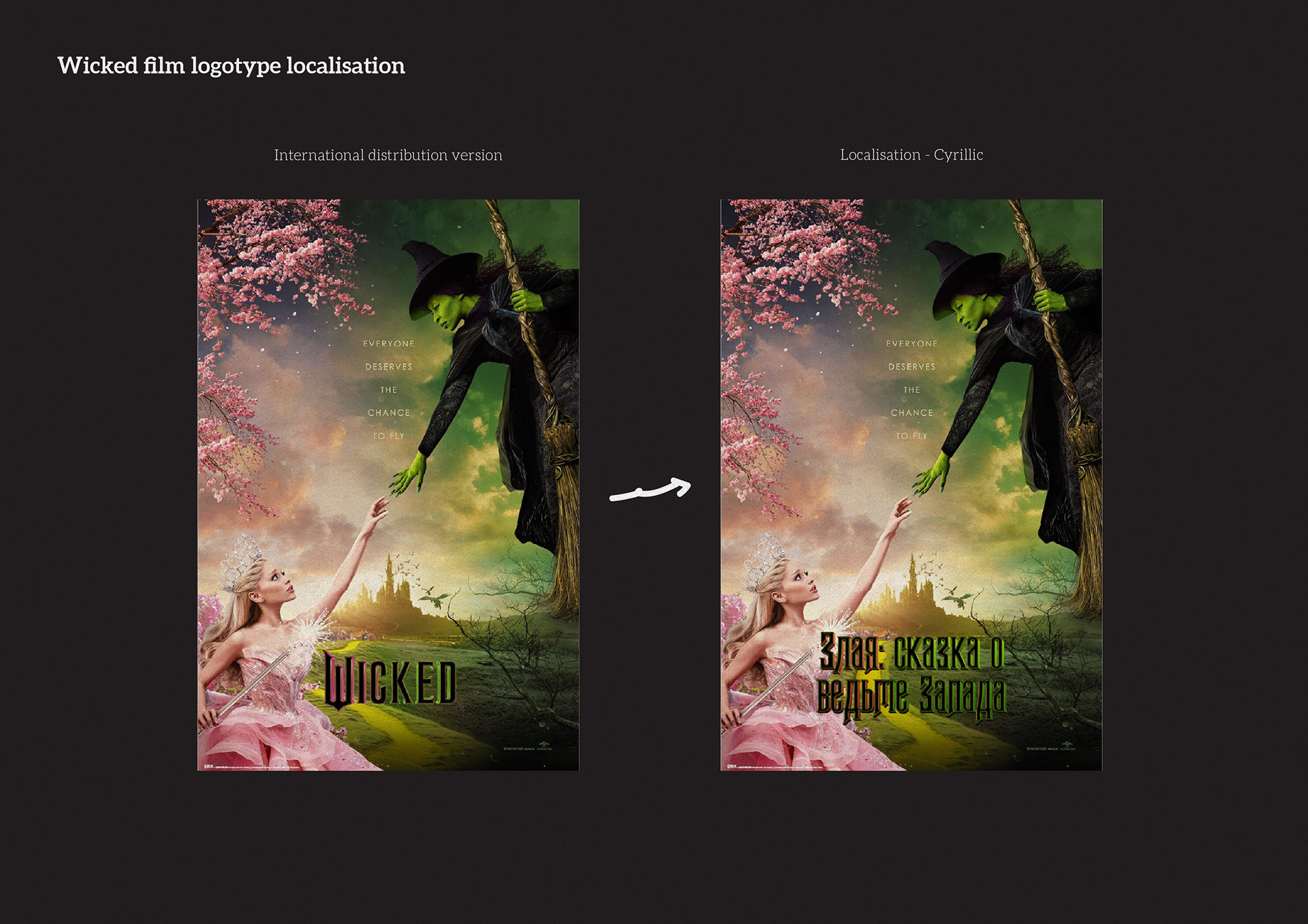
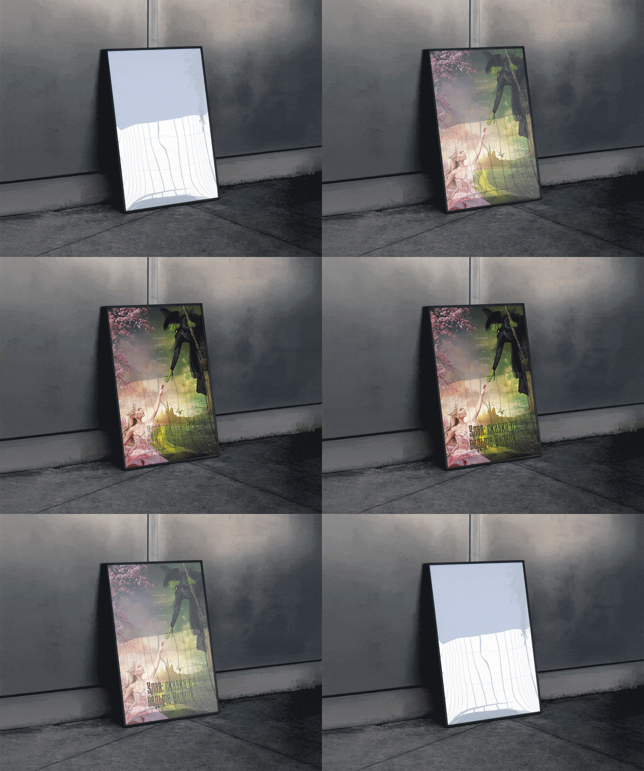
- International vs Cyrillic posters — matched hierarchy and placement.
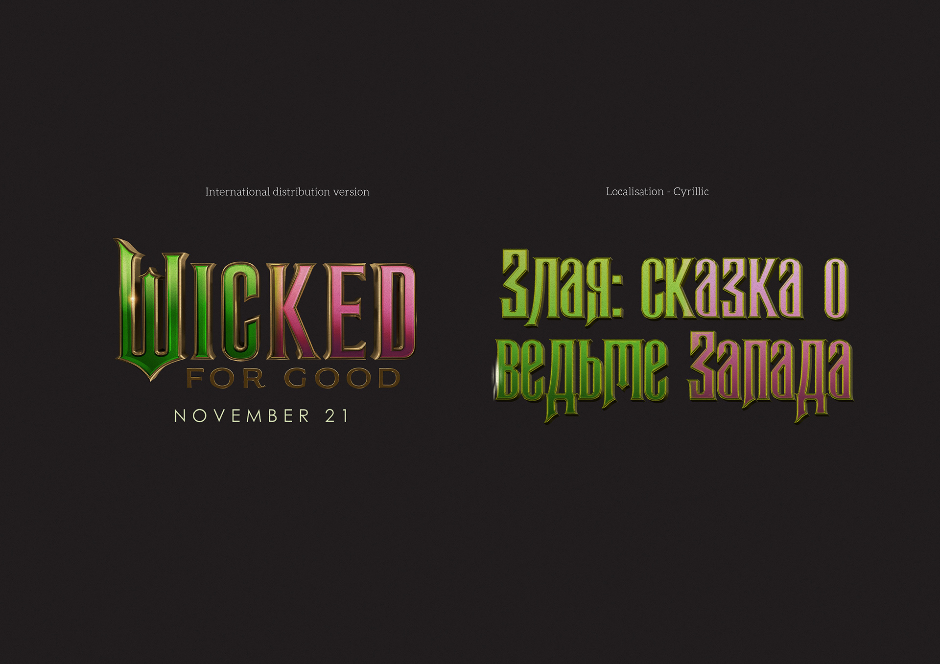
- Logotype set — material and styling aligned with the original.
- Shape mapping — transfer of spikes, outlines, and bevels.
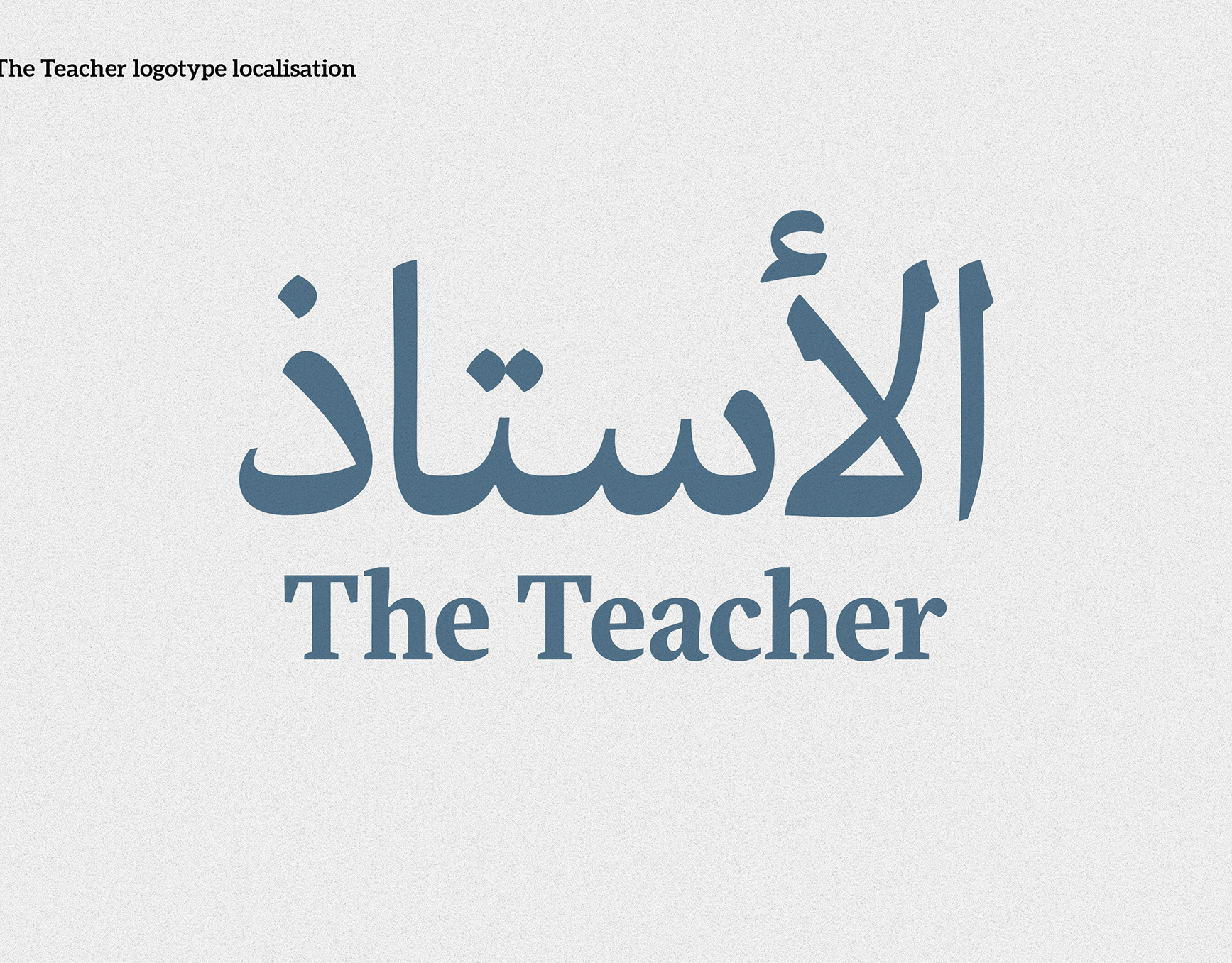
- Script conventions — Cyrillic forms drawn to native norms.
- Shared features — consistent highlights and inner shadows across letters.
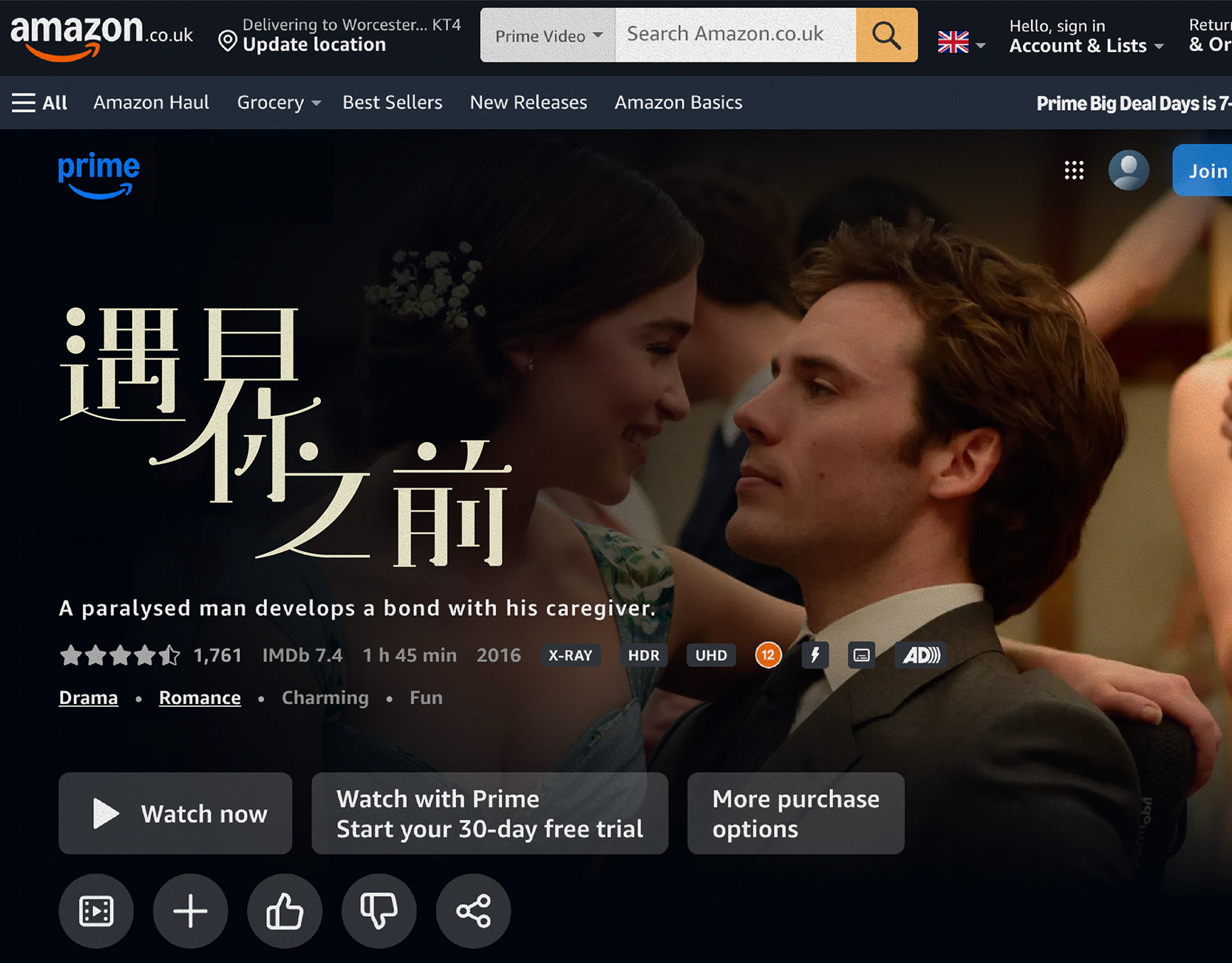
- In-situ test — final artwork over complex backgrounds.
《Wicked》片名在地化(西里爾字母版)
簡介
把《Wicked》電影標誌轉譯為西里爾字母(俄語市場),在保留奇幻歌舞的華麗質感與金屬浮雕效果的同時,讓新字母系統在海報與數位介面上清晰可讀。
把《Wicked》電影標誌轉譯為西里爾字母(俄語市場),在保留奇幻歌舞的華麗質感與金屬浮雕效果的同時,讓新字母系統在海報與數位介面上清晰可讀。
做法
- 解析原標誌的特徵:高反差的黑體骨架、哥德風裝飾、金屬漸層與立體倒角。
- 依西里爾字母慣例重畫字形(如 Л、И 的筆勢與寬度),避免照搬拉丁結構。
- 共享造型語彙:內嵌高光、外框邊線、尖角收筆與內凹筆畫,統一層次與材質。
- 建立標題與副標題兩種字重,調整間距與主要字偶,適配長片名與多行排版。
- 針對海報下緣的複雜背景做對比與描邊優化,確保在實景疊圖中的可讀性。
交付
- 西里爾字母標誌組(主標、副標/單行與多行)
- 材質與效果規範(漸層、描邊、內外光、投影)
- 字距與主要字偶表(西里爾字母)
- 海報關鍵視覺改編與輸出檔(印刷/數位)
圖片說明
1)國際版與西里爾版海報對照:版面層級與位置一致。
2)標誌組:原版與在地化字樣之造型與材質對齊。
3)形狀對映:尖角、外框與立體倒角的轉換方法。
4)字母慣例:依西里爾特性重畫筆勢與寬度,避免拉丁化。
5)共享特徵:在不同字母間統一高光槽與內陰影。
6)實際應用:成品海報於實景背景上的讀寫測試。
1)國際版與西里爾版海報對照:版面層級與位置一致。
2)標誌組:原版與在地化字樣之造型與材質對齊。
3)形狀對映:尖角、外框與立體倒角的轉換方法。
4)字母慣例:依西里爾特性重畫筆勢與寬度,避免拉丁化。
5)共享特徵:在不同字母間統一高光槽與內陰影。
6)實際應用:成品海報於實景背景上的讀寫測試。