Overview
Chinese logotype created for the Hong Kong release of “TENET” (天能). The aim was to echo the geometry and reversibility of the Latin title while keeping clear legibility for print and screen.
Approach
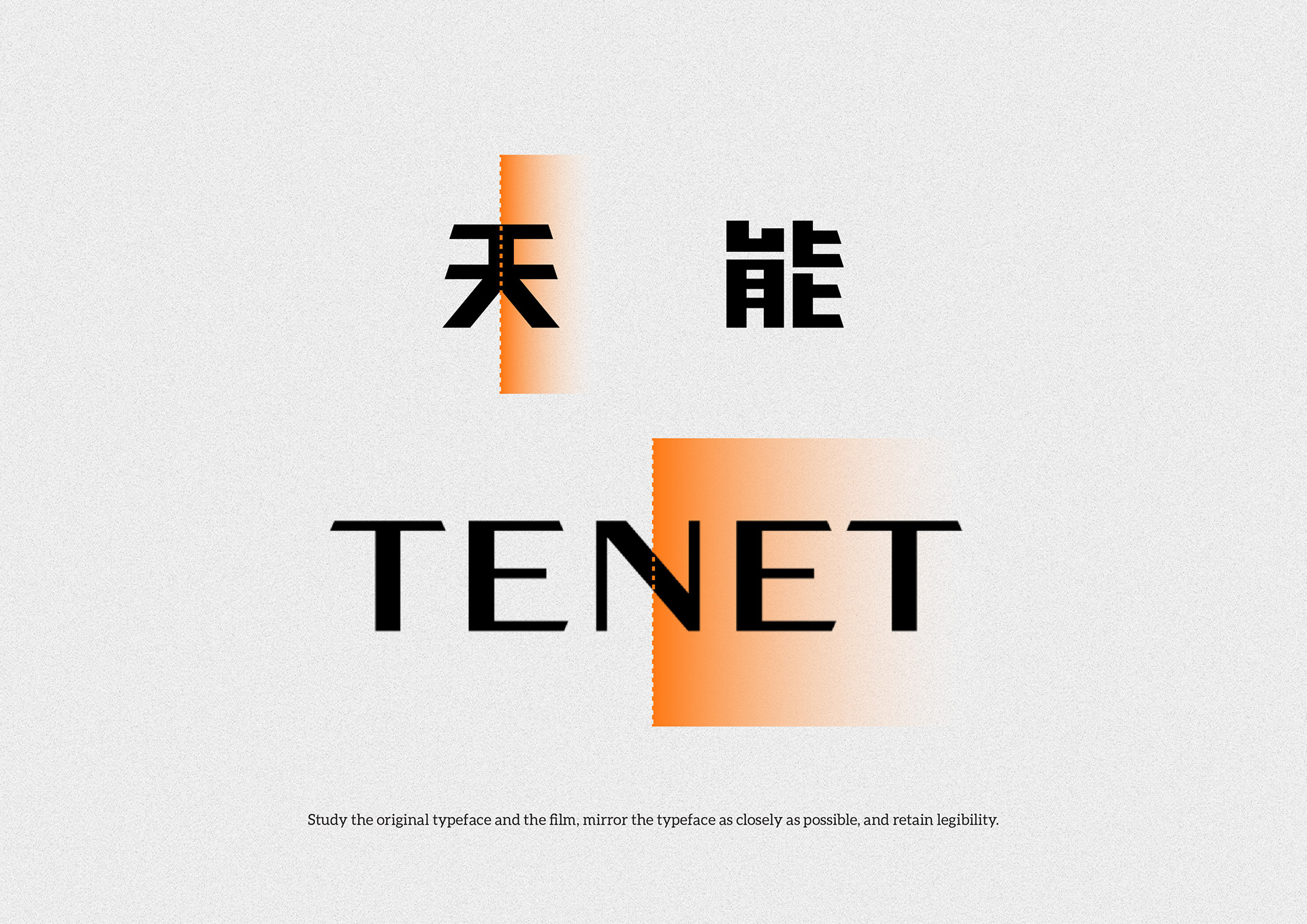
- Studied the Latin wordmark’s proportions, angles and cut details; identified repeatable cues for translation into Chinese.
- Built 天 and 能 with mirrored cuts and consistent stroke widths to reflect the film’s inversion motif.
- Matched cap-height, visual weight and spacing so the Chinese lock-up pairs cleanly with the original Latin mark.
- Prepared variations for poster tilt, small-size use and on-image compositing; delivered vector masters and placement guides.
Deliverables
- Chinese logotype (horizontal and stacked)
- Poster key art adaptation
- Usage notes for spacing, scale and tilt
- Files for print and digital (AI, SVG, layered PSD)


Image notes
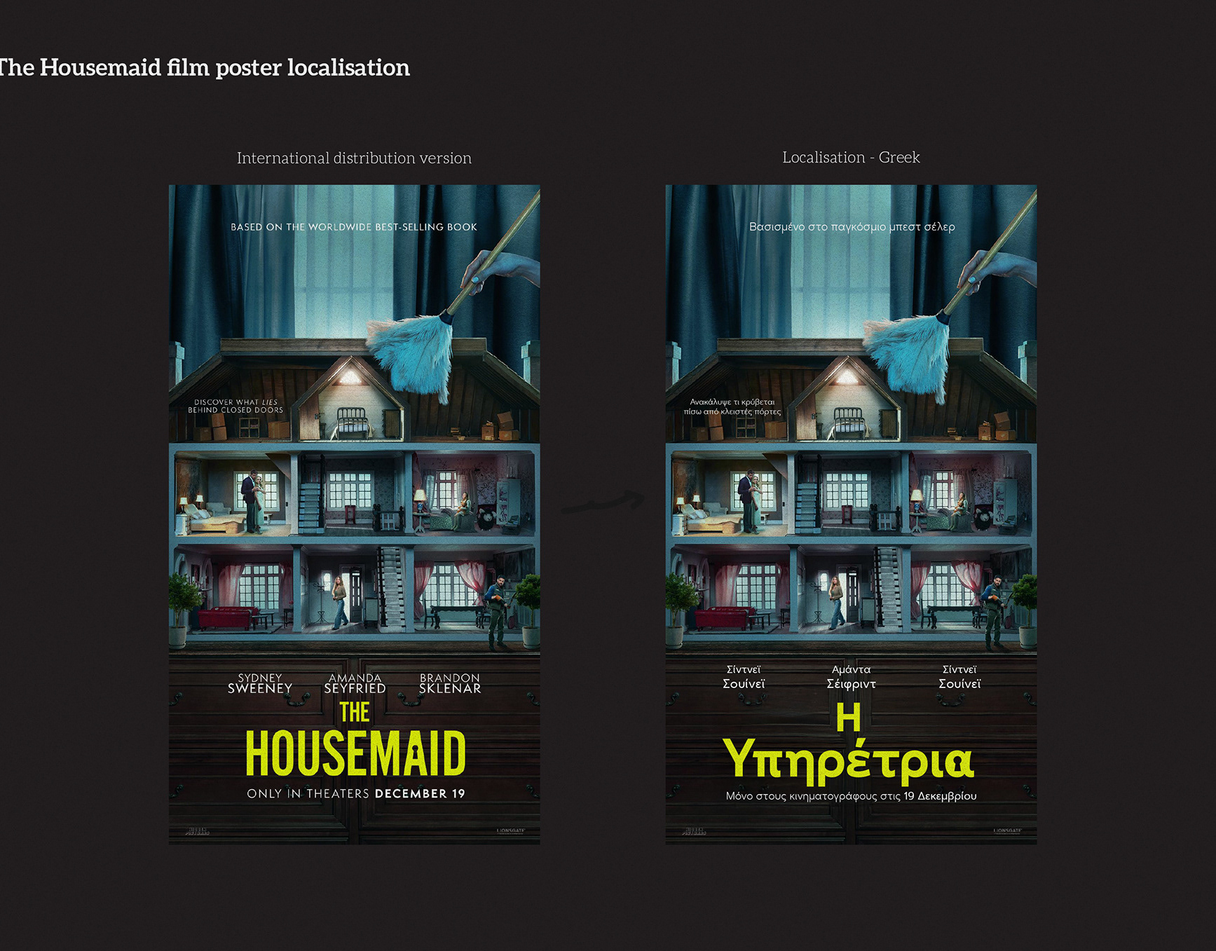
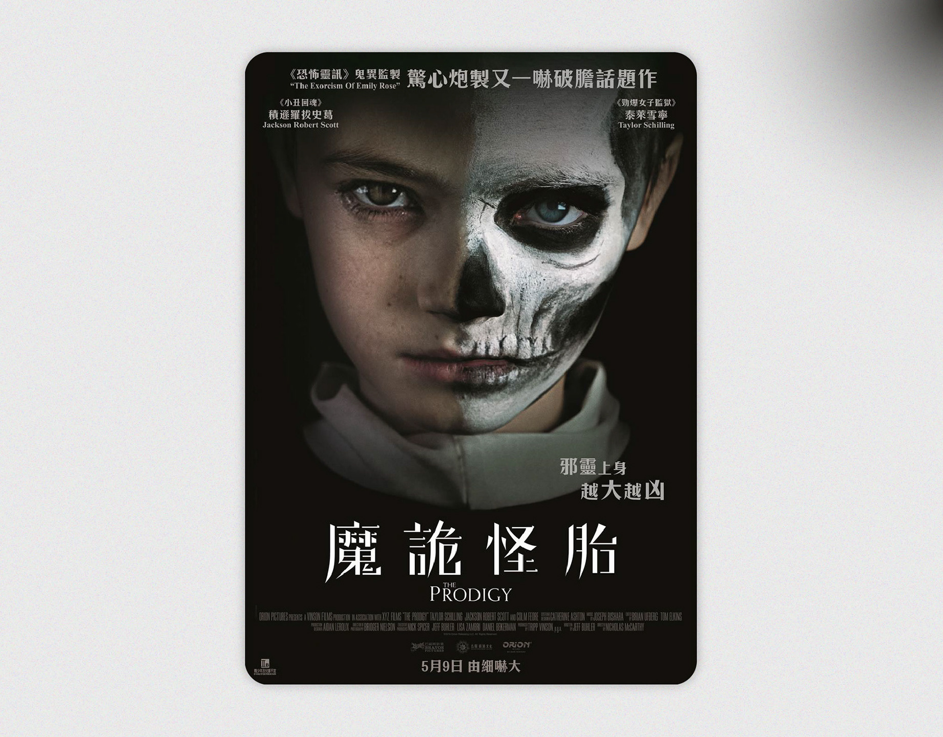
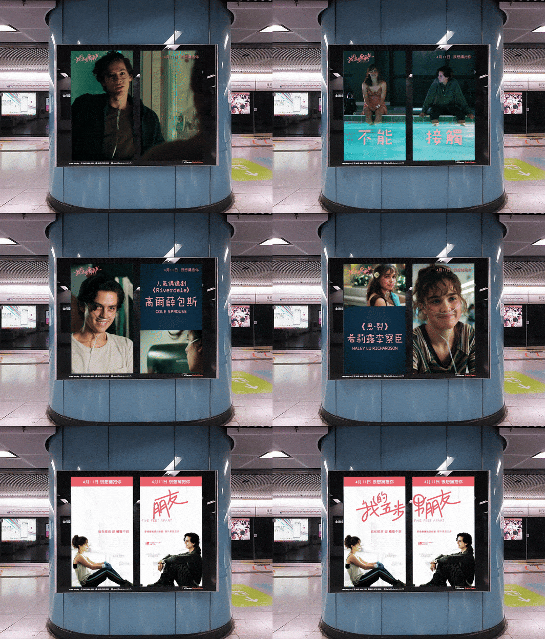
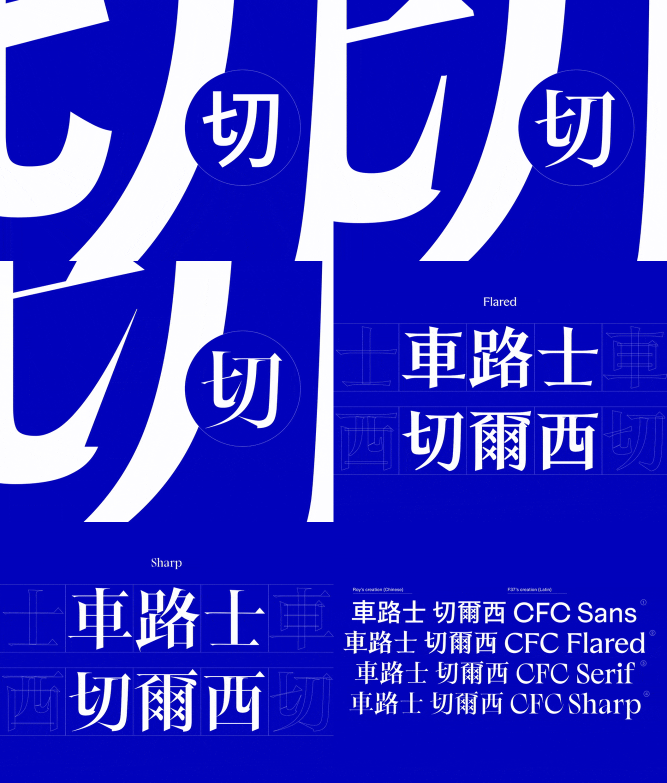
1. Poster application — Chinese title integrated on the key visual.
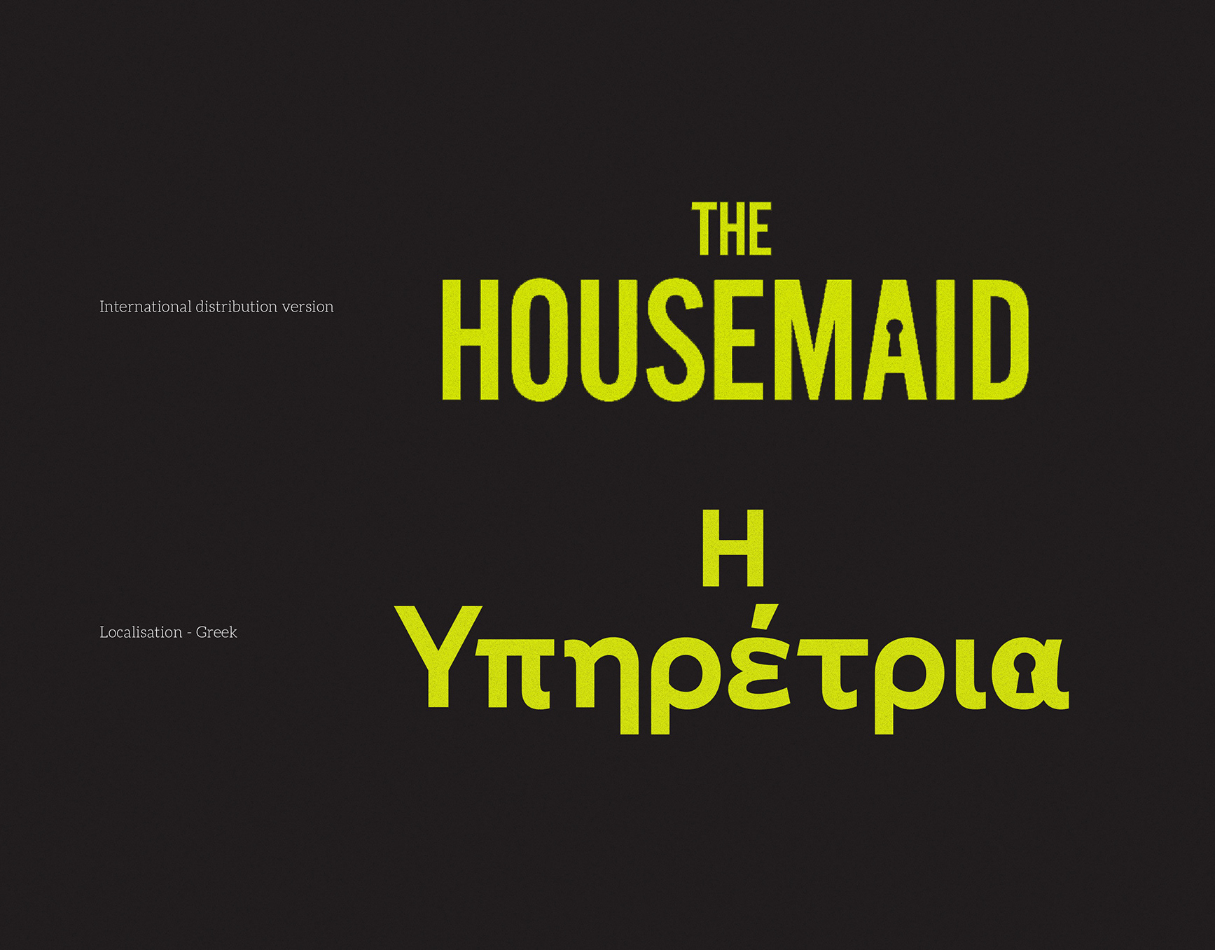
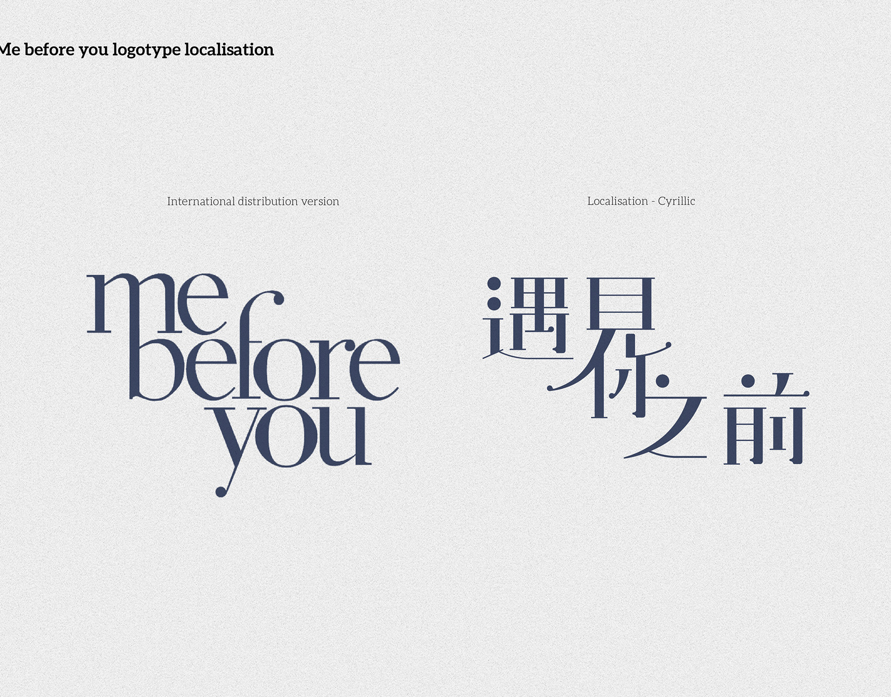
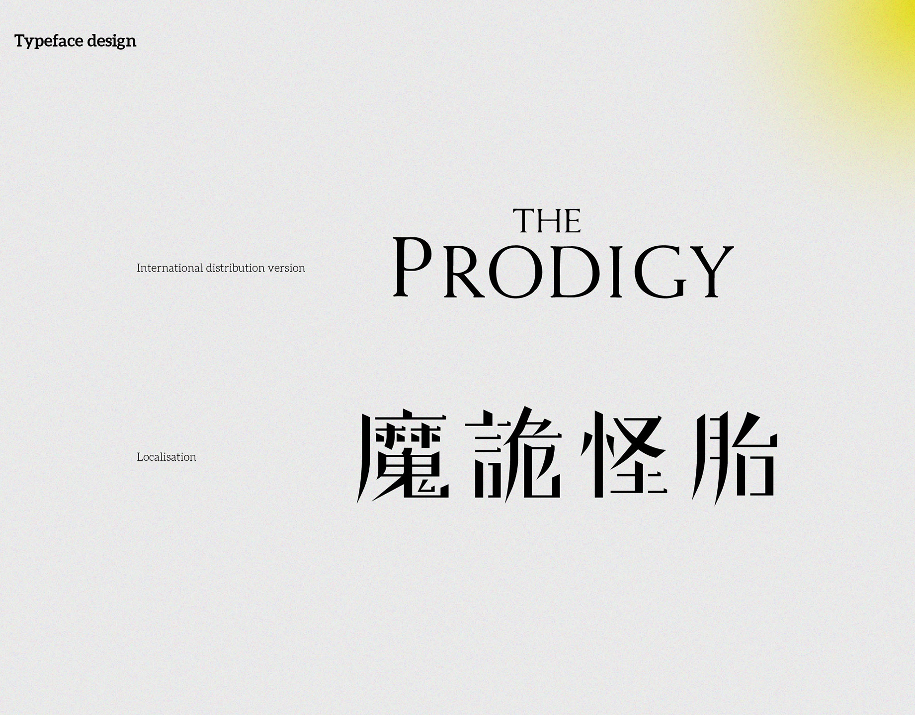
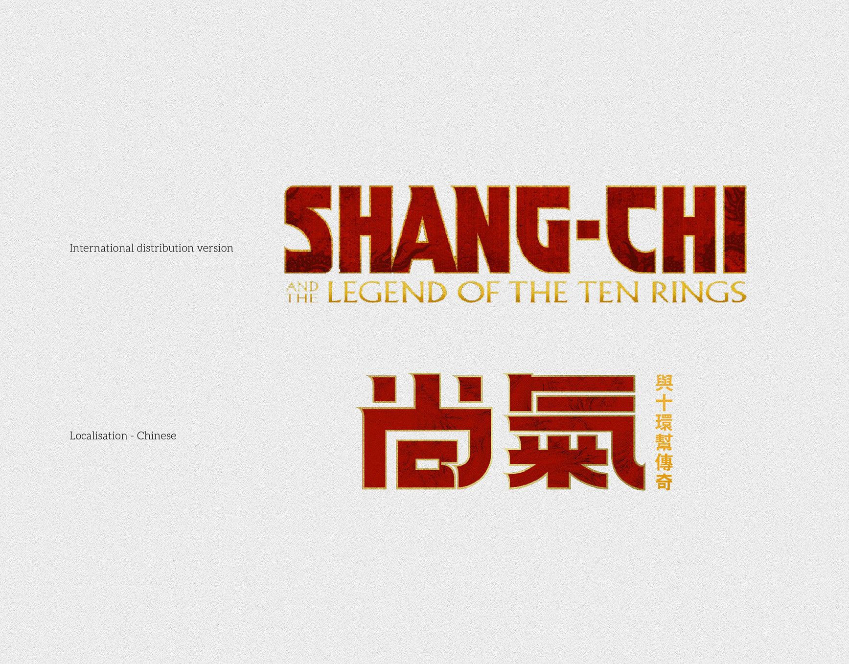
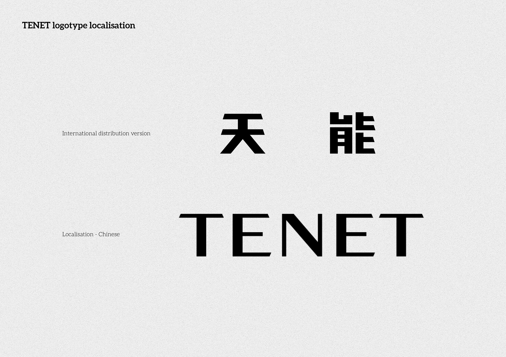
2. International vs Chinese — comparison of forms and hierarchy.
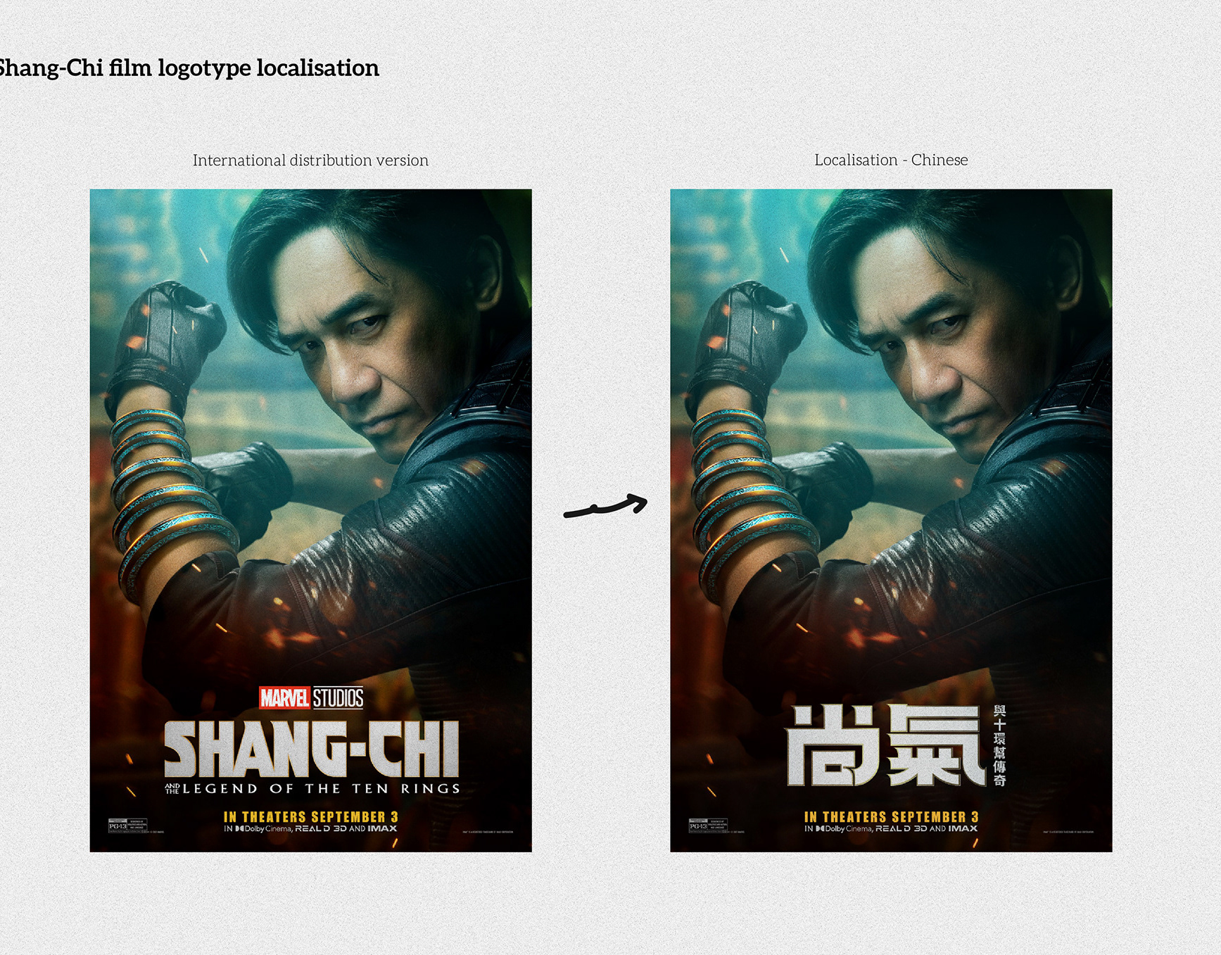
3. Construction sheet — mirrored cuts and proportion alignment with Latin.
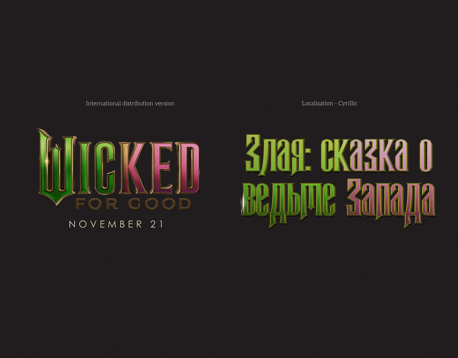
4. Detail view — gradient split reference for the inversion concept.
《天能》中文片名在地化(TENET)
簡介
為香港版《TENET 天能》製作中文片名。設計目標是延續英文標誌的幾何與「可逆」特徵,同時保持在海報與螢幕上的清晰可讀。
為香港版《TENET 天能》製作中文片名。設計目標是延續英文標誌的幾何與「可逆」特徵,同時保持在海報與螢幕上的清晰可讀。
做法
- 解析英文標誌的比例、角度與切角語彙,抽取可轉換至中文字的設計要素。
- 以對稱與鏡像切角建立「天/能」結構,呼應時間反轉主題。
- 校準視覺重量與字距,確保與英文標誌的並置讀感自然。
- 提供傾斜版、小尺寸與疊圖版本,並附向量母檔與版面使用指引。
交付
- 中文片名組版(橫排、直排)
- 海報主視覺改編
- 版面使用規範(間距、比例、傾斜角)
- 印刷與數位檔案(AI、SVG、分層 PSD)
圖片說明
1)海報應用——中文片名與主視覺整合。
2)國際版對照——字形與層級比較。
3)結構圖——鏡像切角與比例對齊。
4)細節圖——漸變分割概念,呼應反轉意象。
1)海報應用——中文片名與主視覺整合。
2)國際版對照——字形與層級比較。
3)結構圖——鏡像切角與比例對齊。
4)細節圖——漸變分割概念,呼應反轉意象。