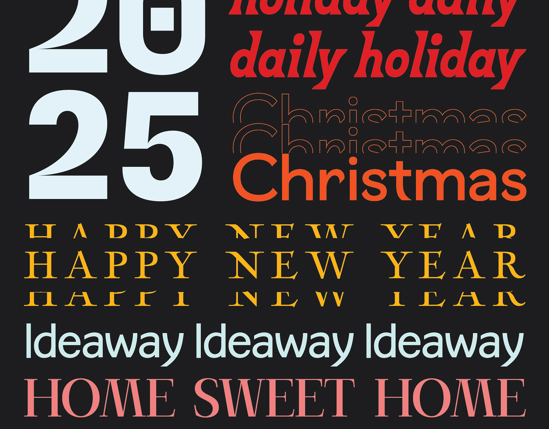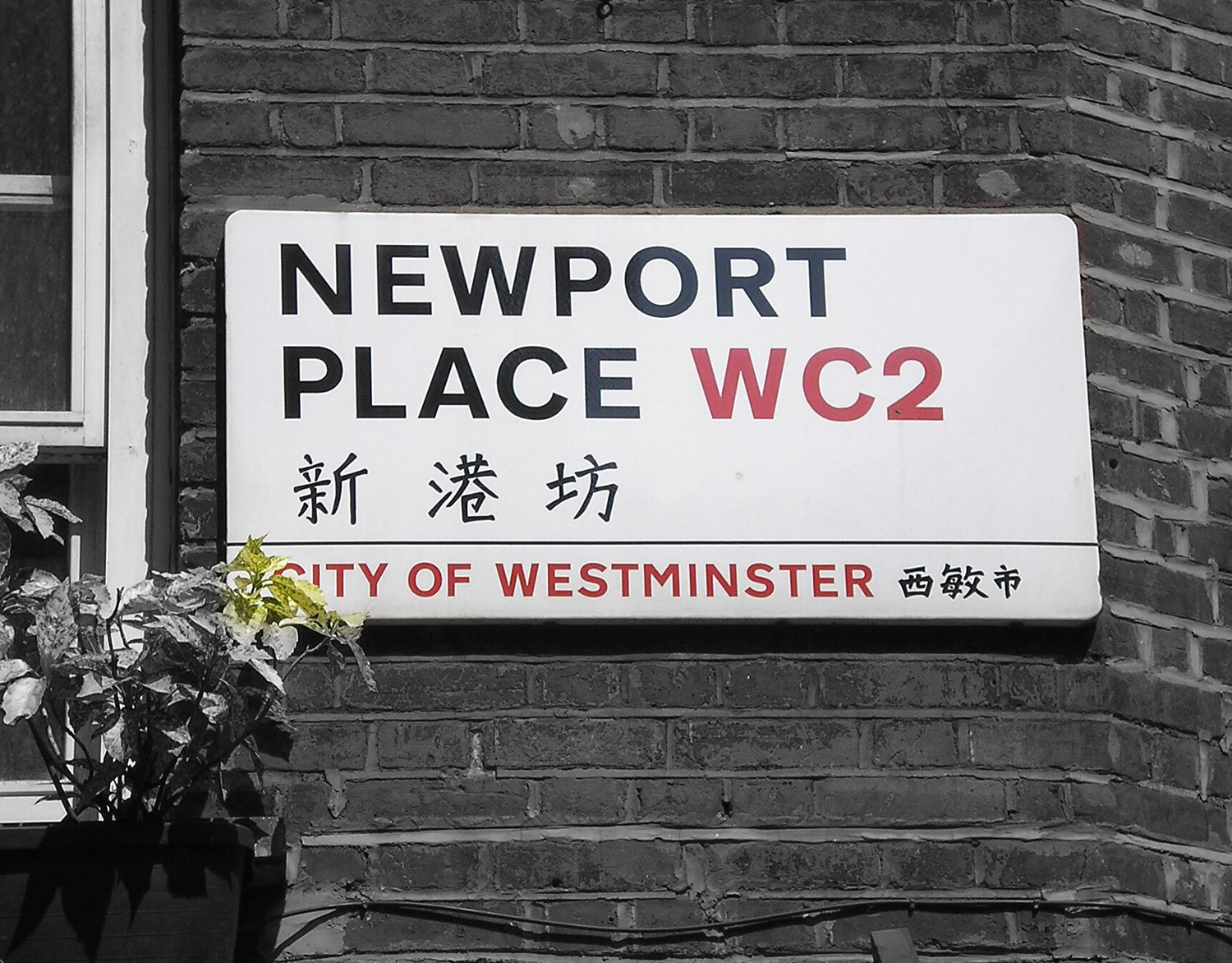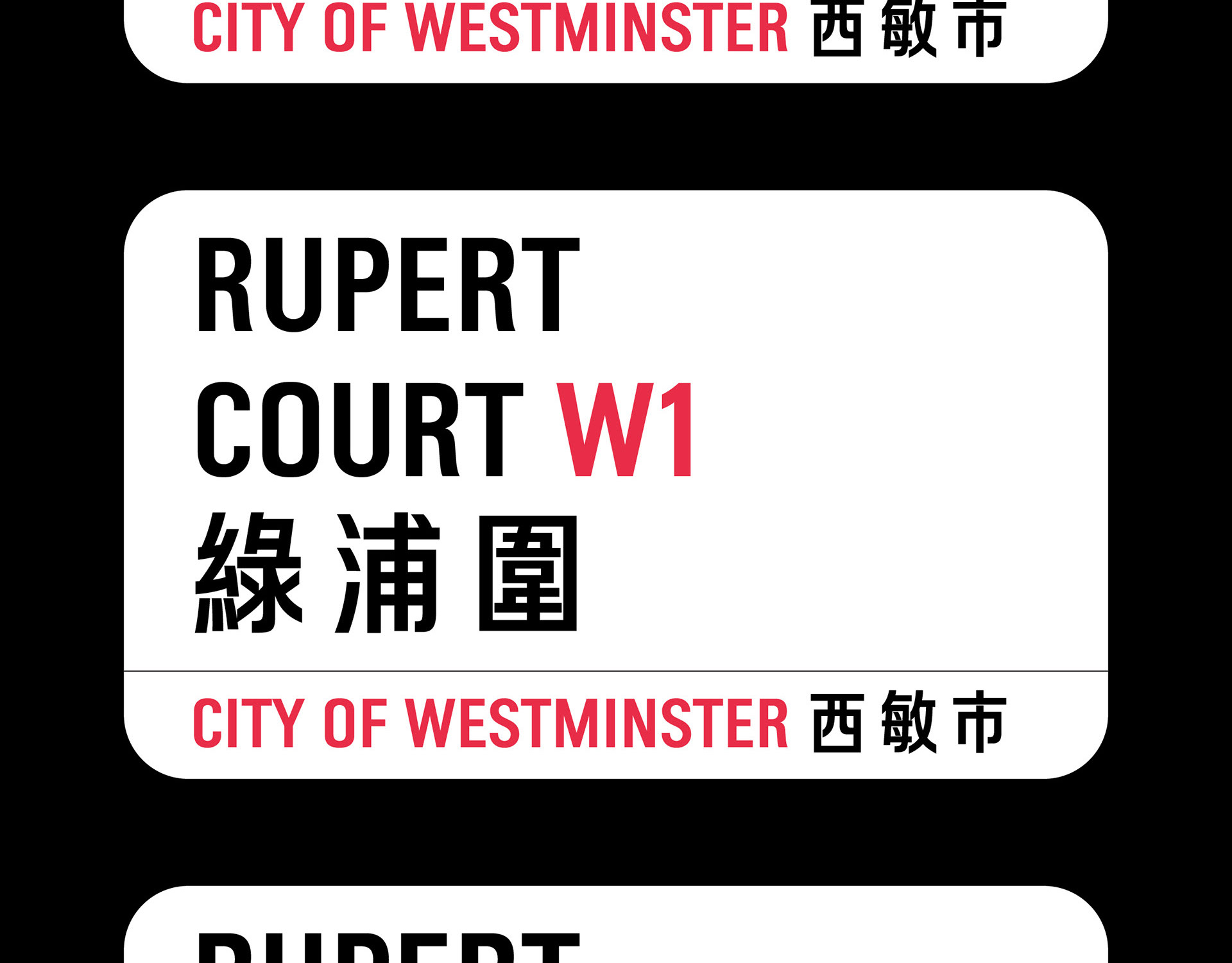
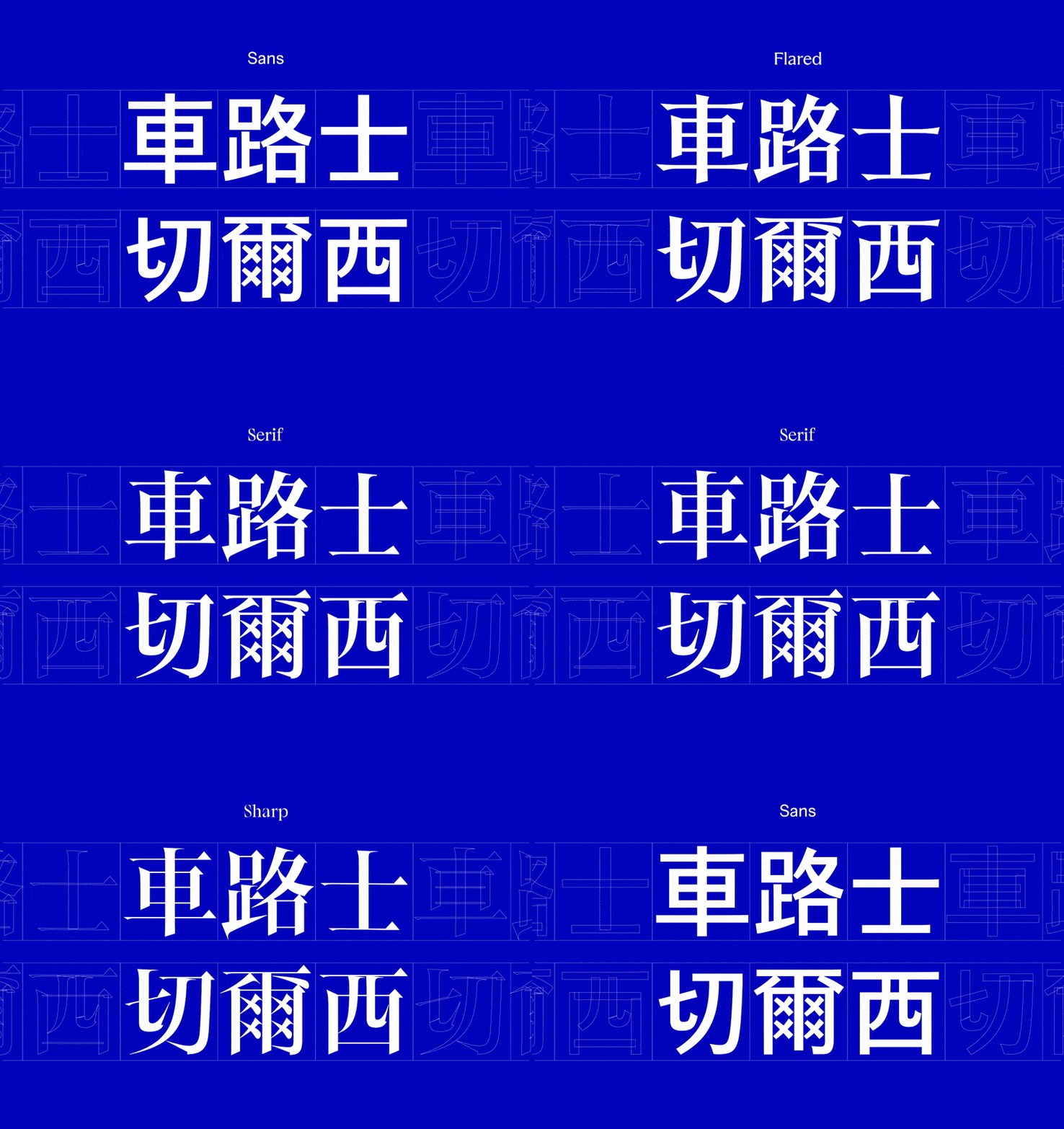
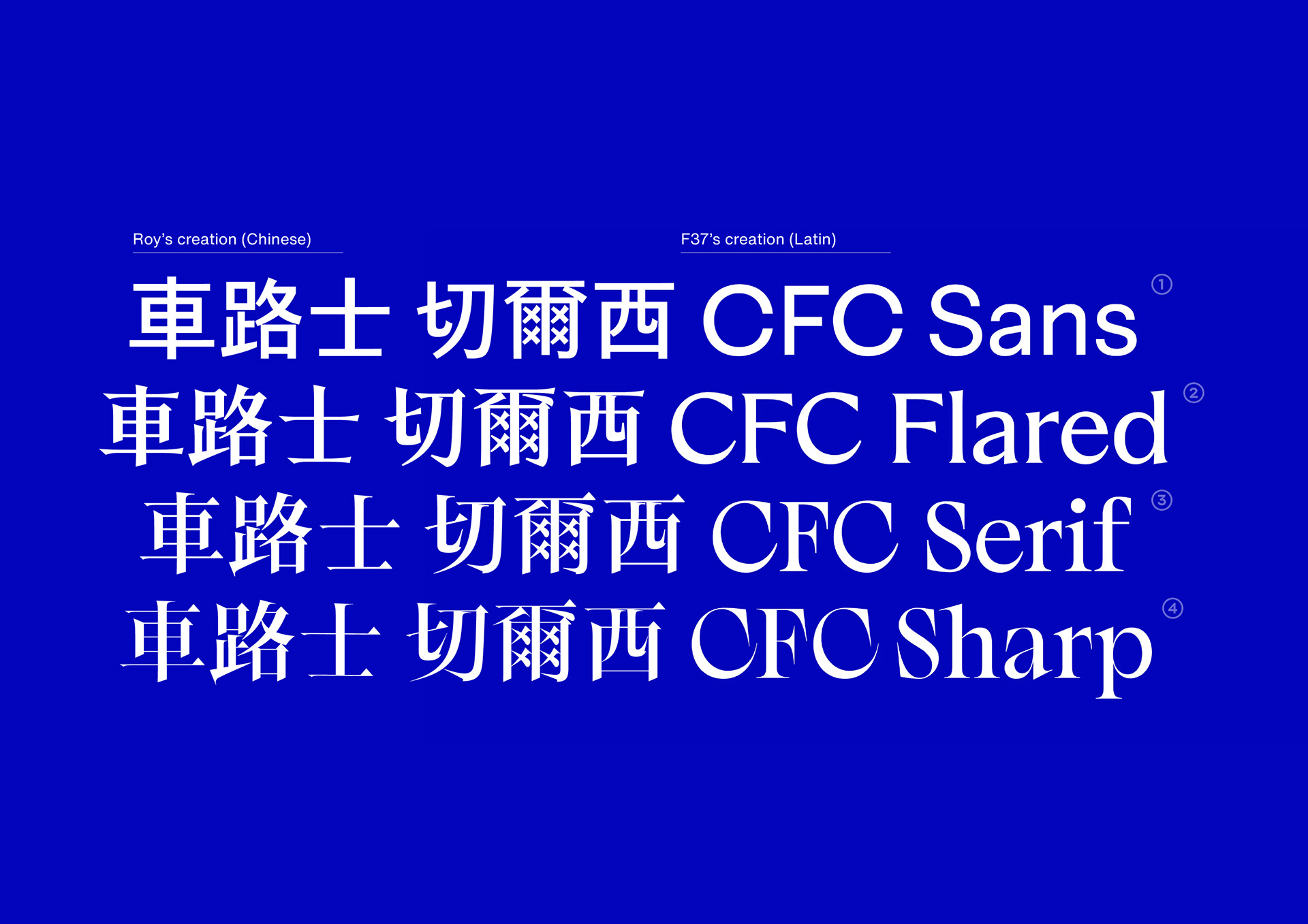
This project extends F37’s custom Chelsea FC type system into Chinese, so the club can speak to fans across Greater China, Hong Kong and Taiwan with the same voice and craft. The work takes F37’s four-style family: Sans, Flared, Serif and Sharp, as the creative baseline and translates its core attitude into Chinese letterforms. Credit and respect go to F37 and the original team for defining the design language and for building a typographic system inspired by the club’s lion mark and made for global use.
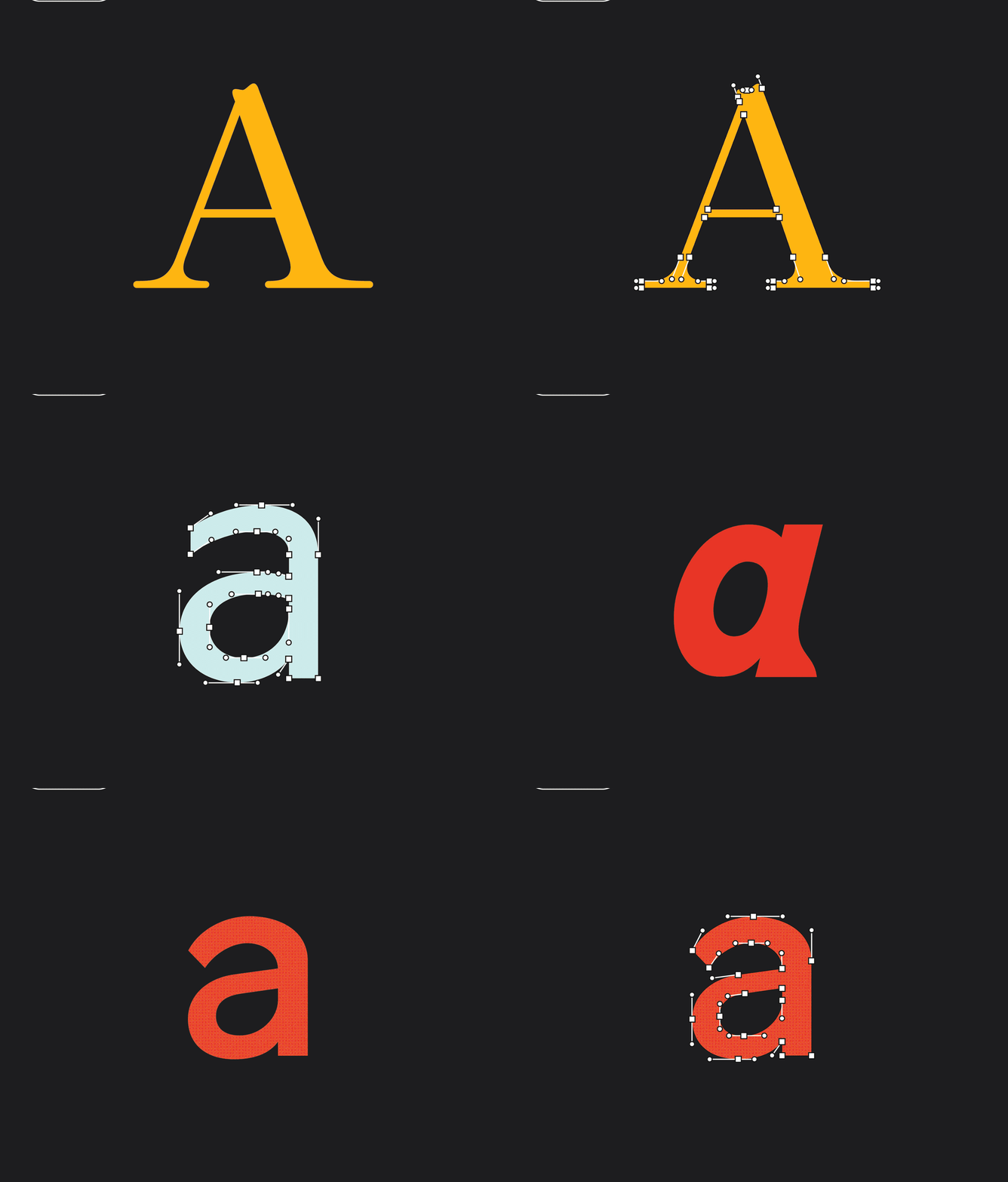
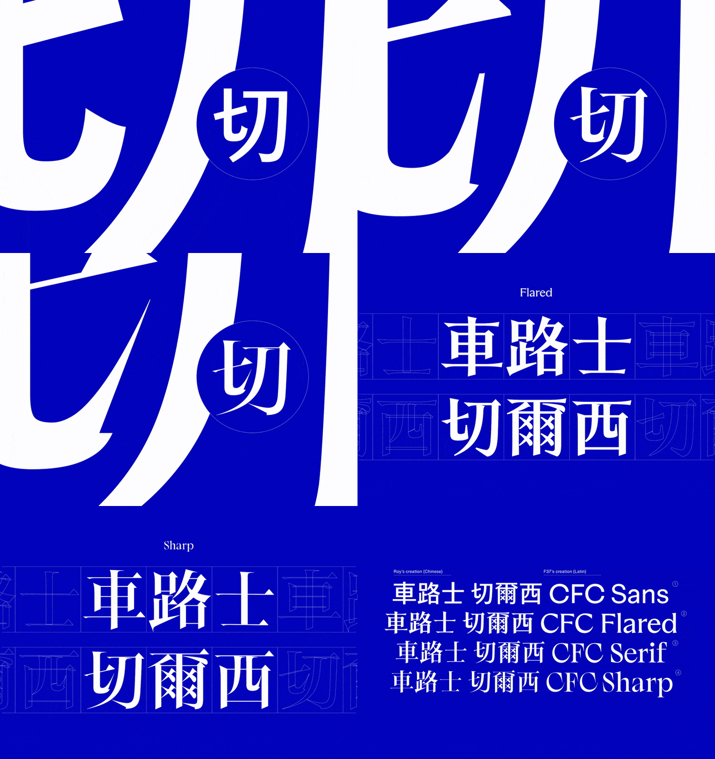
The aim was not to imitate Latin details on top of Chinese strokes, but to interpret the thinking behind them: confident proportions, firm modulation, and the claw-like terminals and cuts that come from the lion iconography. Each Chinese style mirrors the role of its Latin counterpart. Sans delivers clean, utility communication for fixtures, scores and wayfinding. Flared keeps the open, human feel in a script with very different stroke logic. Serif brings a sense of heritage for editorial and long-form, while Sharp focuses on high-impact headlines where the lion’s energy needs to be felt instantly. This keeps messaging consistent from London to East Asia: same voice, different script.
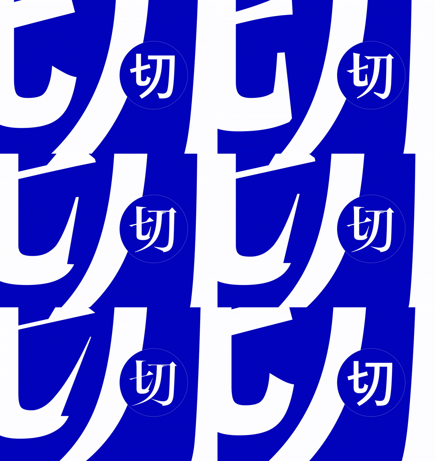
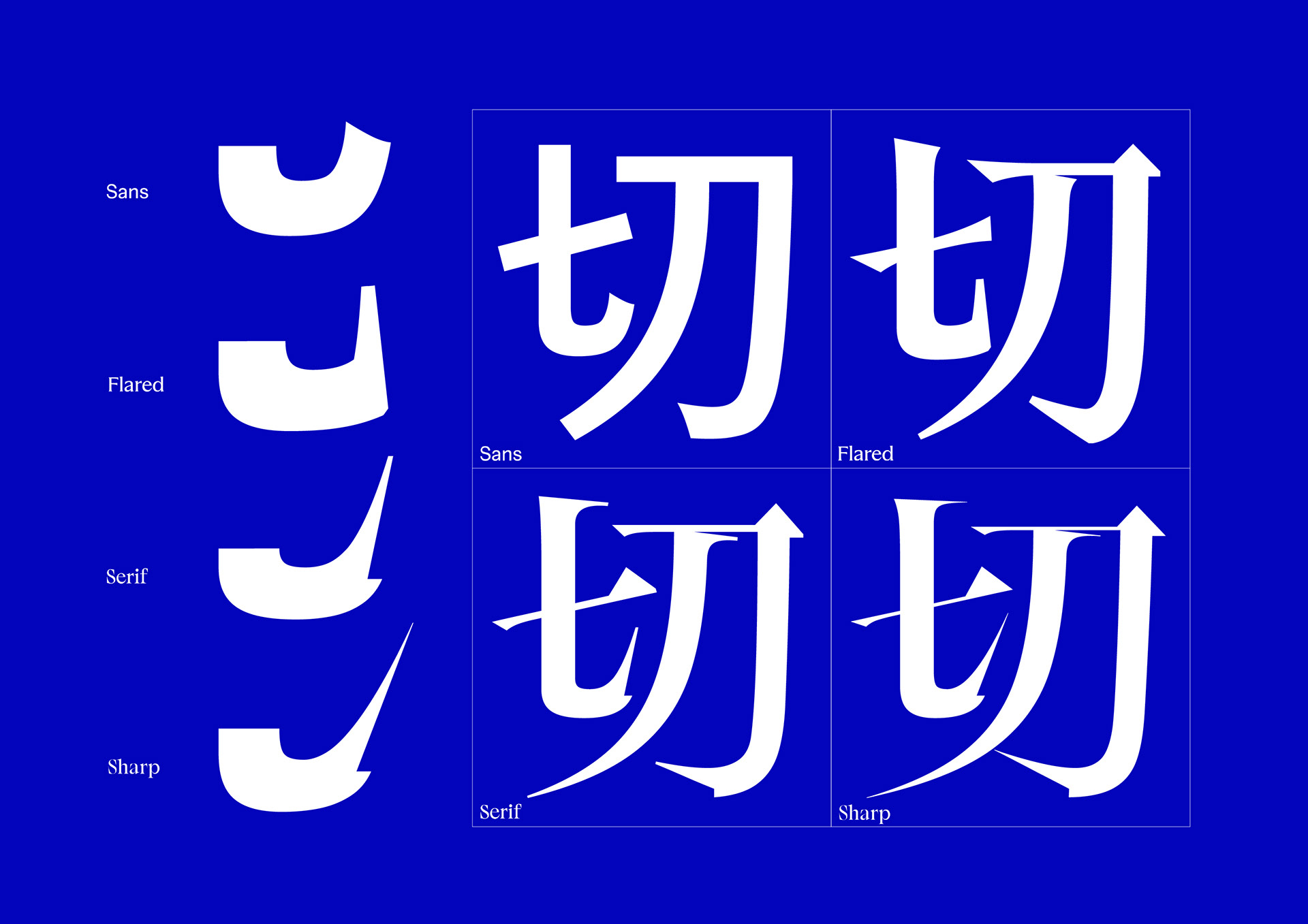
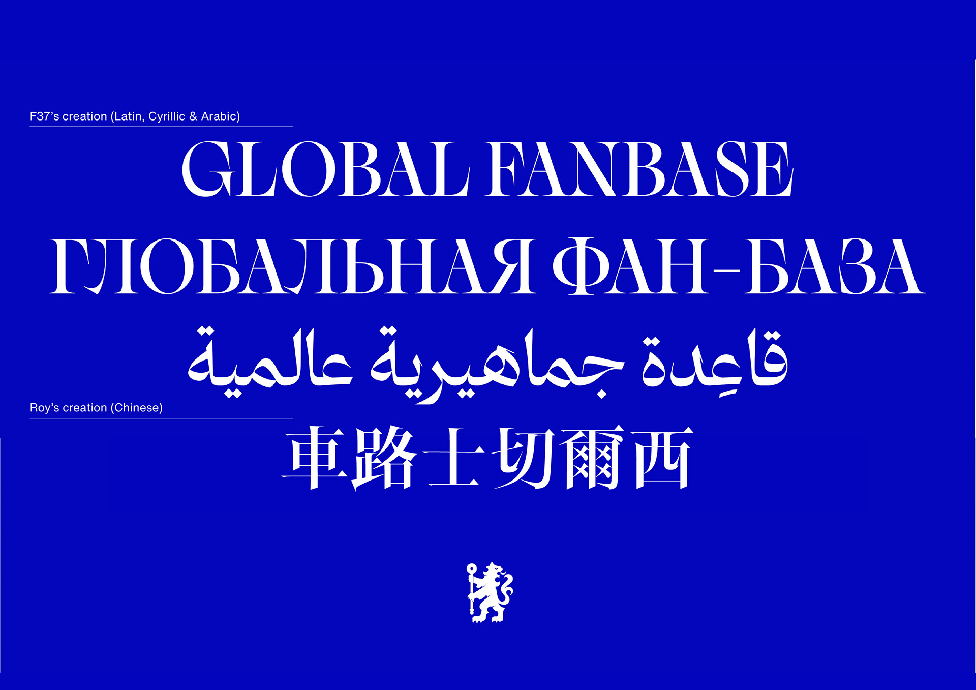
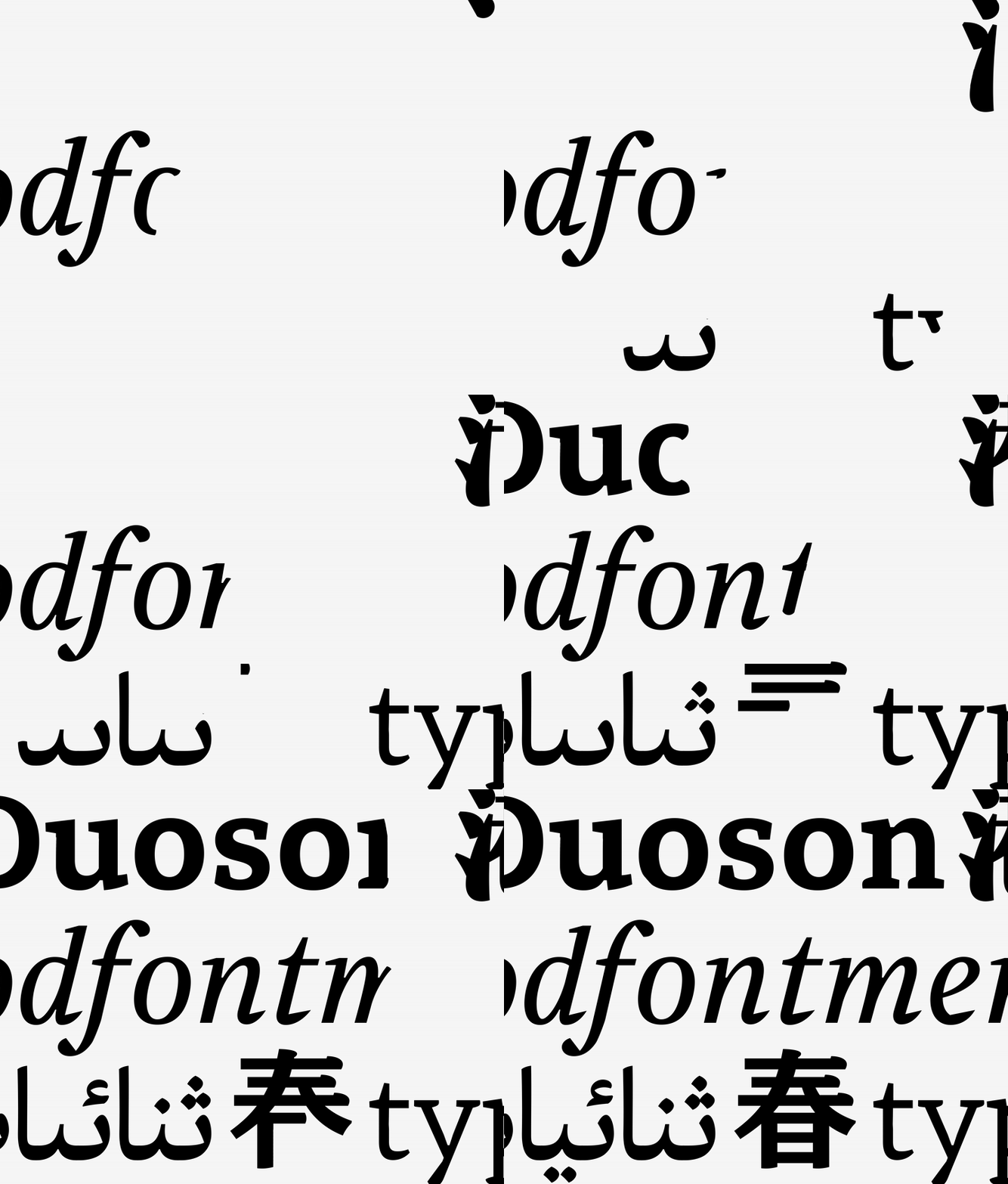
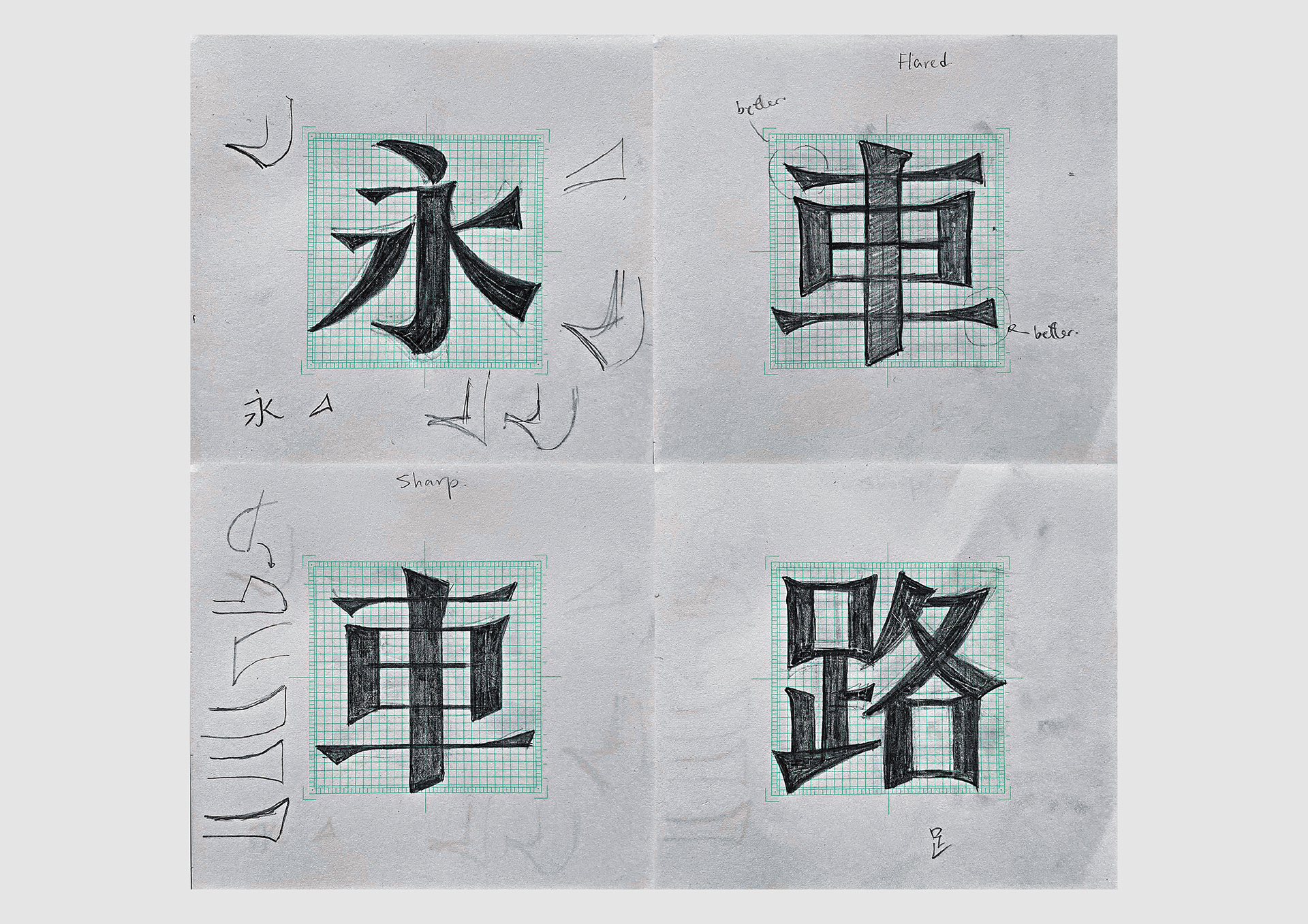
Design decisions were made at stroke level. Stem widths and counters were calibrated to match the optical weight of the Latin, then adjusted to suit the square framework of Han characters. The “hook” and “throw” strokes were redrawn to carry the family’s distinctive flicks without disrupting legibility at distance. Where the Latin relies on tapered or chiseled endings, the Chinese adopts analogous moves, selective bevels, angled cuts and controlled ink-trap moments, to land the same texture and rhythm. The result is a set that reads naturally in Chinese, yet sits comfortably beside the original titles and numerals in mixed-script layouts.
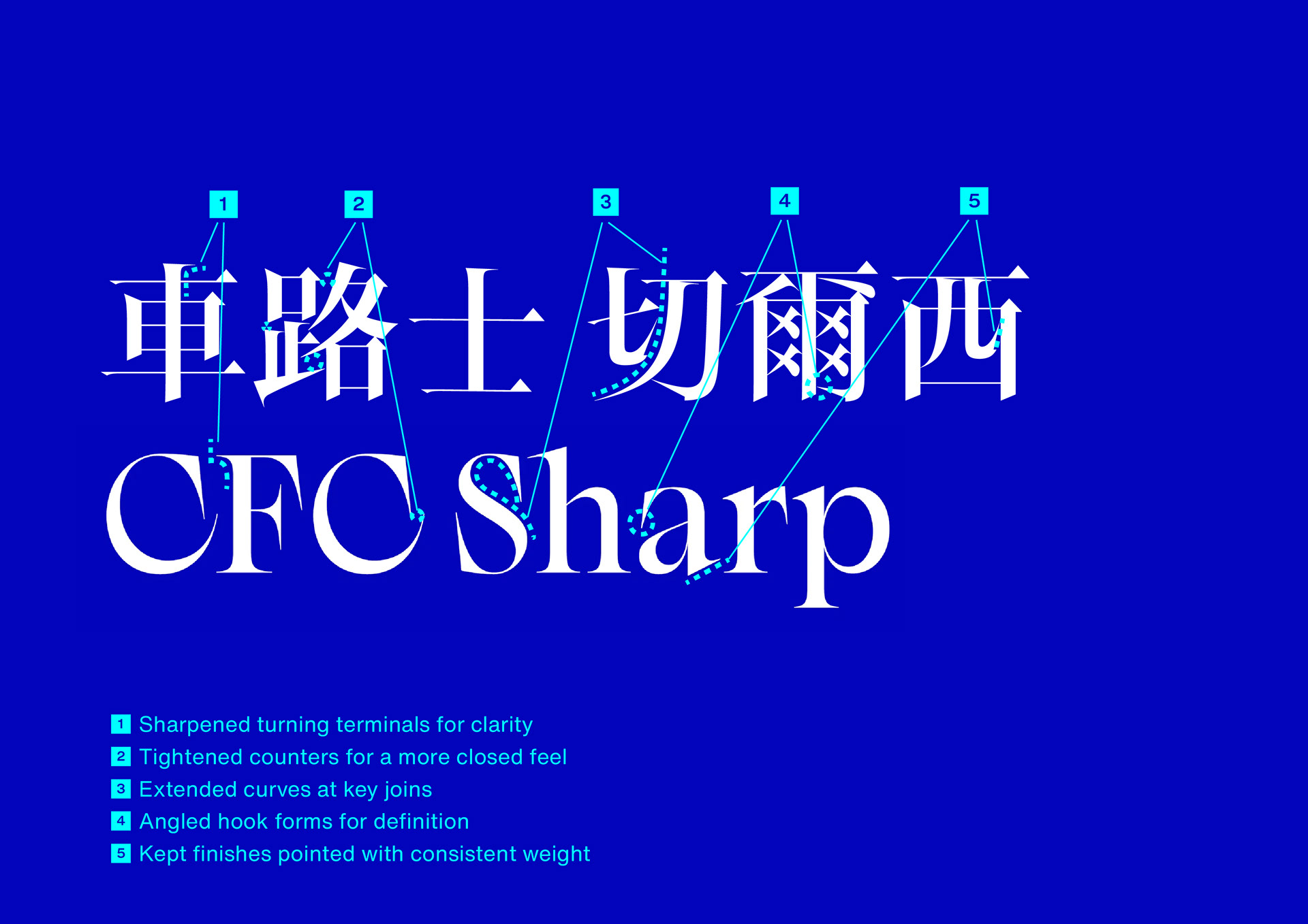
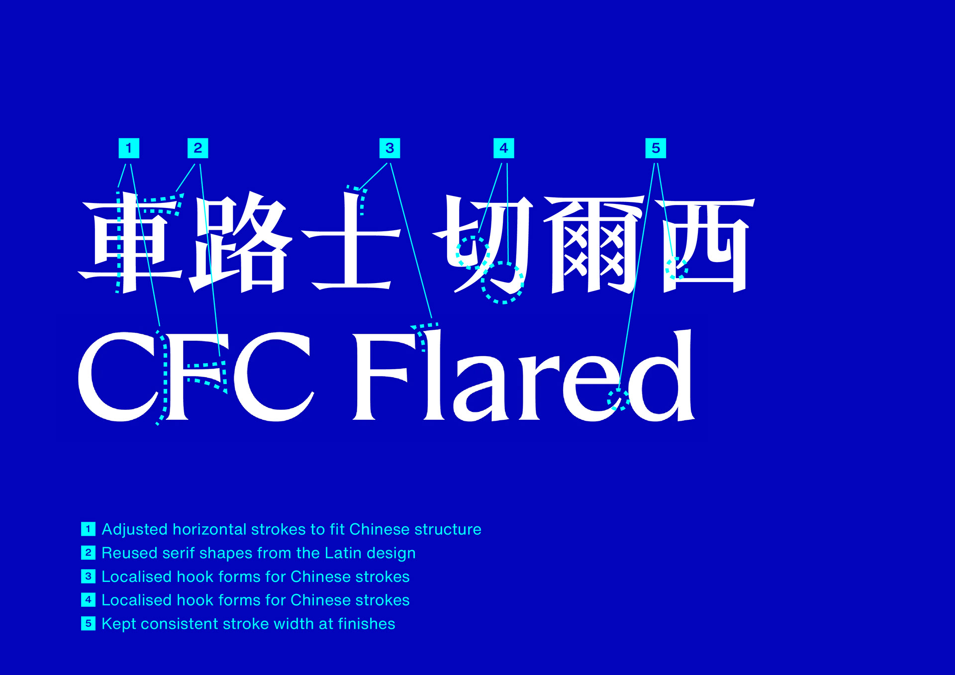
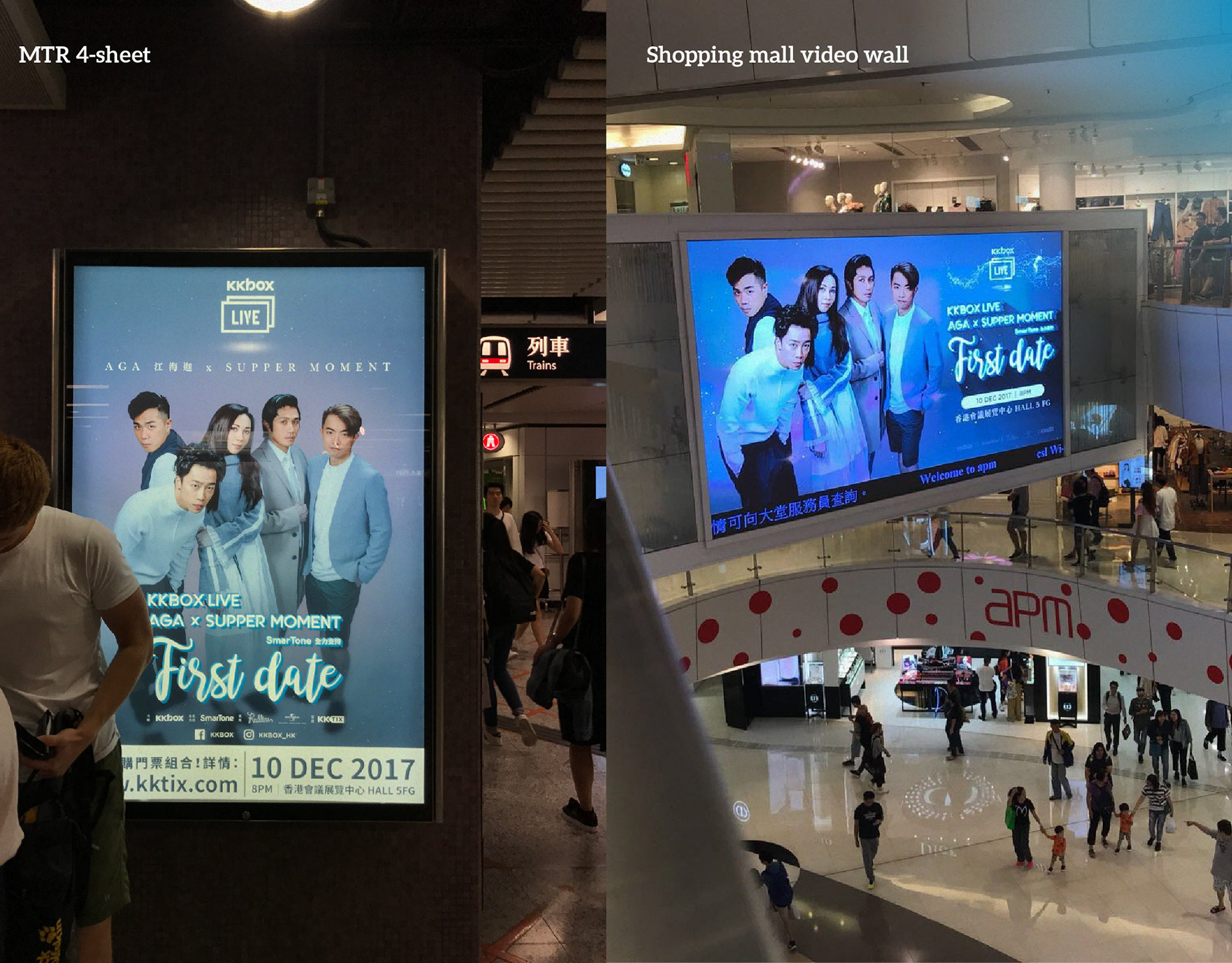
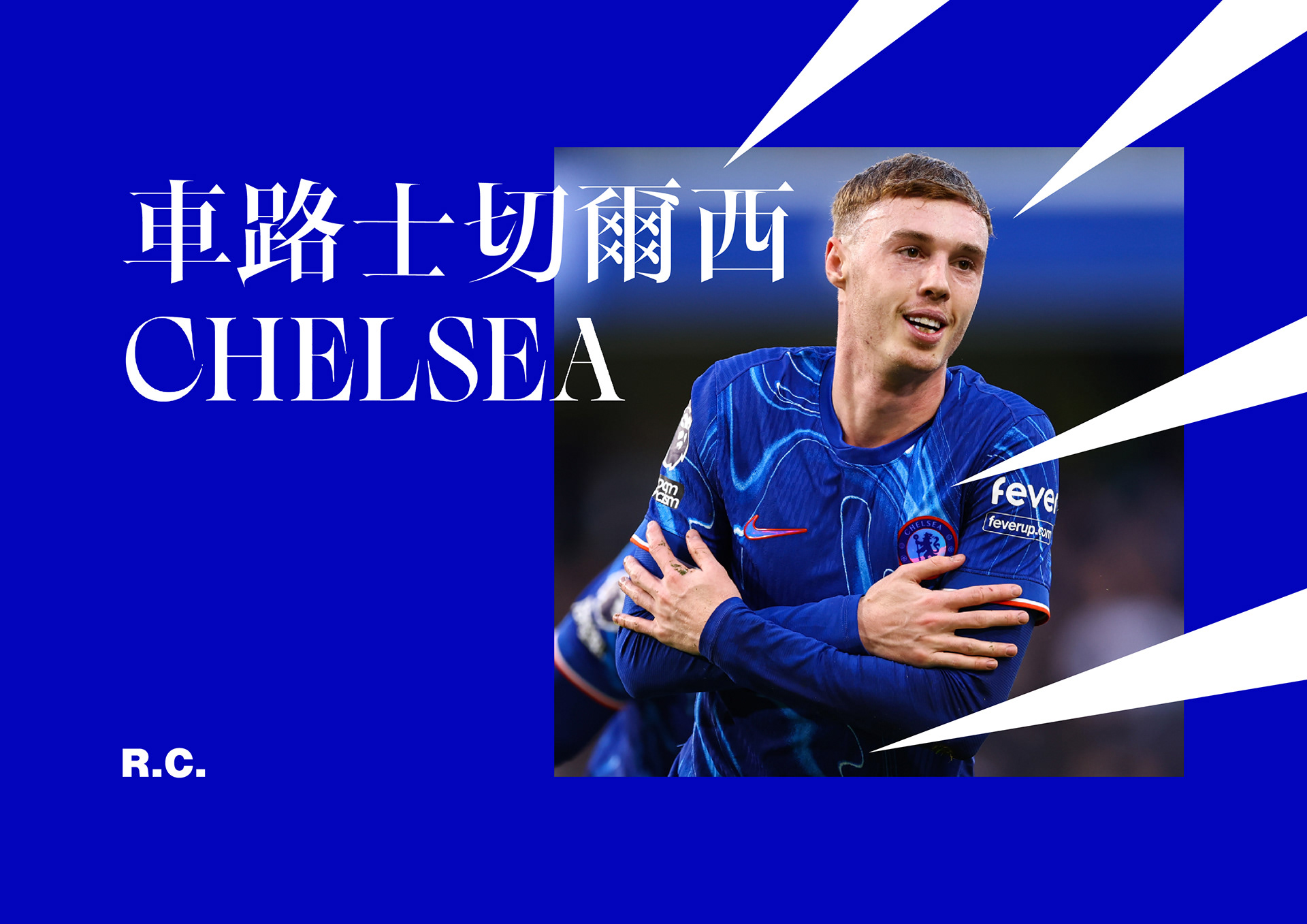
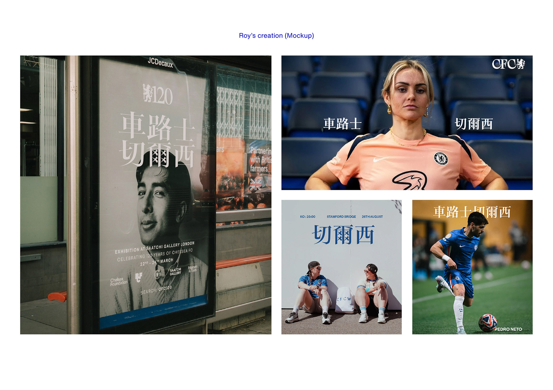
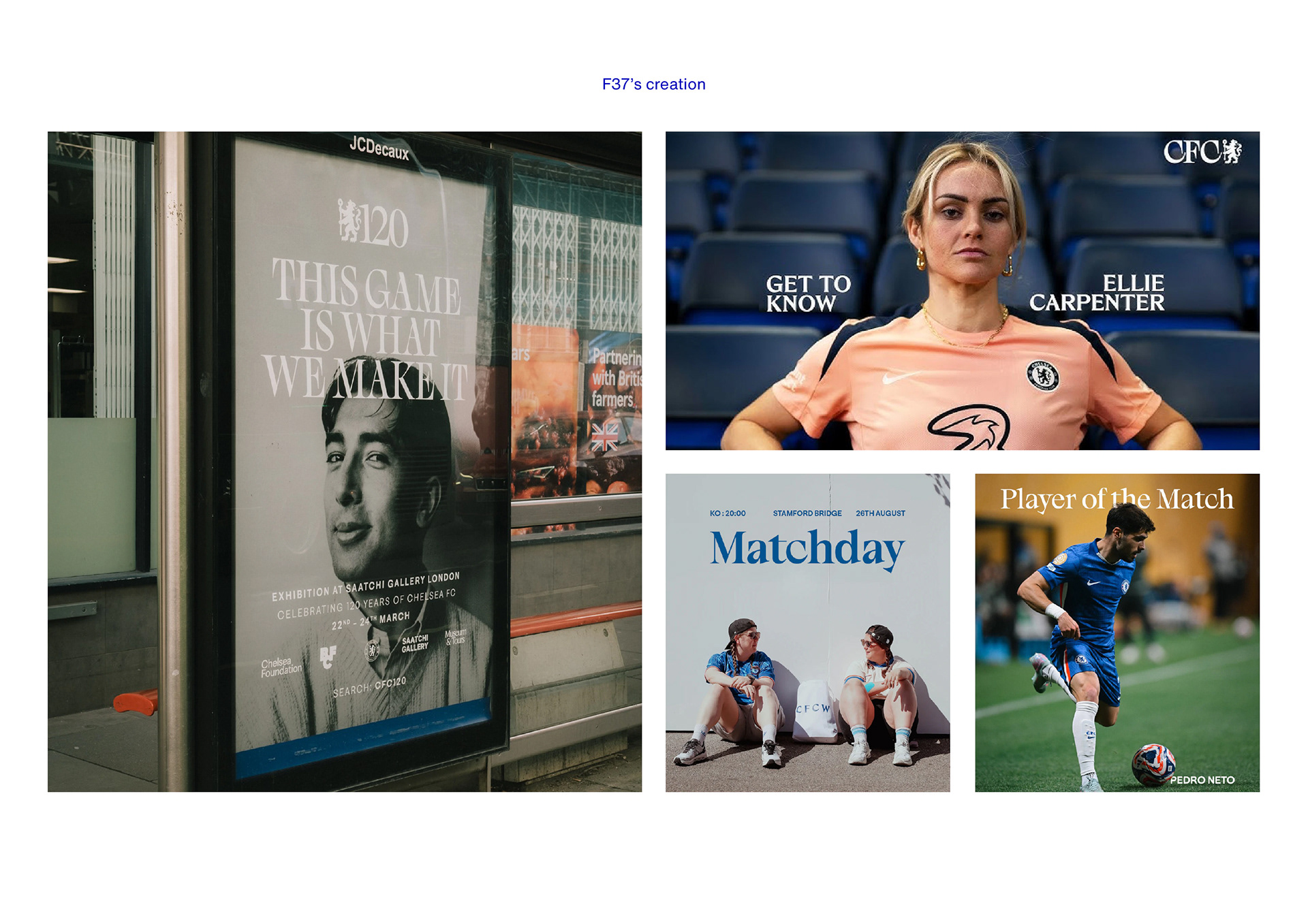
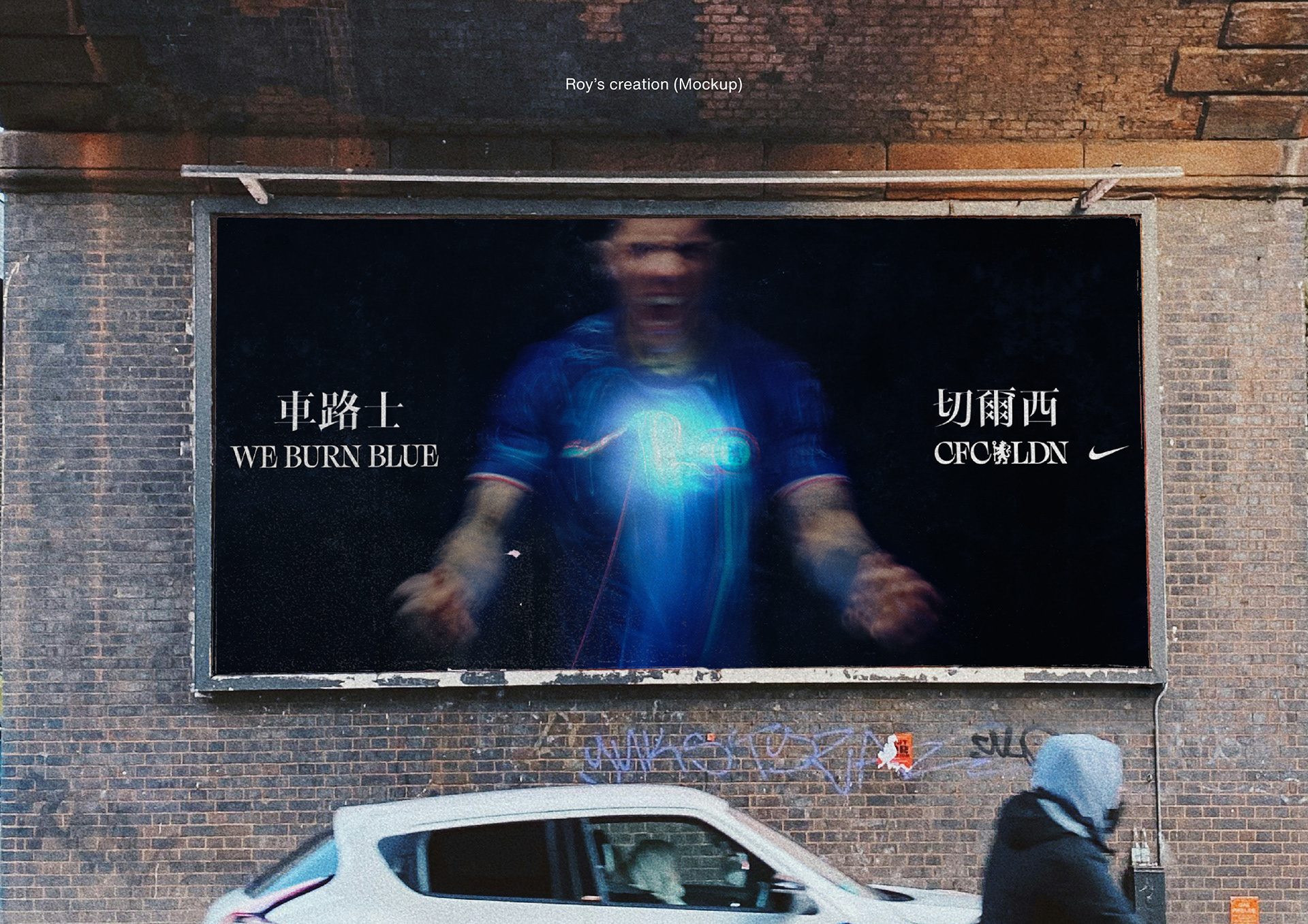
The family is built around the club name and core phrases to prove the concept in real contexts: shirts, stadia, social graphics and out-of-home. In use, the Sharp style drives hero headlines; Serif supports editorial and heritage moments; Flared bridges expressive and functional needs; Sans handles dense information. Spacing and basic kerning were tuned for display sizes so strokes don’t collapse in heavy weights, and vertical metrics were aligned with the Latin to make bilingual typesetting straightforward.
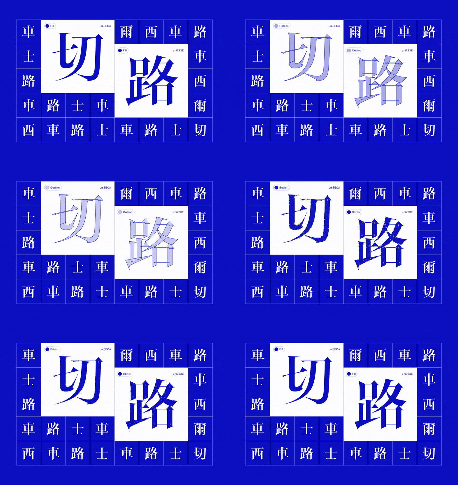
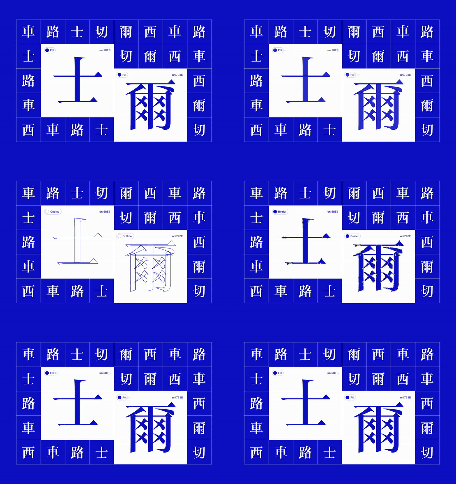
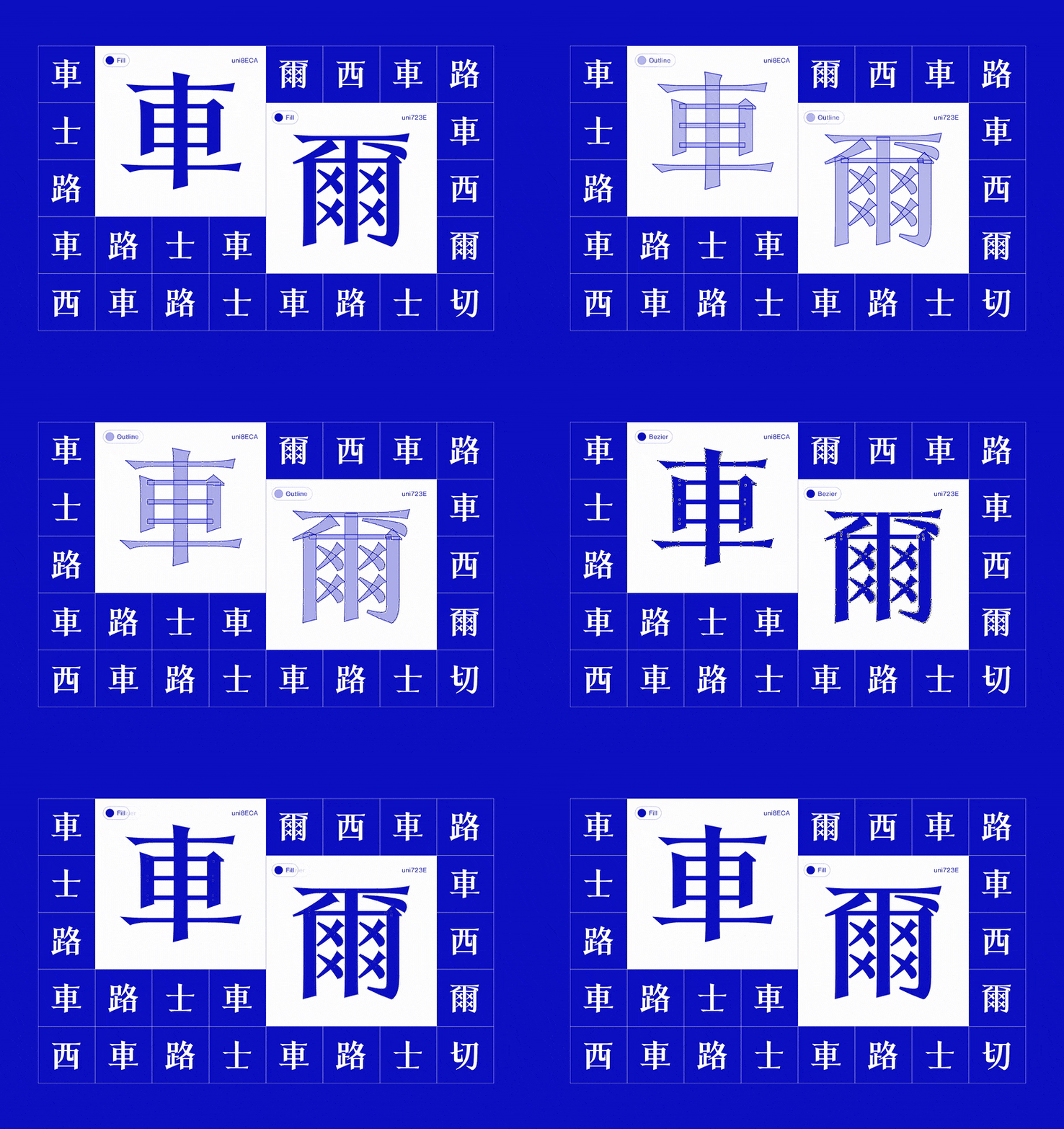
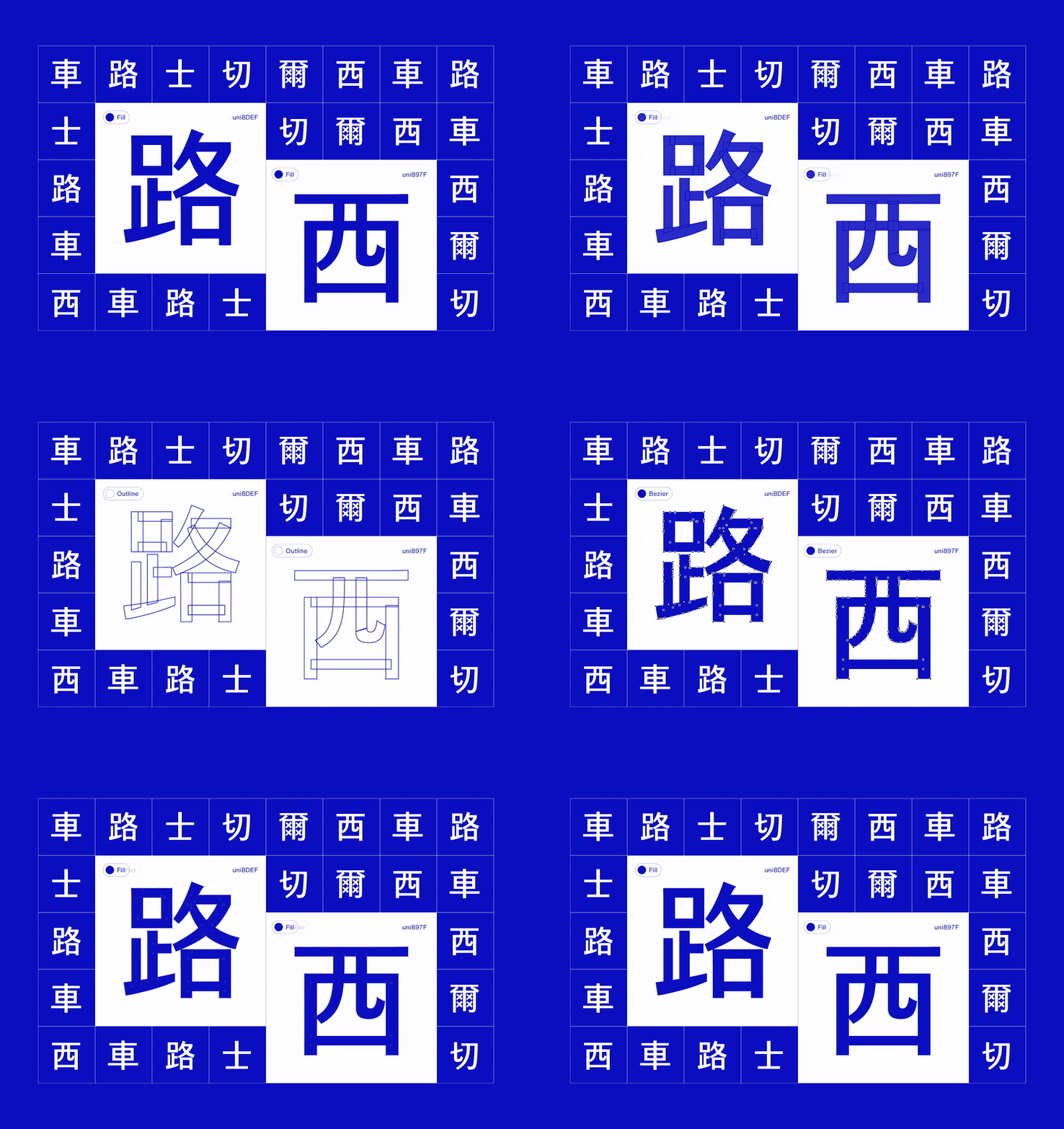
This Chinese extension is presented as an independent study that follows the intent and craft of F37’s work and shows how the club’s voice can scale to Chinese without losing character. It demonstrates a clear path to a production build: expand the character set around Chinese for China, Hong Kong and Taiwan, refine hinting for LED and broadcast. The goal is simple: one typographic system, four styles, all scripts, so communications feel unmistakably Chelsea wherever they appear.
Credit
Client: Mockup inspried by F37
Role: Type Designer, Motion Designer, Art Director.
Role: Type Designer, Motion Designer, Art Director.
🚀 Let's create something big together! 🚀
Contact Roy Chan at roychancch@gmail.com
Follow us on Behance | Instagram |
More about us on moodmenfont.com
Contact Roy Chan at roychancch@gmail.com
Follow us on Behance | Instagram |
More about us on moodmenfont.com