Overview
Chinese logotype developed for “Me Before You” for use on streaming artwork and key visuals. The aim was to reflect the elegance of the original high-contrast serif while keeping clear legibility in Traditional Chinese.
Approach
- Analysed the Latin wordmark’s voice: fine hairlines, rounded ball terminals, tight vertical rhythm.
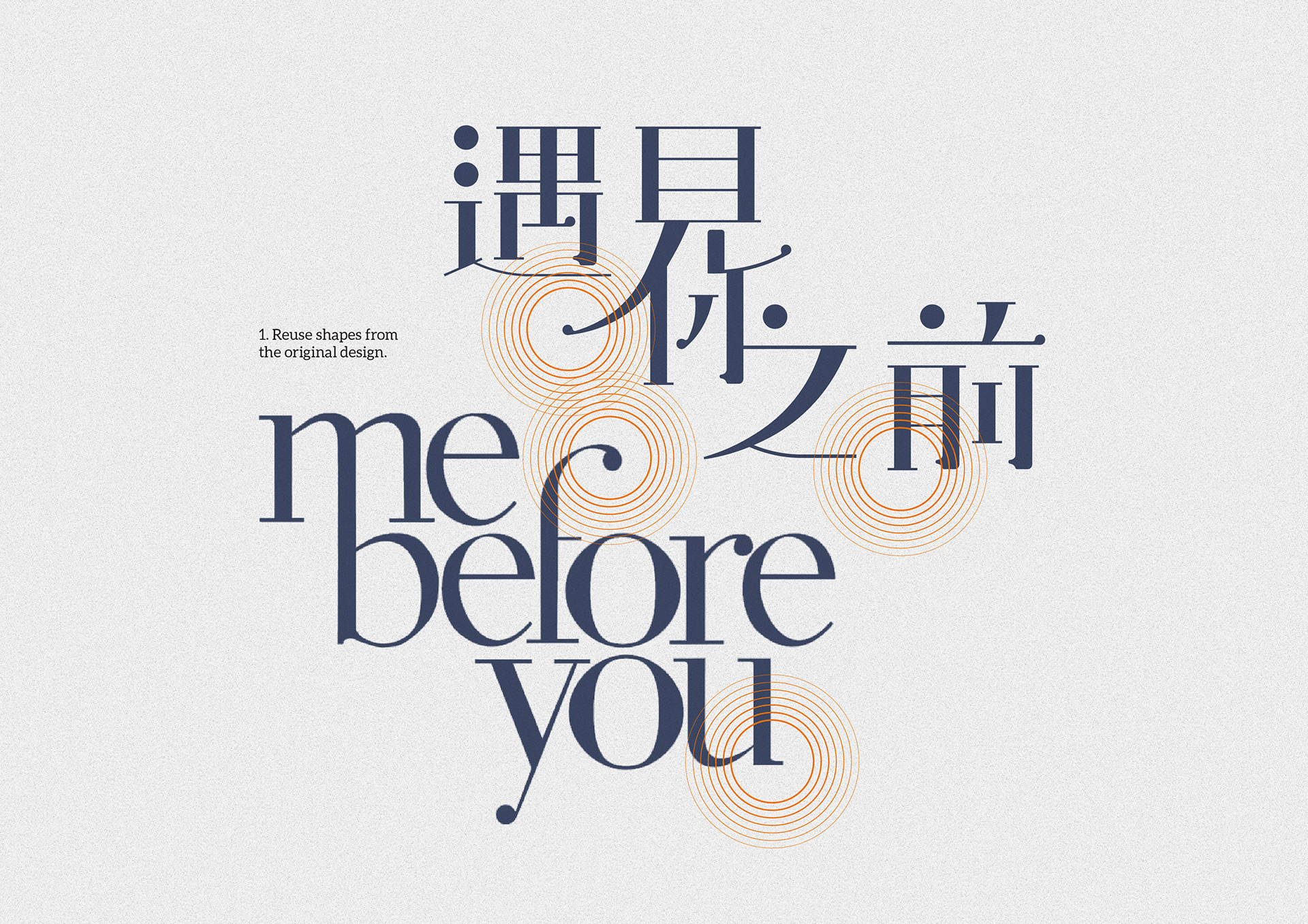
- Translated those cues into Chinese by reusing shapes where sensible (terminal spheres, tapering strokes) and simplifying joins for clarity at small sizes.
- Built a stacked layout that mirrors the Latin title’s three-line composition and negative-space balance.
- Tuned contrast and spacing for on-image placement, including darker backgrounds and subtle vignettes.
Deliverables
- Chinese logotype (primary stacked and horizontal alternates)
- Key-art adaptation for streaming thumbnails/hero
- Usage notes (minimum sizes, clearspace, colour and placement)
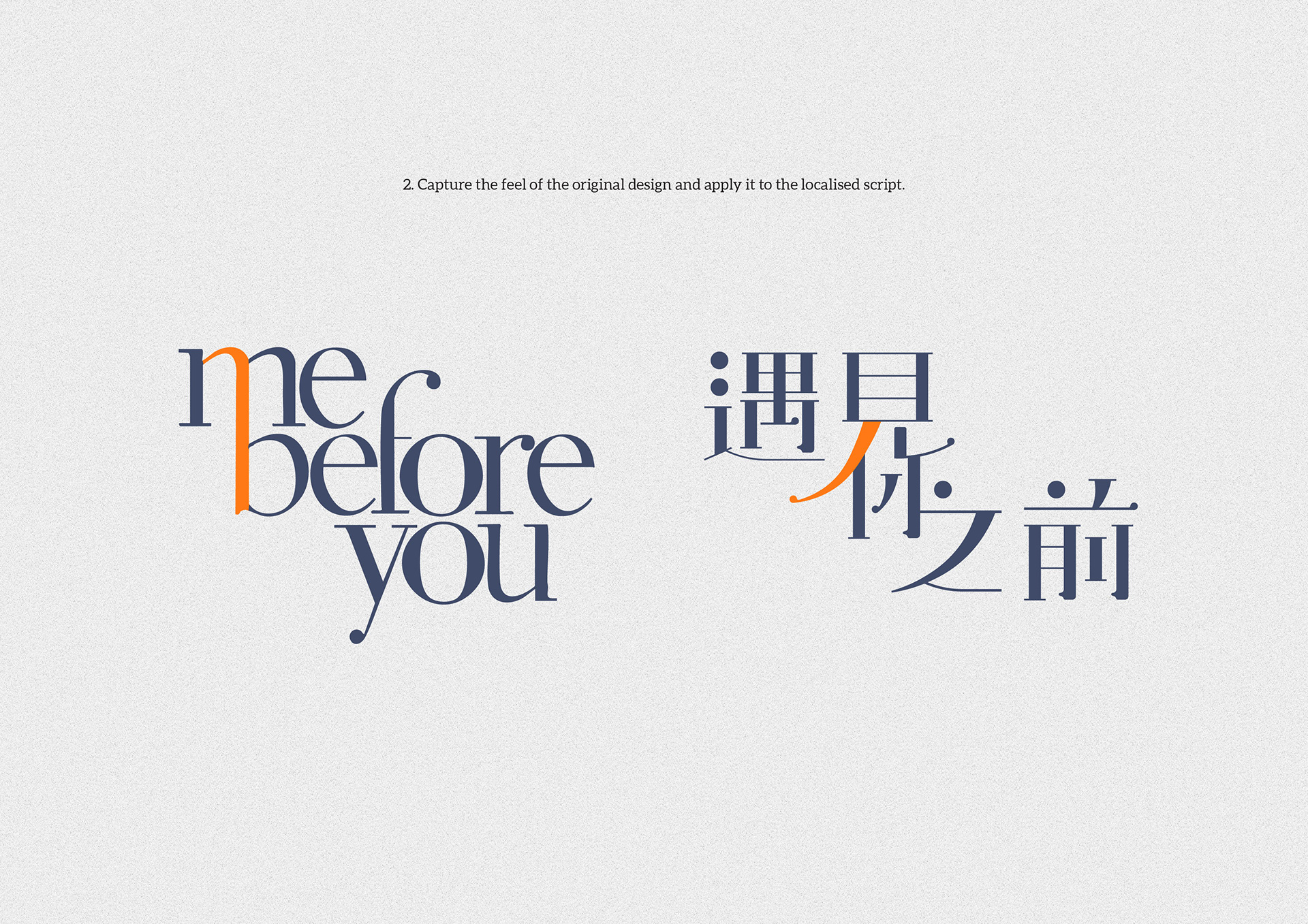
Image notes
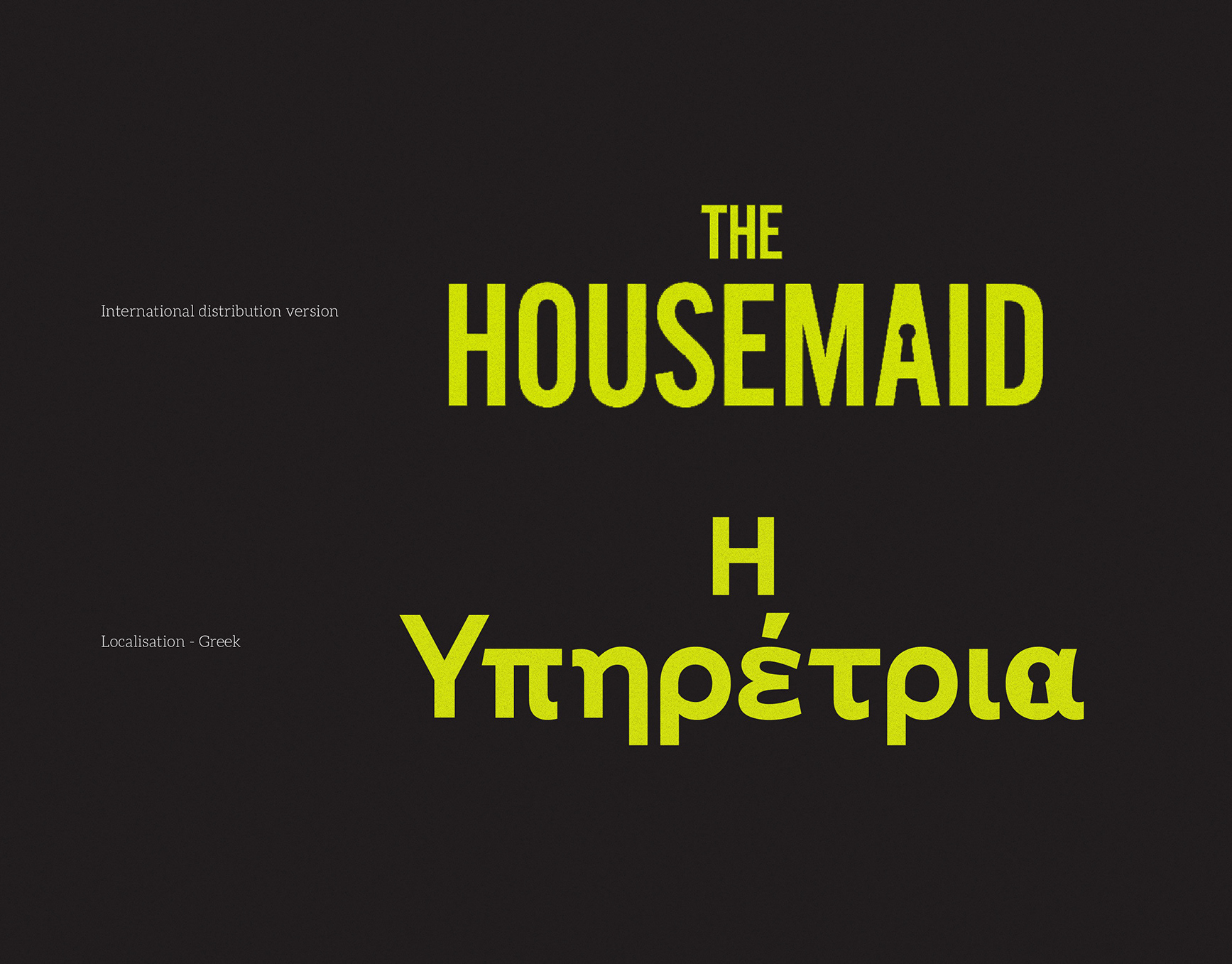
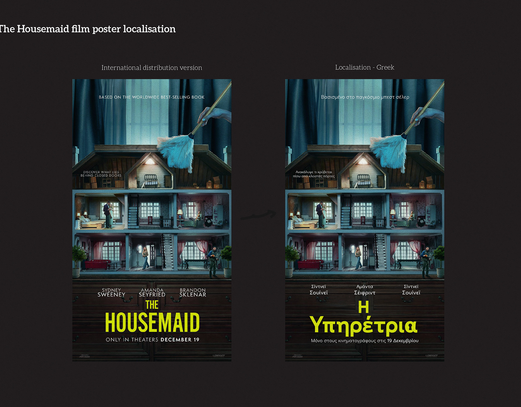
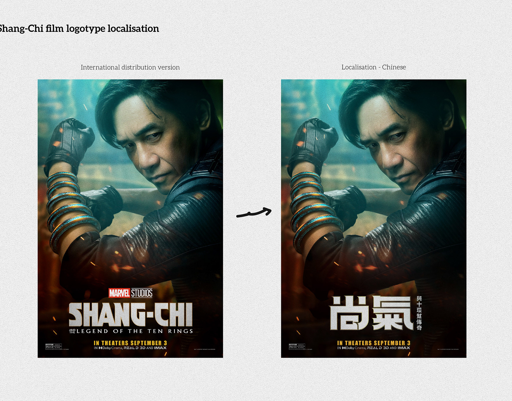
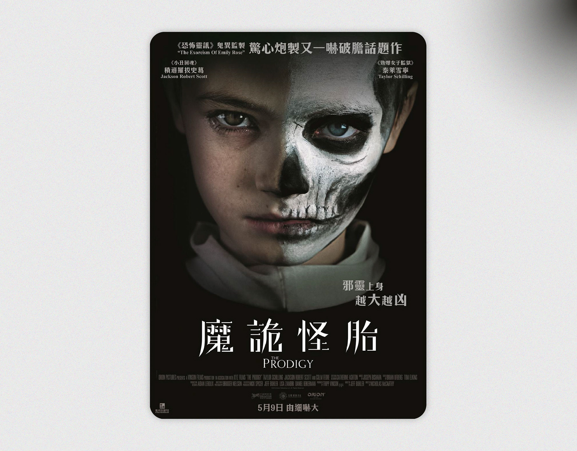
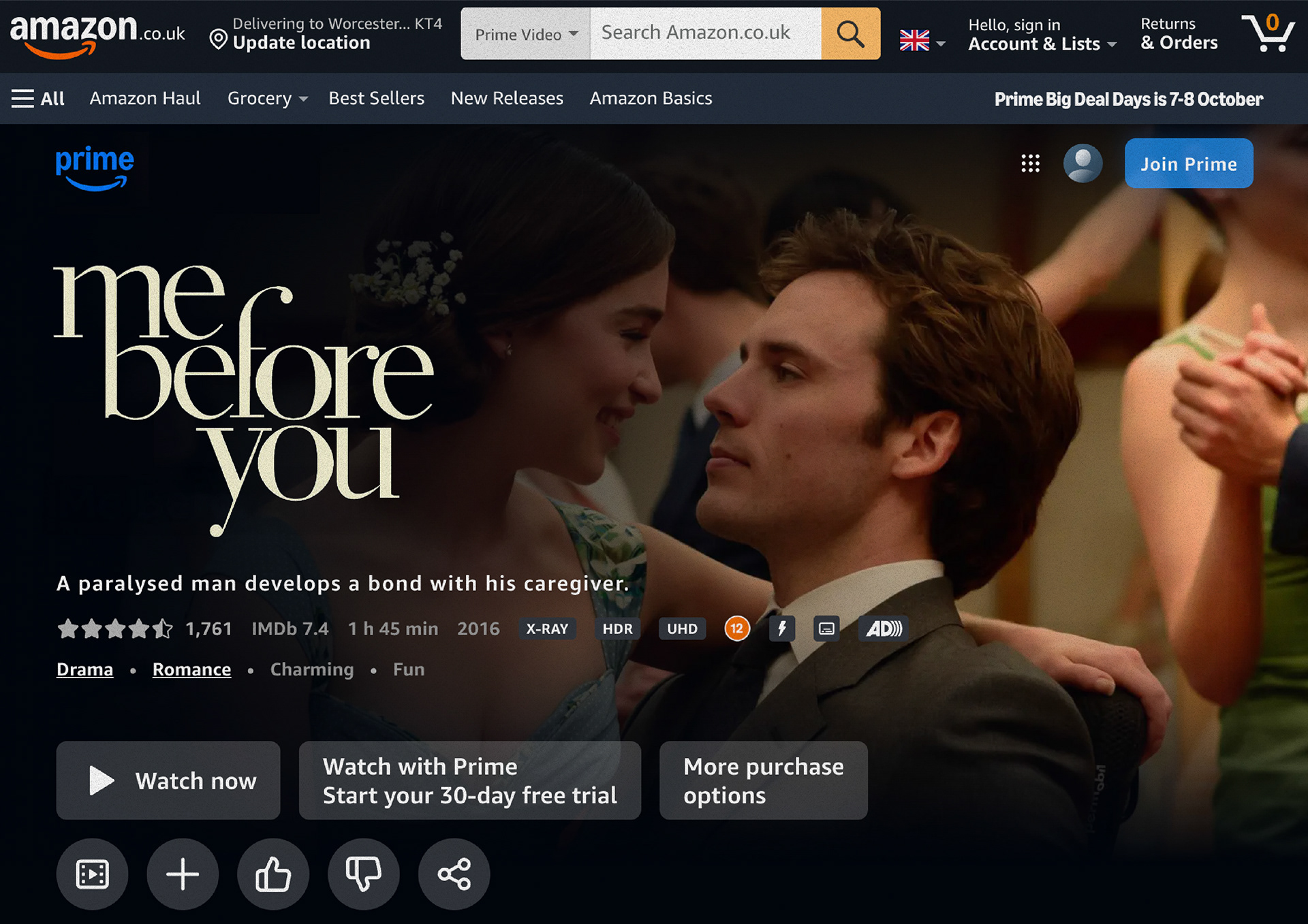
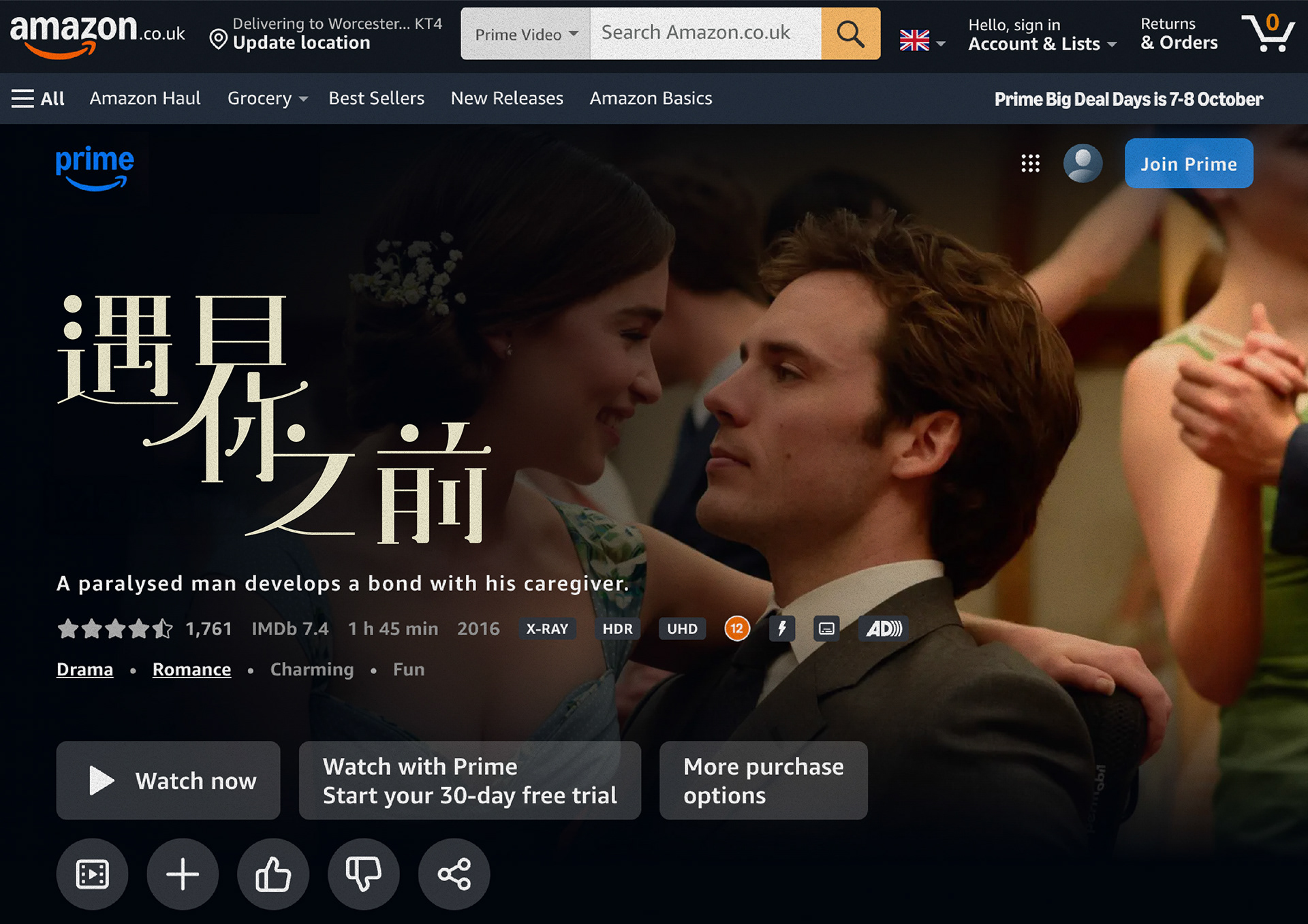
1. Streaming hero — side-by-side comparison of Latin and Chinese titles on the same key still.
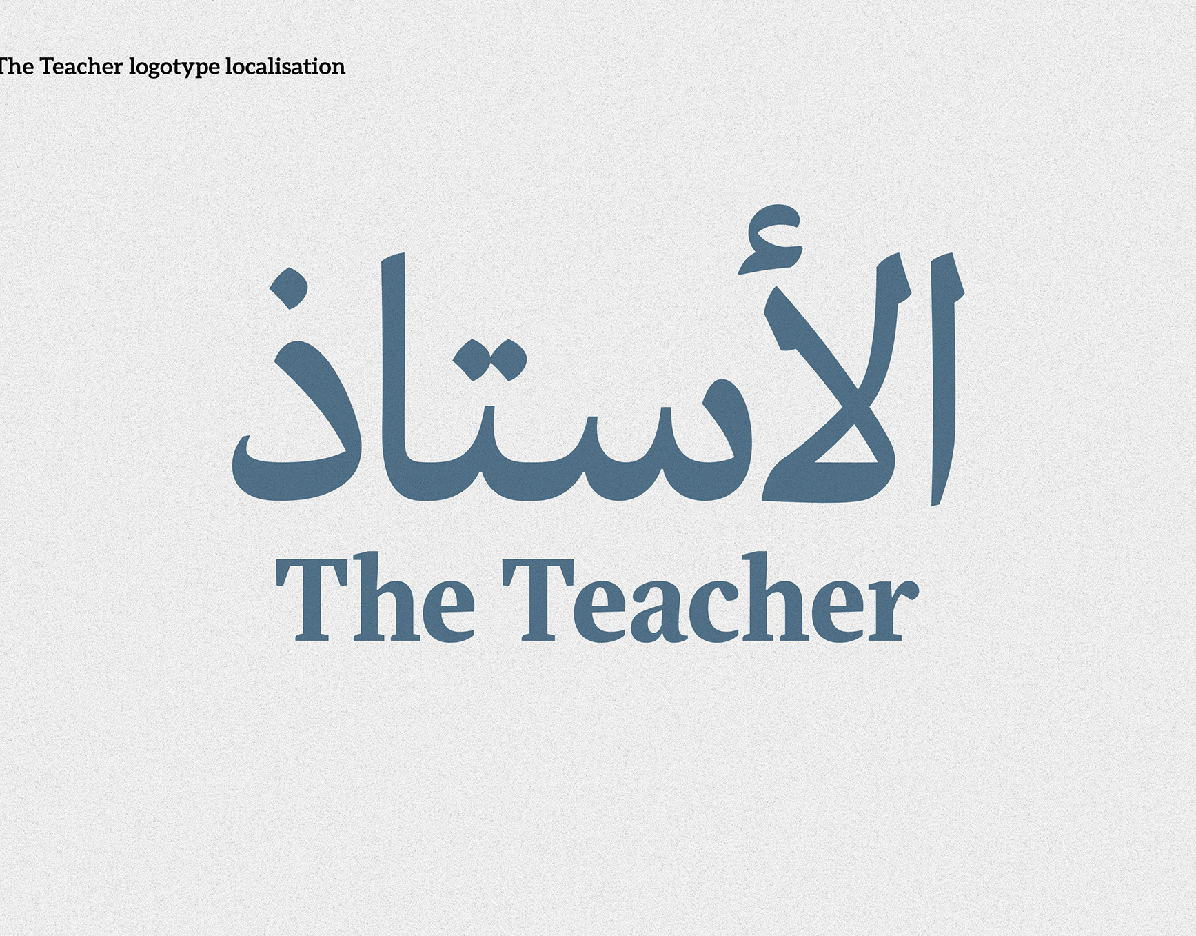
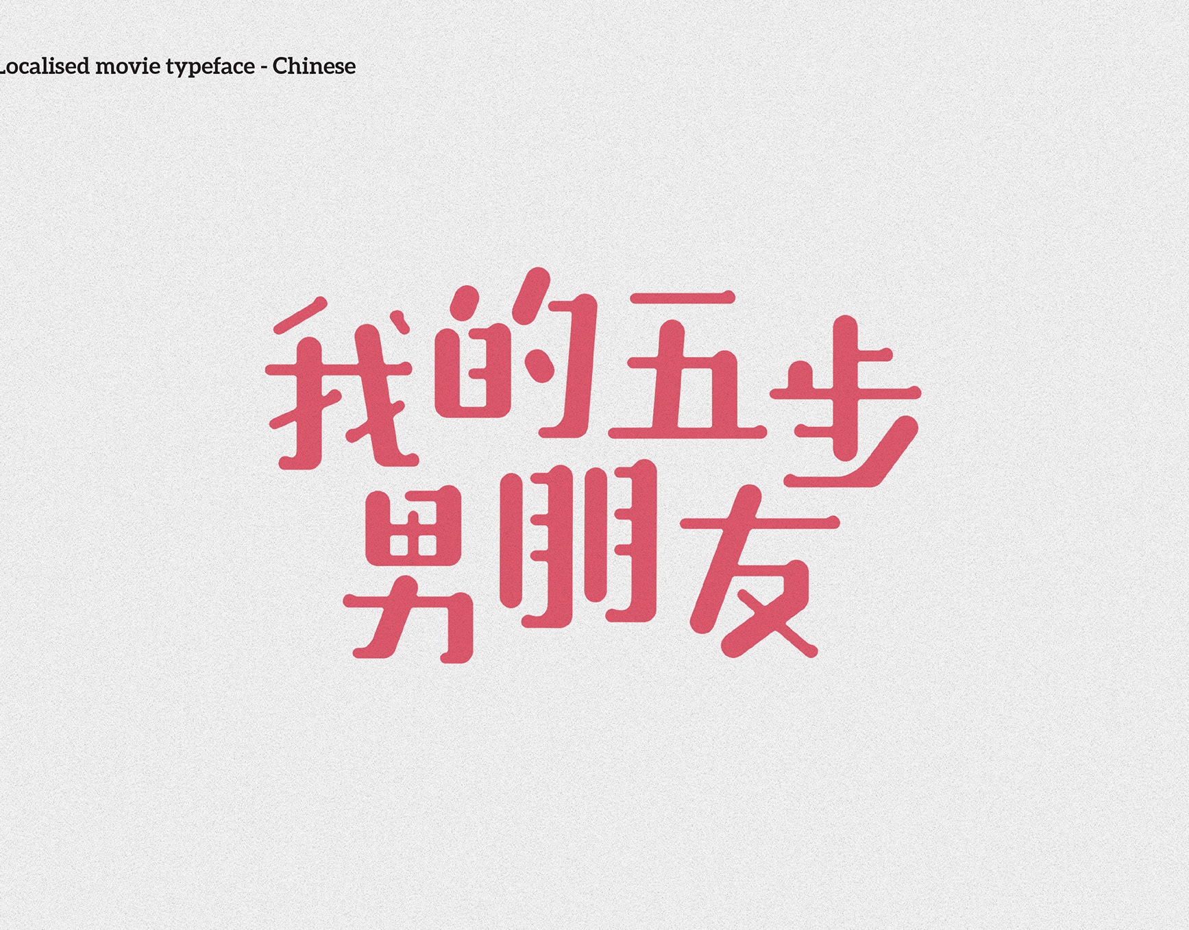
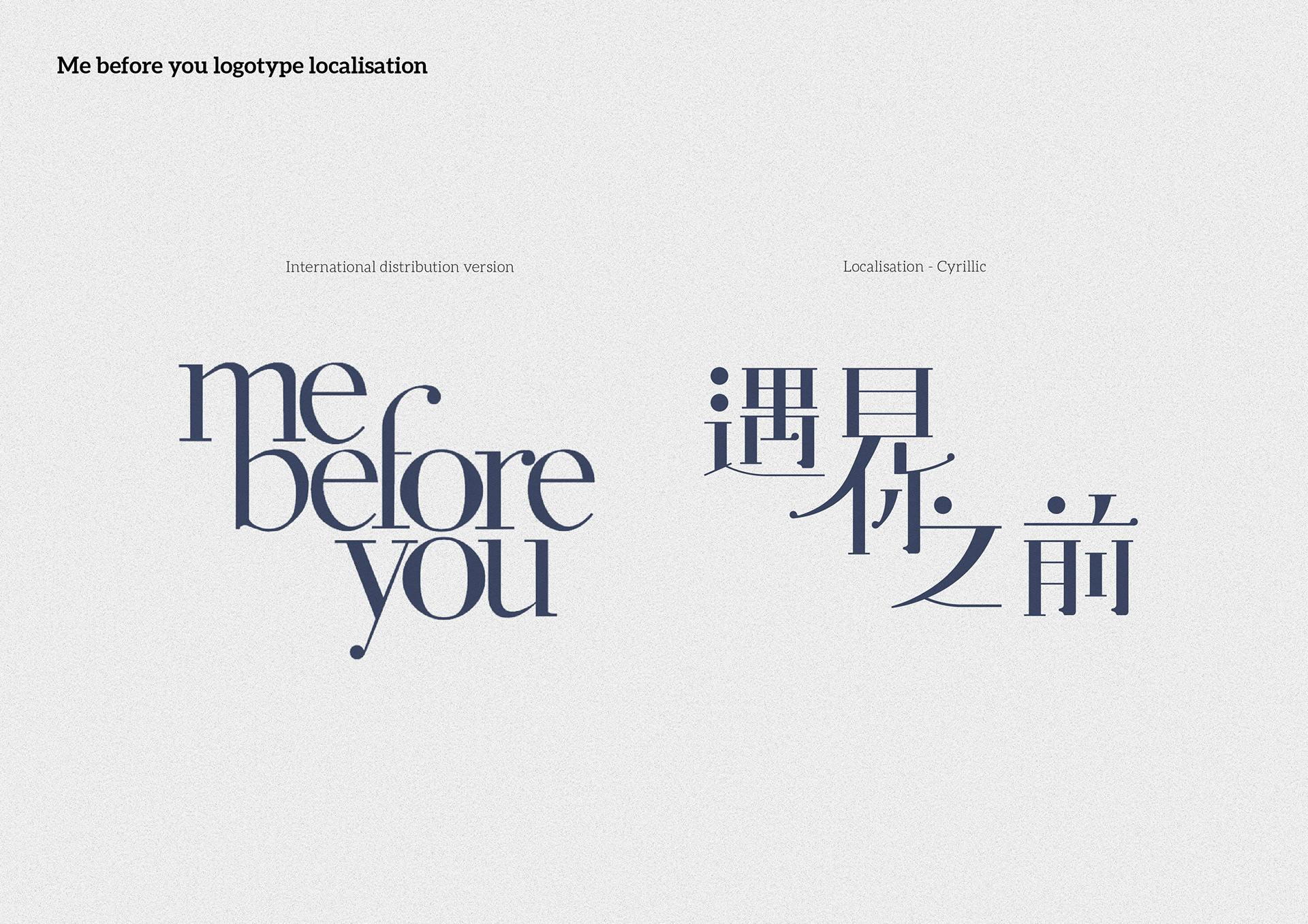
2. International vs Chinese — shape language and hierarchy.
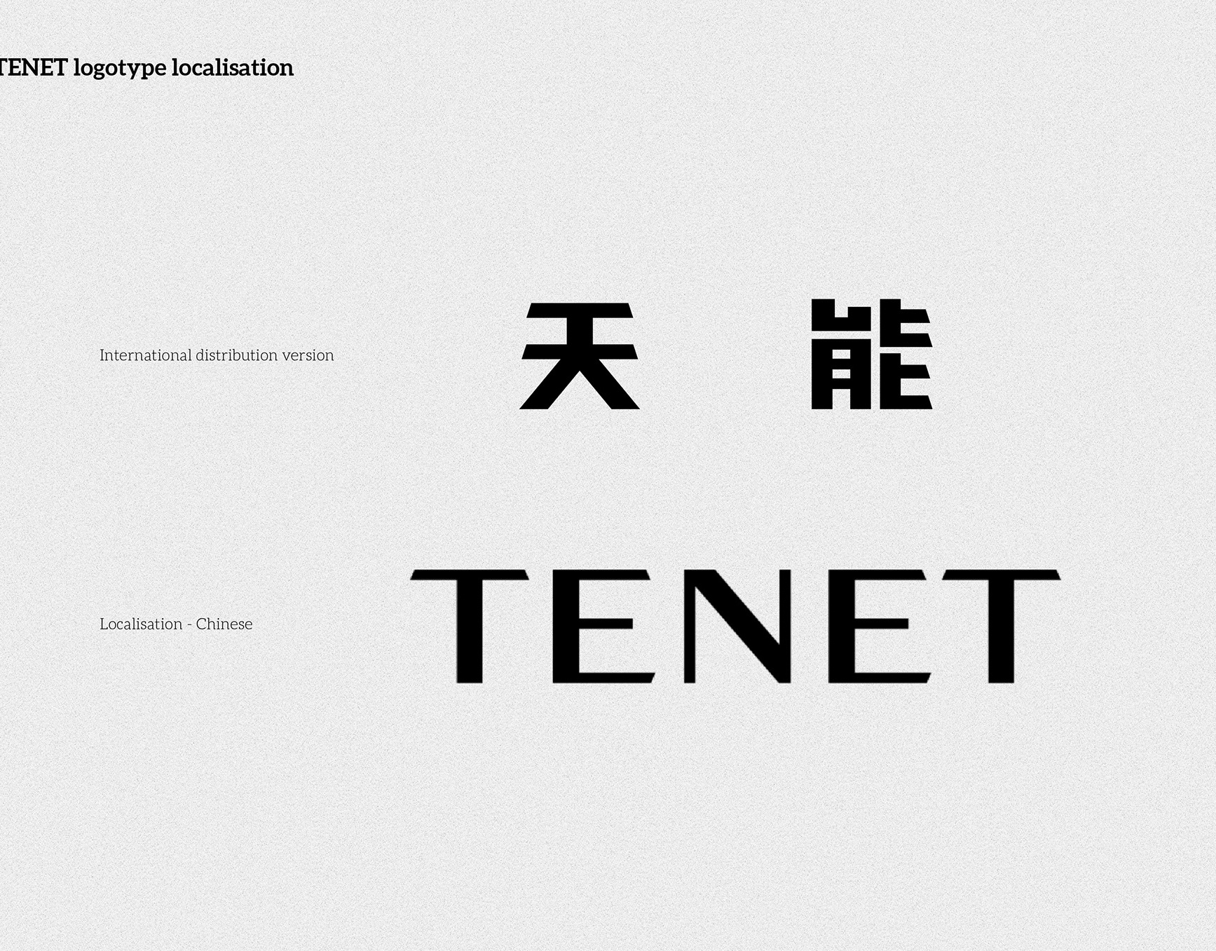
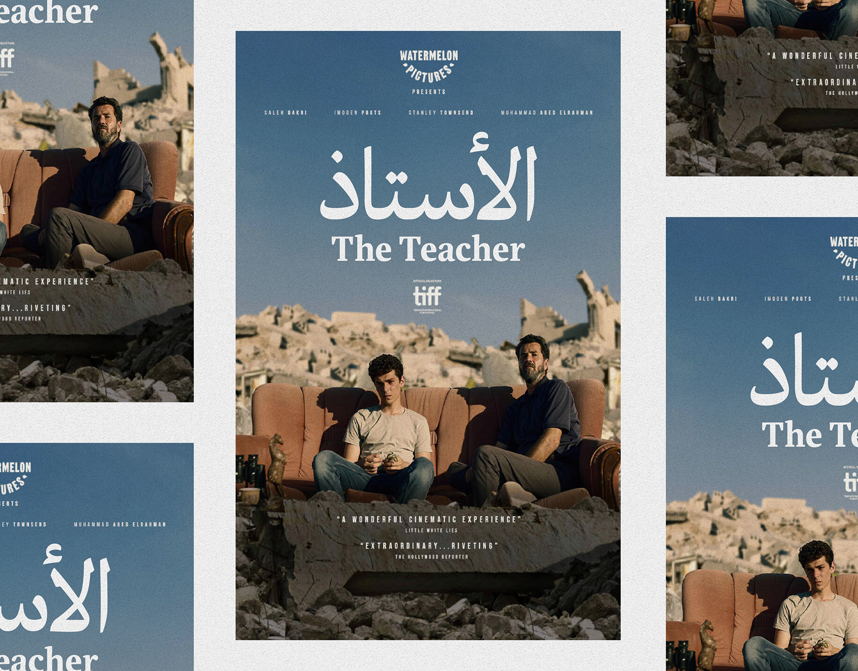
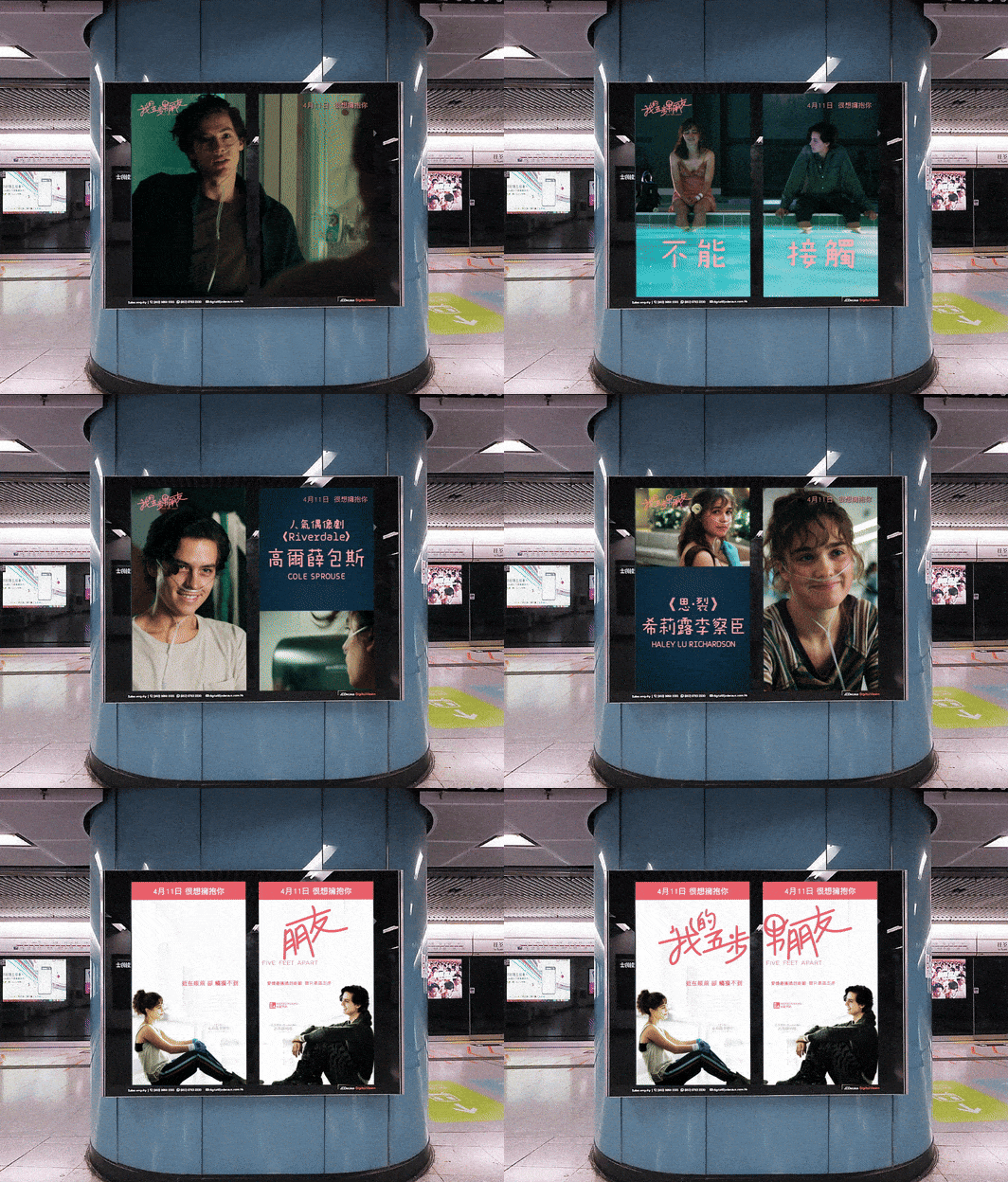
3. Shape reuse diagram — mapped terminals and curves from the Latin to Chinese.
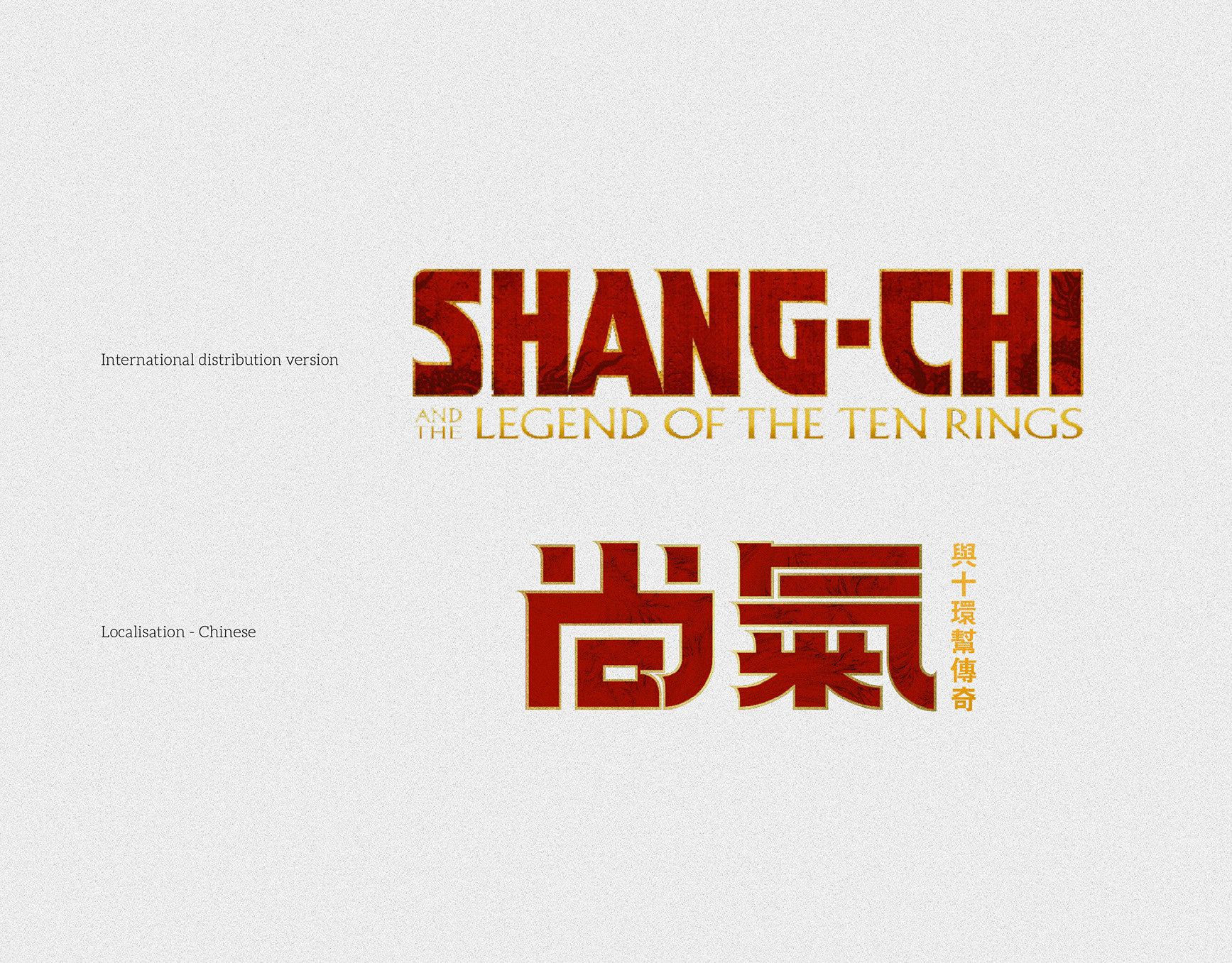
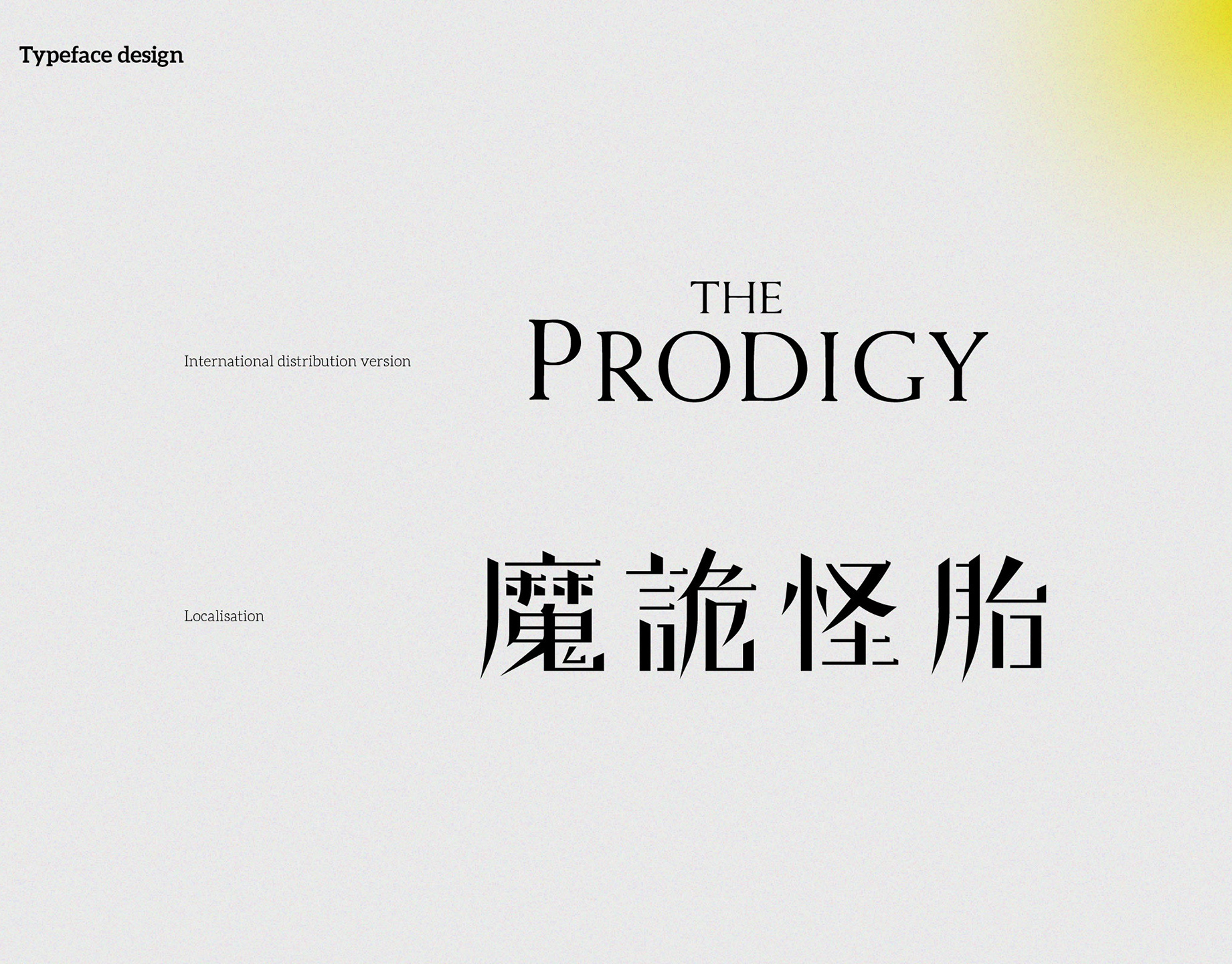
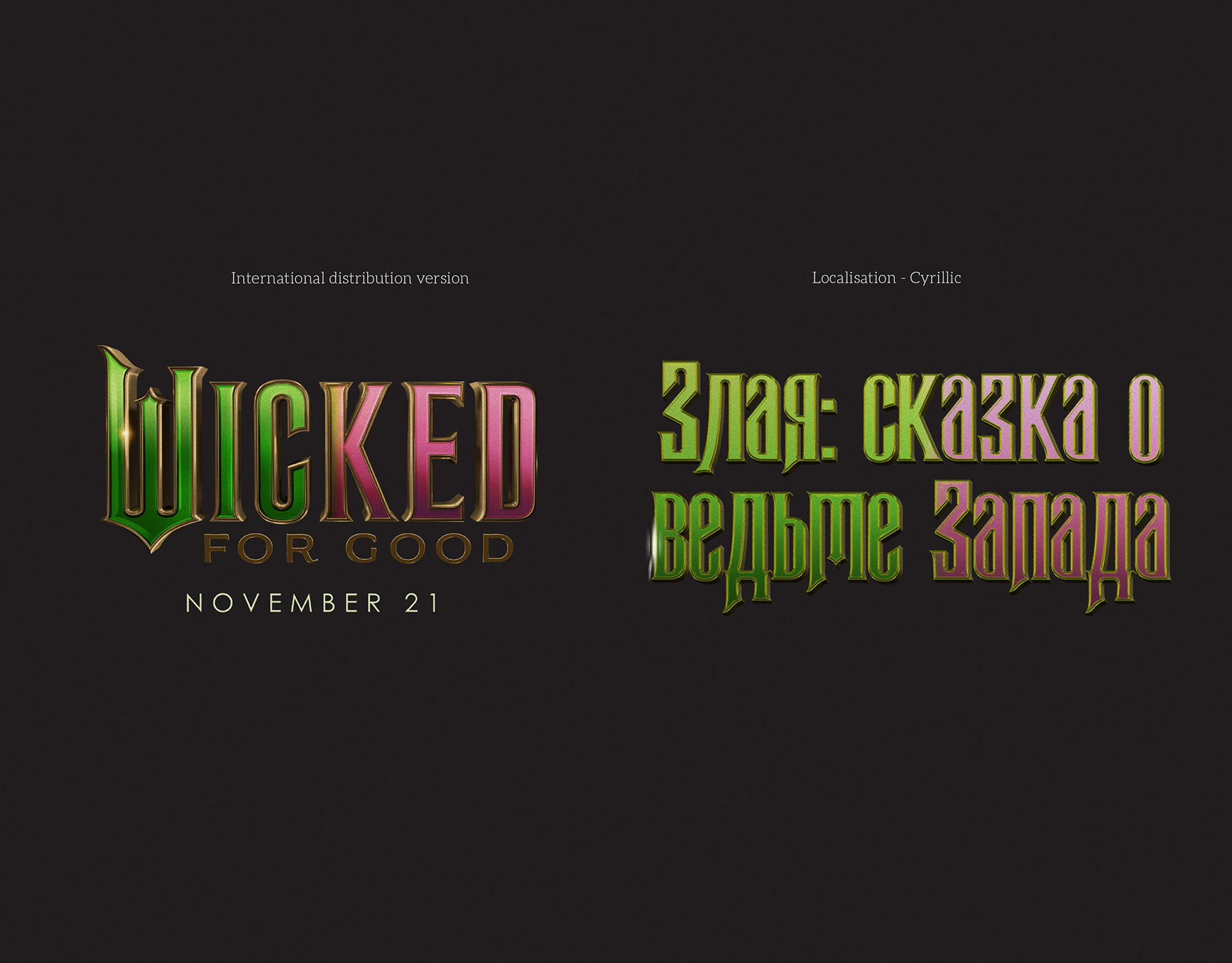
4. Tone match — applying the same feel to a localised script, with contrast and rhythm aligned.
《遇見你之前》中文片名在地化(Me Before You)
簡介
為《Me Before You》製作繁體中文片名,用於串流平台與主視覺。設計方向為延續原字樣的細高對比與優雅氣質,同時確保中文在螢幕與小尺寸下的可讀性。
為《Me Before You》製作繁體中文片名,用於串流平台與主視覺。設計方向為延續原字樣的細高對比與優雅氣質,同時確保中文在螢幕與小尺寸下的可讀性。
做法
- 解析英文字樣特徵:纖細細筆、圓形收筆、緊湊的垂直節奏。
- 合理借用形狀語彙(圓點、漸細筆畫),並簡化轉折與連接以提升清晰度。
- 建立三行堆疊版式,呼應原標誌的版面結構與留白比例。
- 調整黑白對比與字距,適配深色背景與疊圖應用。
交付
- 中文片名組版(主版與橫排備用)
- 串流平台主視覺改編
- 版面使用規範(最小尺寸、保留空間、色彩與位置)
圖片說明
1)串流頁面應用——英中片名對照。
2)國際版與中文對比——造型與層級對應。
3)形狀對映圖——圓點與曲線的轉換方法。
4)氣質對齊——對比與節奏的調整。
1)串流頁面應用——英中片名對照。
2)國際版與中文對比——造型與層級對應。
3)形狀對映圖——圓點與曲線的轉換方法。
4)氣質對齊——對比與節奏的調整。