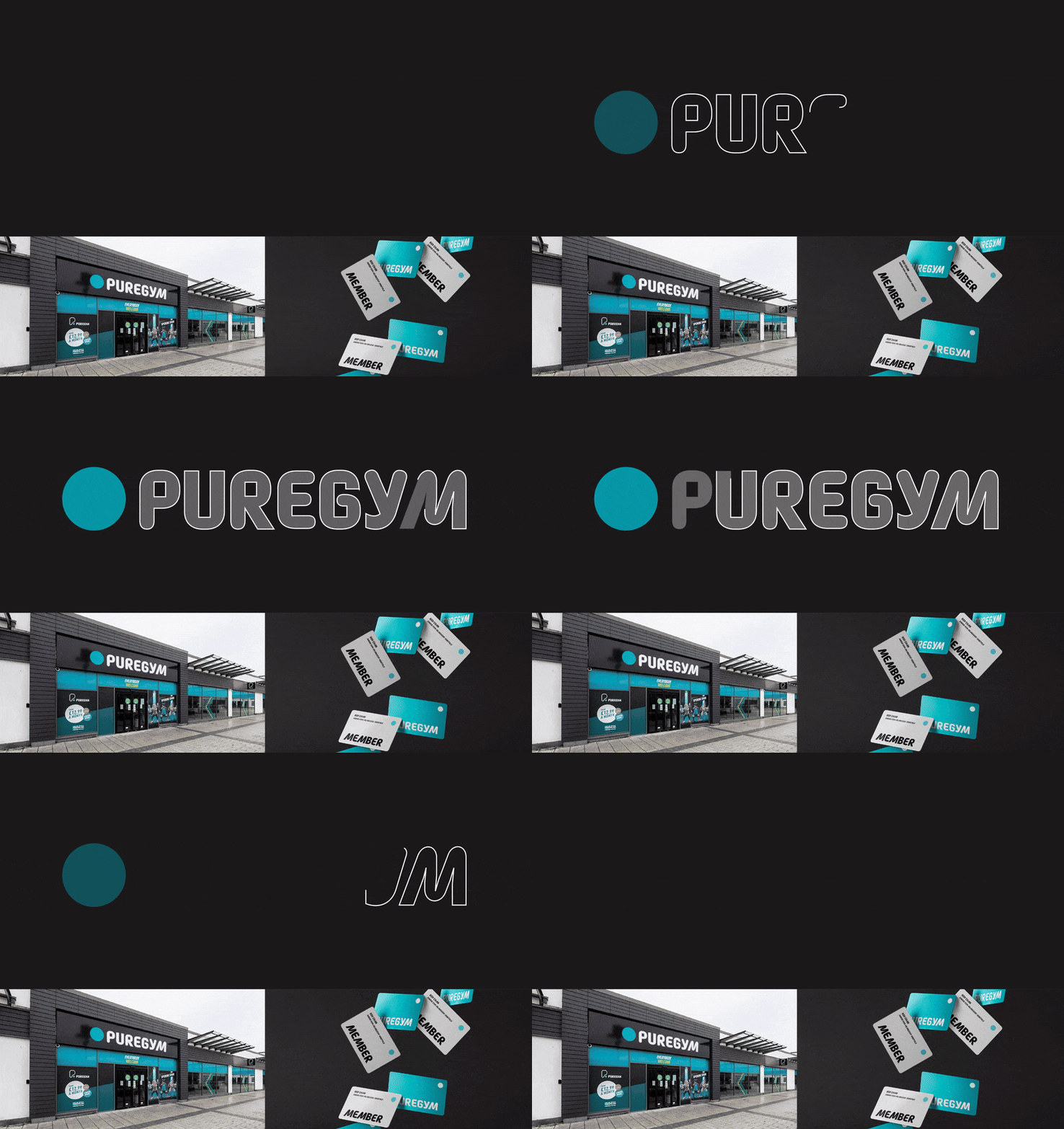
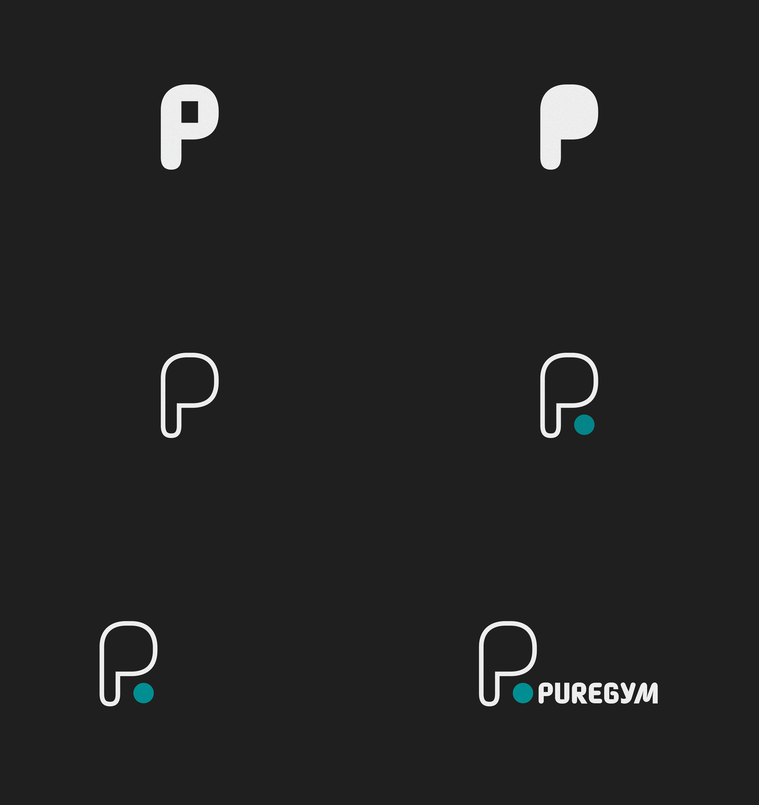
This mockup explores a refreshed brand direction for PureGym built around energy, approachability and clarity. The core idea is to give the brand a single, confident typographic voice that works as well on a busy high street as it does in an app header or a gym-floor sign. The rounded letterforms and soft corners introduce warmth without losing strength, so the brand feels helpful and inclusive while still looking active.
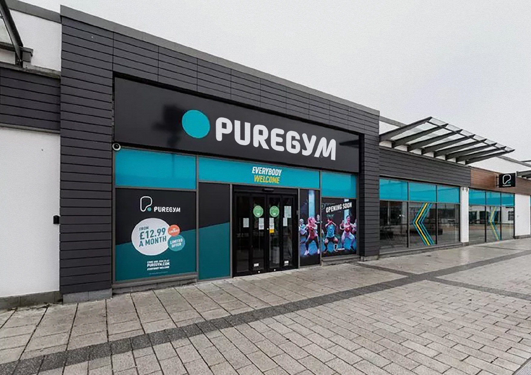
The wordmark is redrawn with sturdier proportions and cleaner curves, improving legibility at distance and in motion. In the hero lockups and shopfront signage, the mark holds its shape against strong contrast and mixed lighting, which helps it read quickly from the street. The turquoise brand colour carries through every touchpoint to keep recognition high, with a neutral dark background used to make the type and accents pop.
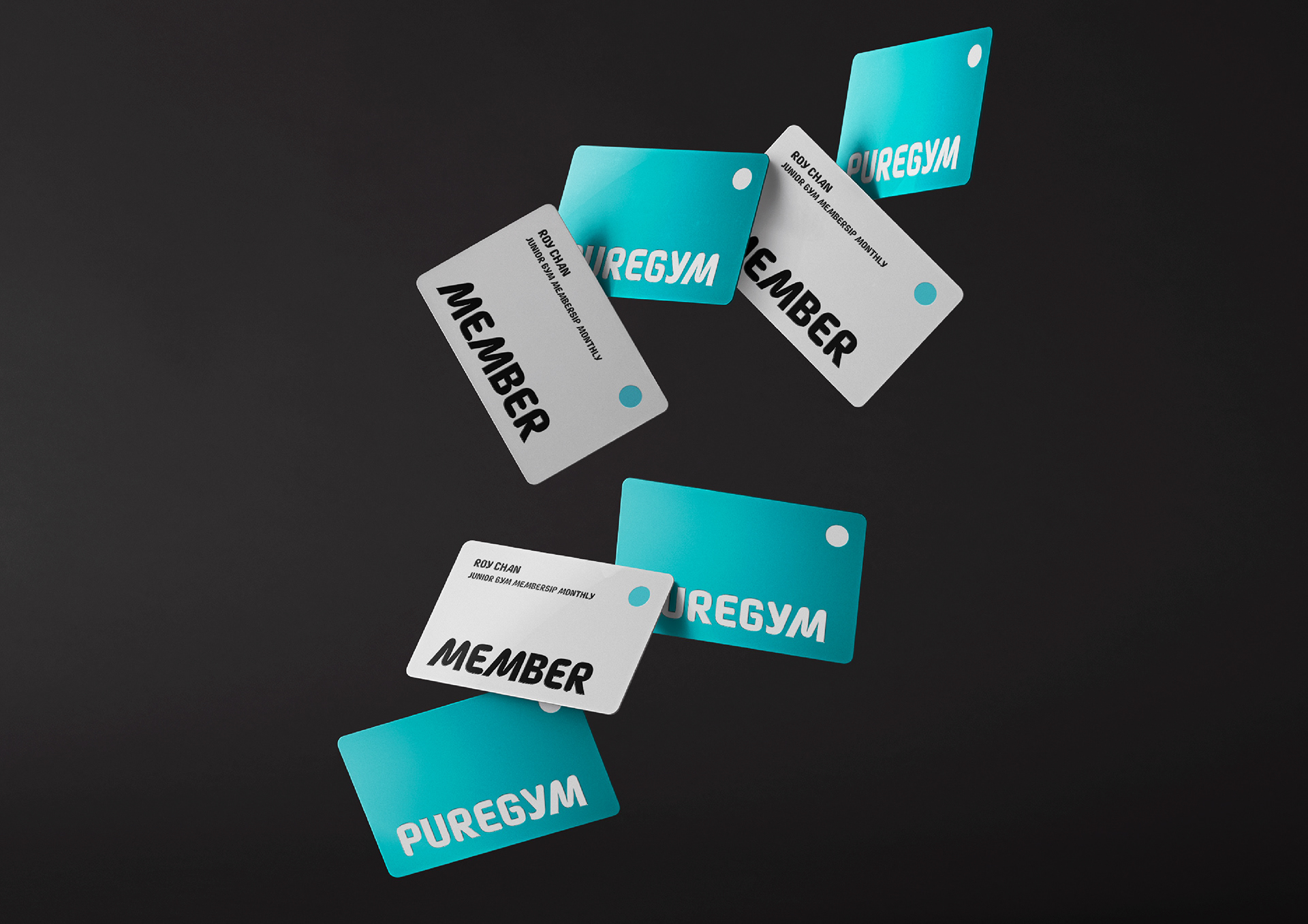
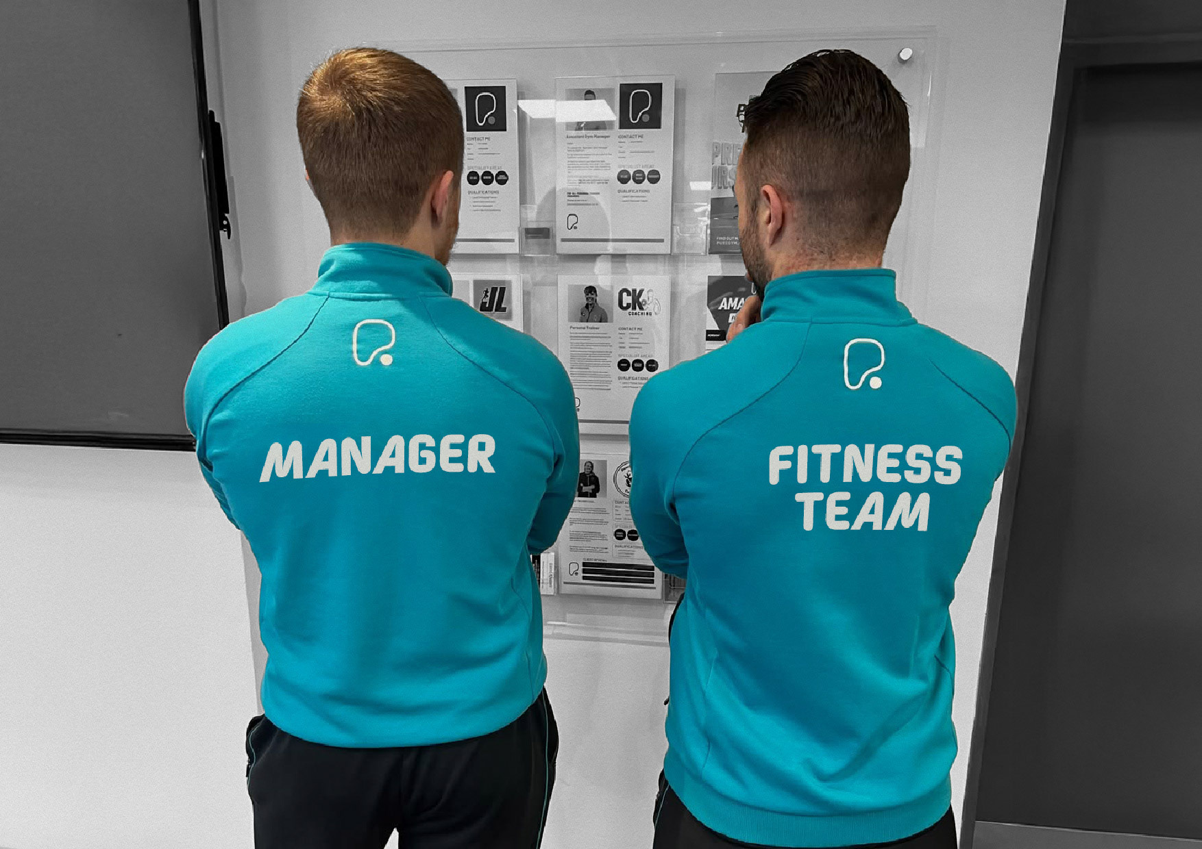
Membership cards and staff applications show how the system scales to small formats. The heavy-weight typography keeps “PUREGYM” readable when reduced, while the rounded cuts punch through on plastic and fabric printing. Staff jackets use oversized back prints for fast wayfinding on the gym floor, and the same typographic rules keep “MANAGER” and “FITNESS TEAM” consistent with the brand voice.
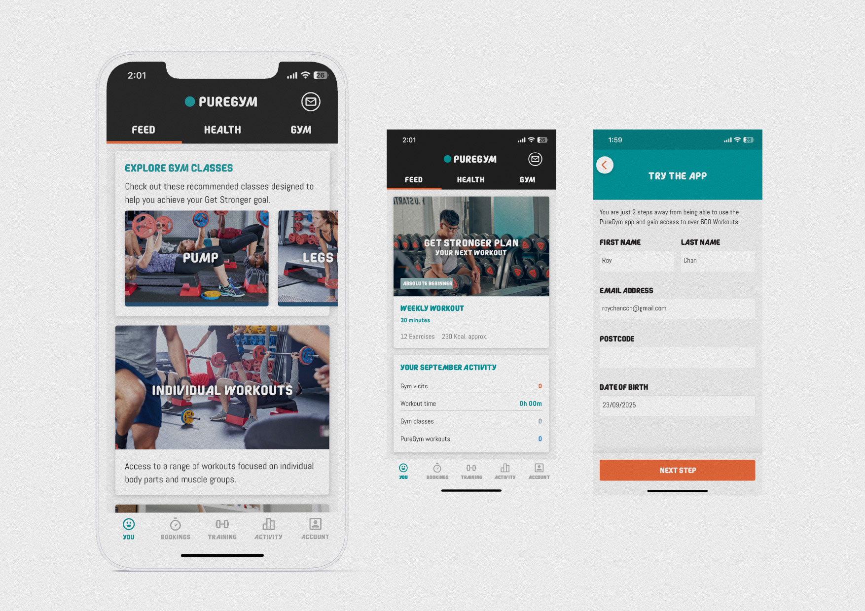
The app screens carry the same typographic cadence into UI. Headlines guide the eye, labels remain legible on the move, and CTAs have enough weight to feel actionable without shouting. The palette is kept tight for accessibility and to make progress states and buttons immediately understandable.
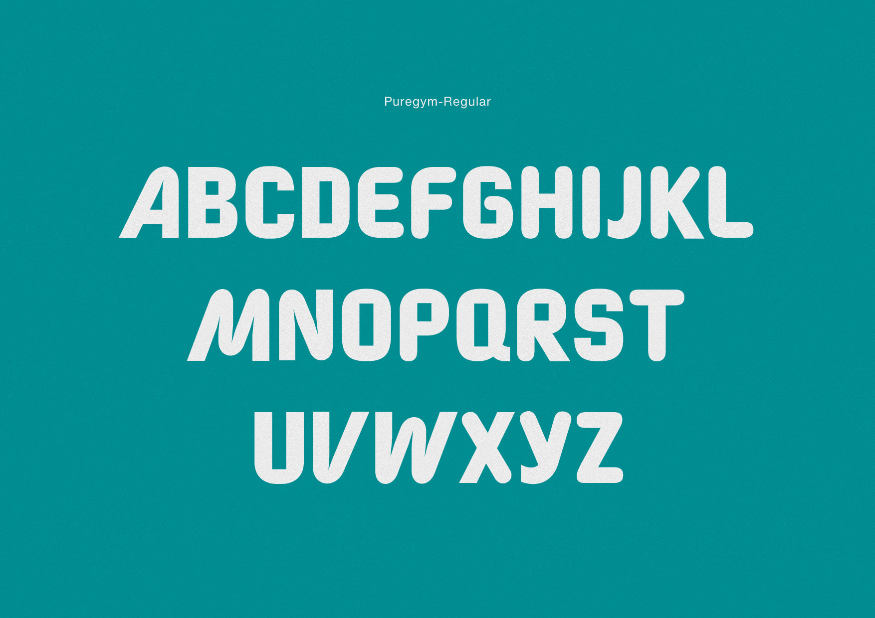
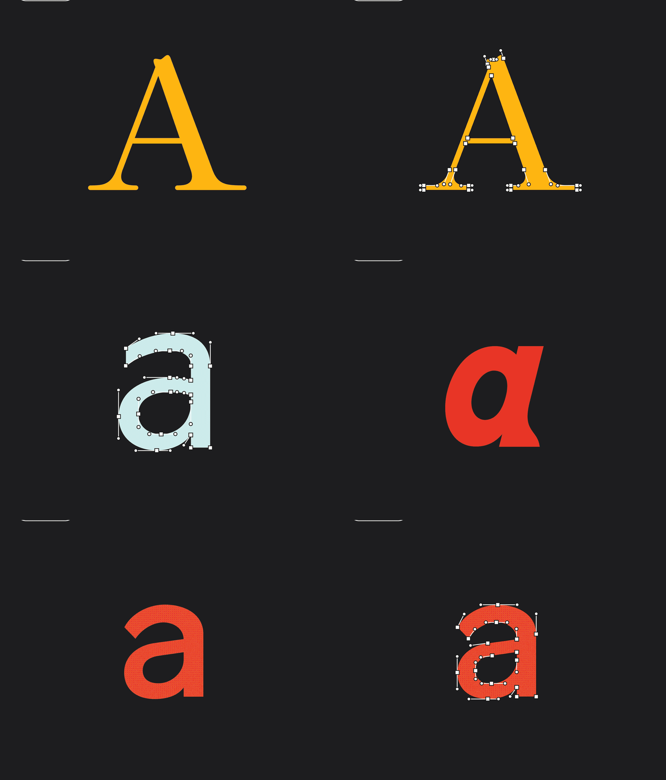
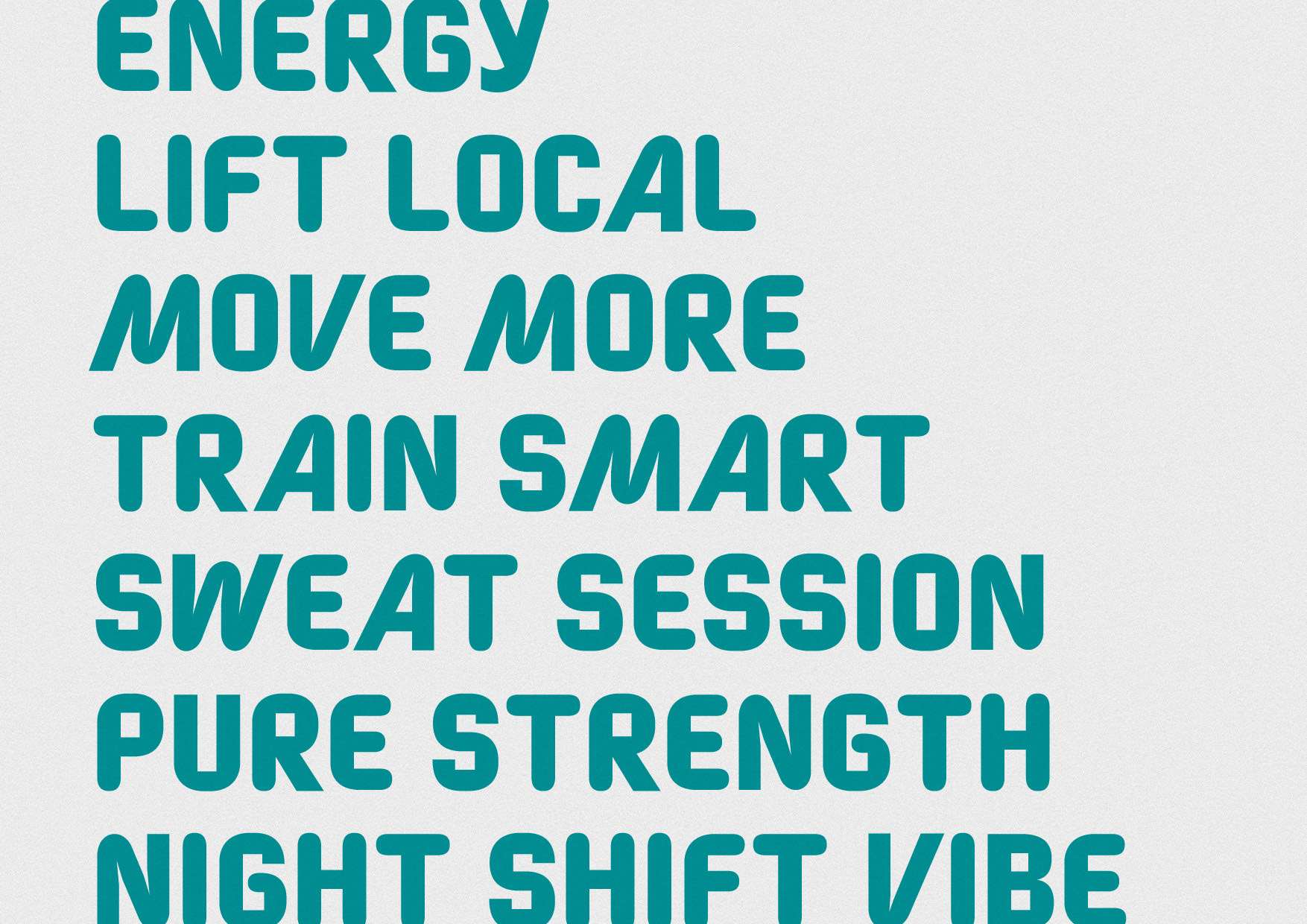
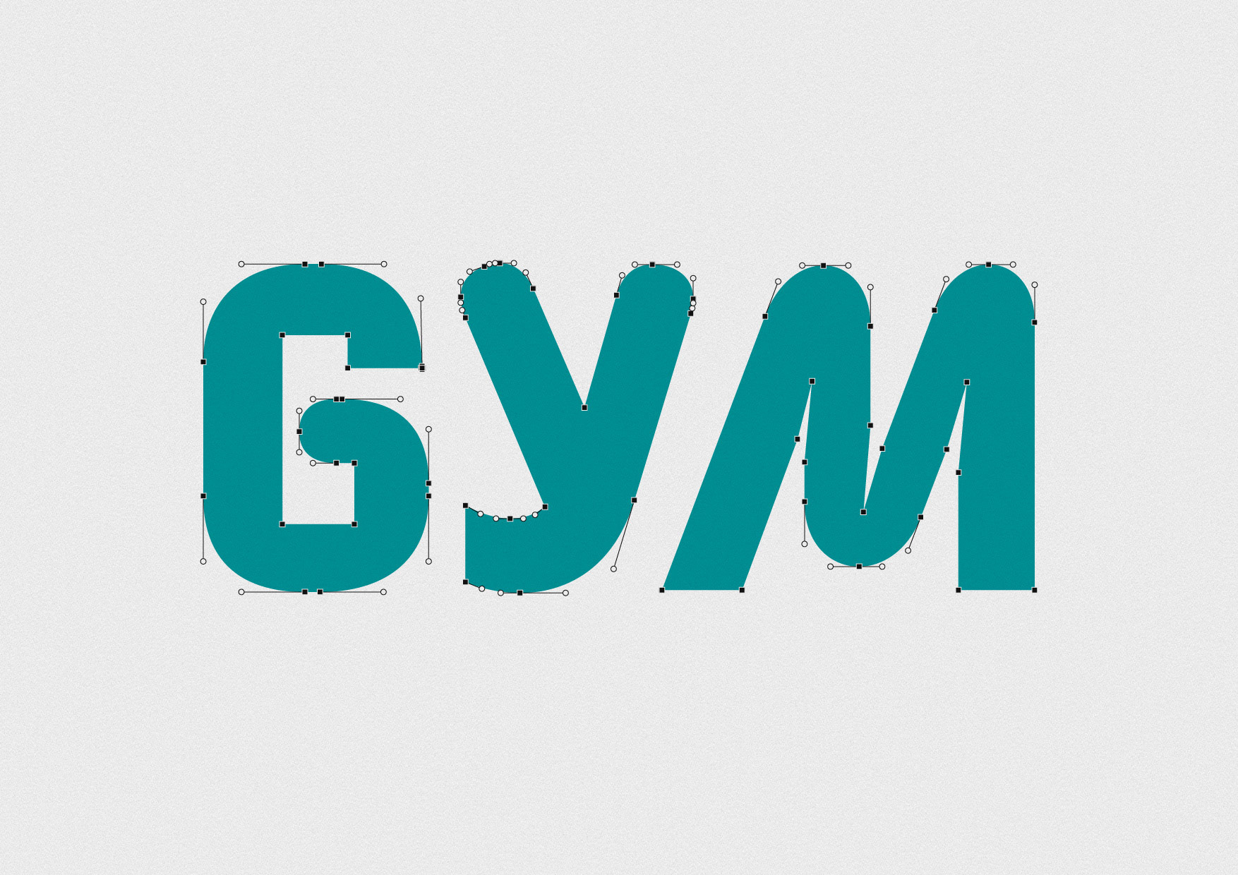
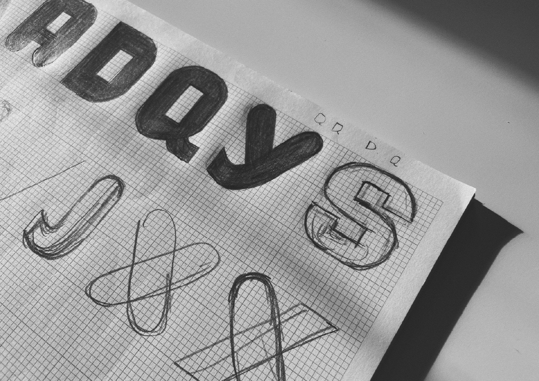
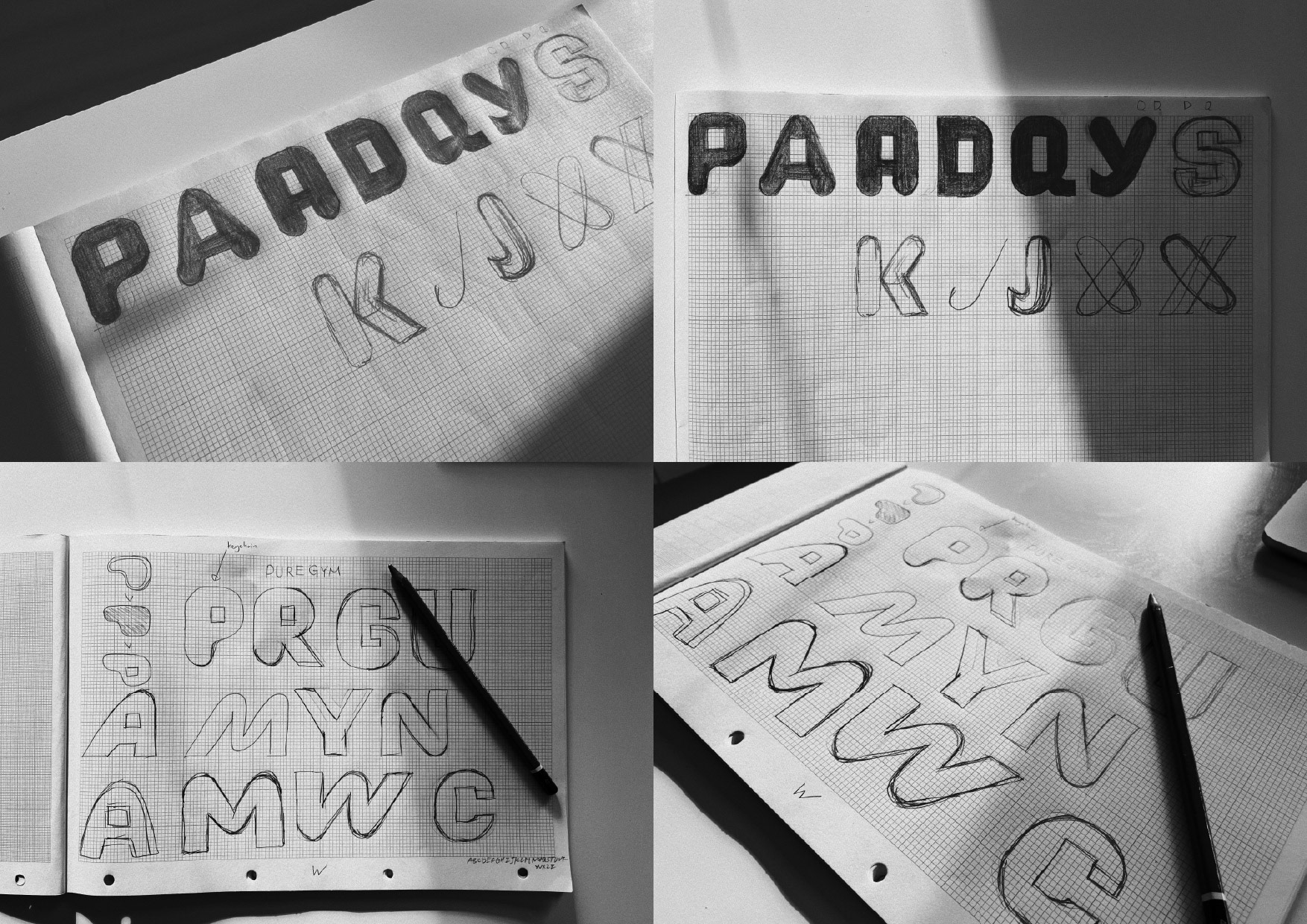
The alphabet sheet shows the full A–Z drawing, tuned for even color and rhythm across words. Counters are opened slightly to prevent fill-in at small sizes, and joins are simplified so the letters render cleanly on LED signage and lower-resolution screens in gym environments. Vector details highlight the optical corrections made at joins and curves to keep strokes lively rather than mechanical.
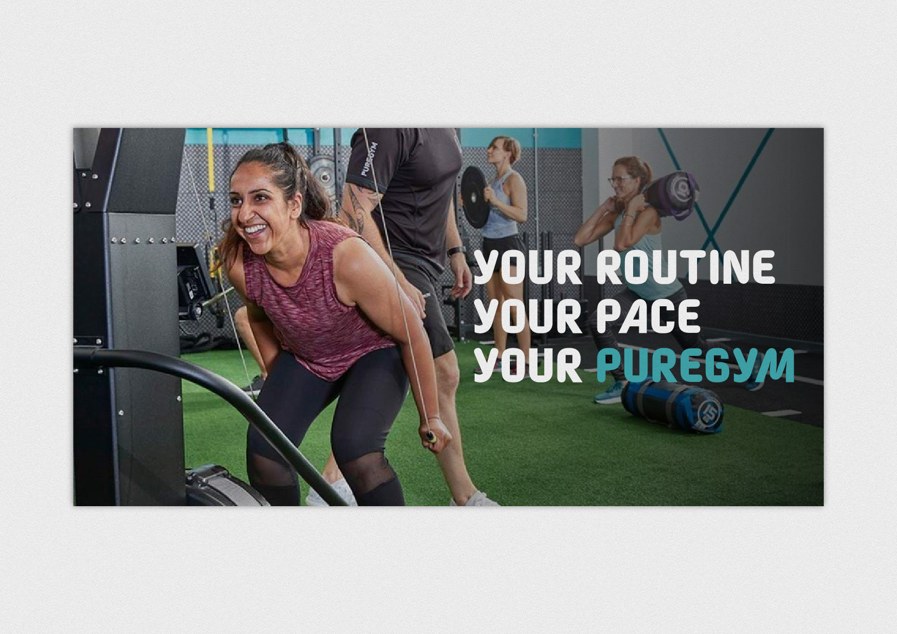
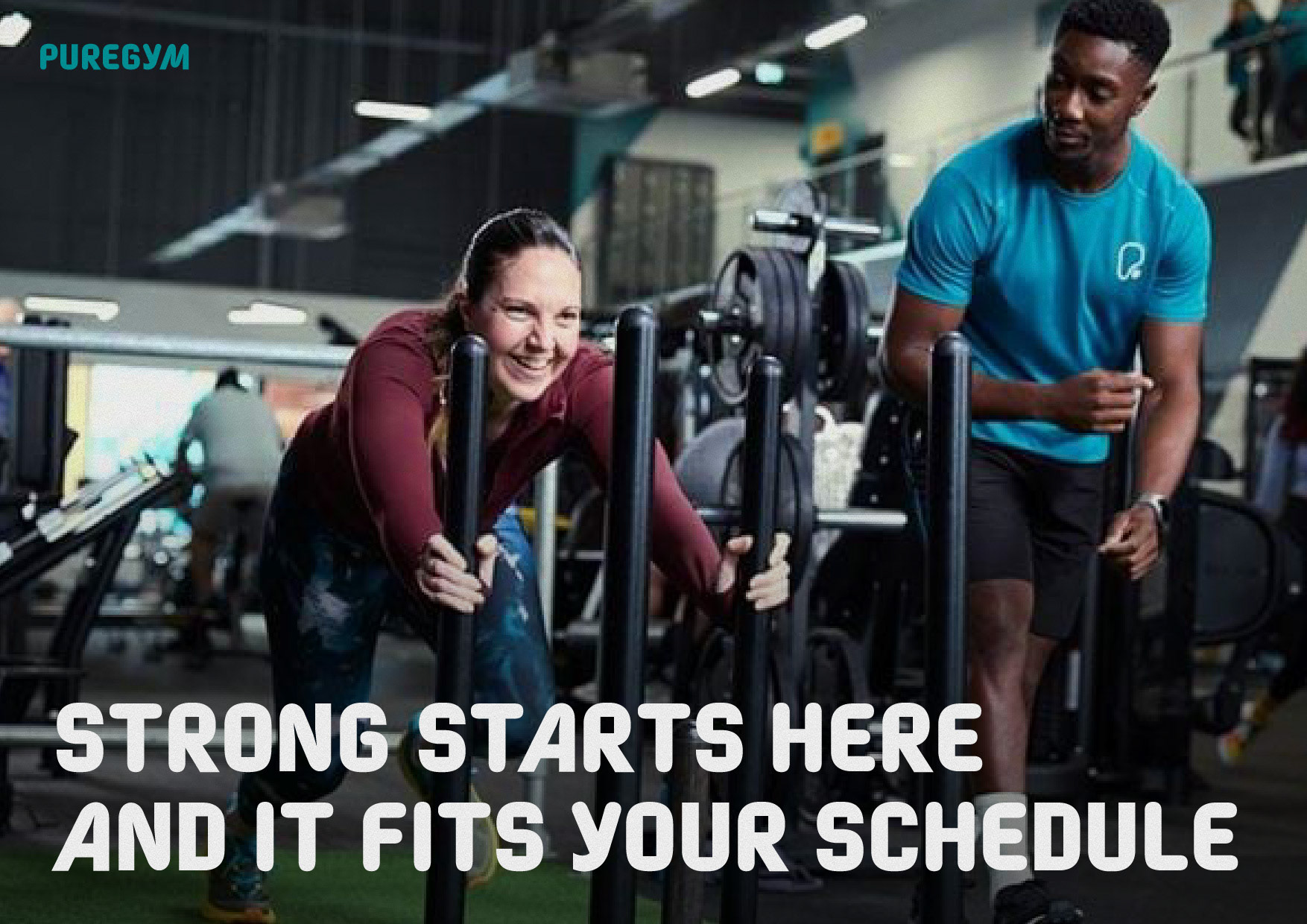
Campaign layouts focus on short, motivational lines that are easy to scan: “YOUR ROUTINE. YOUR PACE. YOUR PUREGYM.” The custom display style handles stacked type well, so headlines can sit confidently over photography without fighting for attention. In motion or static, the softened terminals avoid harsh edges, which suits inclusive messaging and a broad member base.
Overall, this proposal aims to give PureGym a cohesive, friendly system that’s easy to implement across print, digital and environment. It keeps the brand open and welcoming while adding the punch and clarity needed for real-world use. This is an independent concept study created for portfolio purposes only and is not affiliated with or endorsed by PureGym.
Credit
Client: Mockup
Role: Type Designer, Art Director
Role: Type Designer, Art Director
🚀 Let's create something big together! 🚀
Contact Roy Chan at roychancch@gmail.com
Follow us on Behance | Instagram |
More about us on moodmenfont.com
Contact Roy Chan at roychancch@gmail.com
Follow us on Behance | Instagram |
More about us on moodmenfont.com