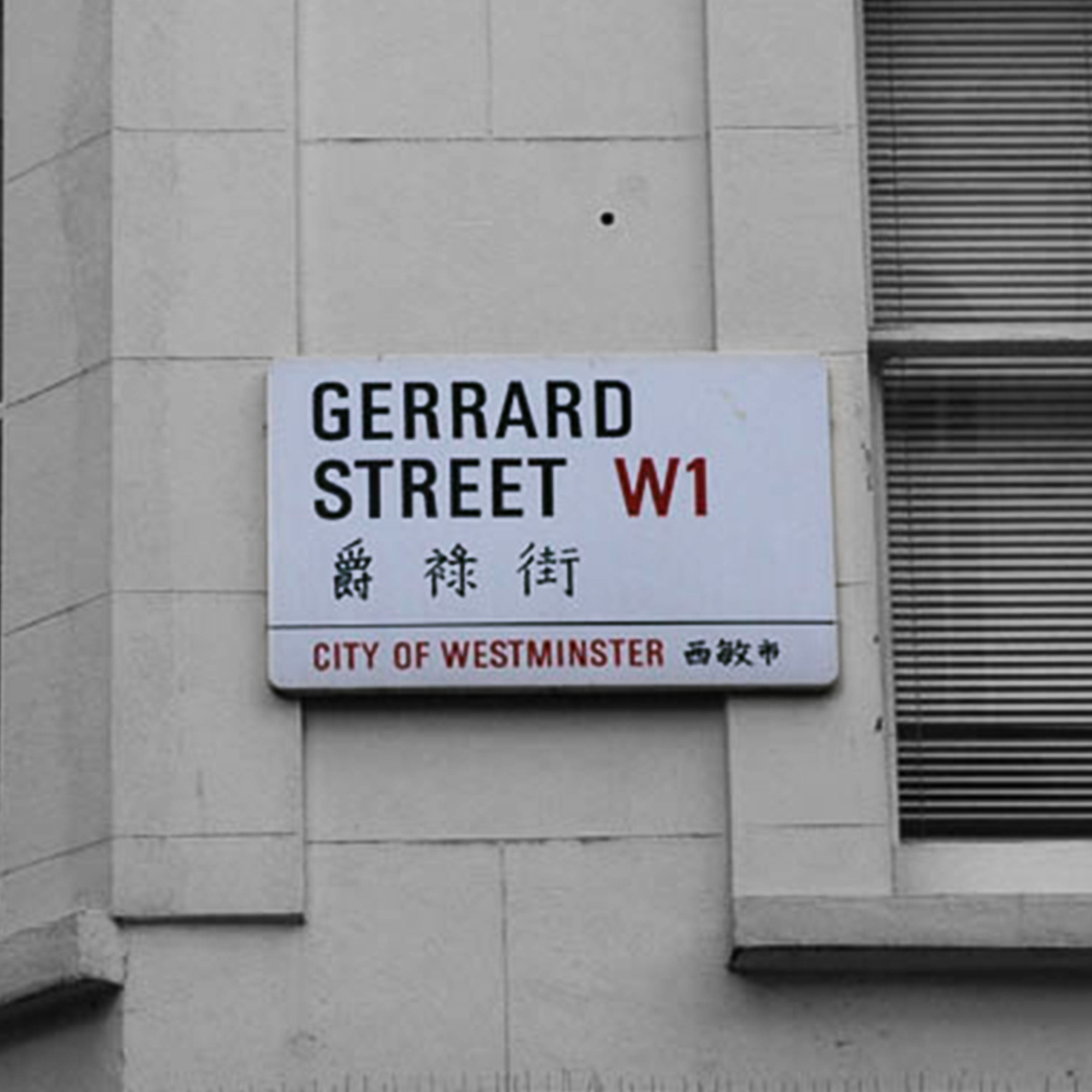
London’s Chinatown features bilingual street name signs in both Chinese and English. These distinctive signs showcase the cultural character of Chinatown, blending urban design with the area’s community heritage.
When and why did bilingual street signs appear?
Bilingual street signs were introduced in London’s Chinatown in the mid-1980s as part of a community improvement initiative by Westminster City Council. The plan was developed in consultation with the London Chinatown Chinese Association (LCCA) to recognise the local Chinese community and enhance the area’s cultural identity. In 1985, Westminster City Council officially designated the Soho area as “Chinatown” and held the first official Chinese New Year celebration there, signifying formal acknowledgement of the community’s importance. The bilingual signs came to symbolise this recognition, underscoring the authorities’ respect and support for the Chinese enclave. Beyond helping residents and visitors who cannot read English to navigate the streets, the introduction of Chinese text into the urban landscape carried profound cultural significance, reflecting the spirit of multicultural inclusion.

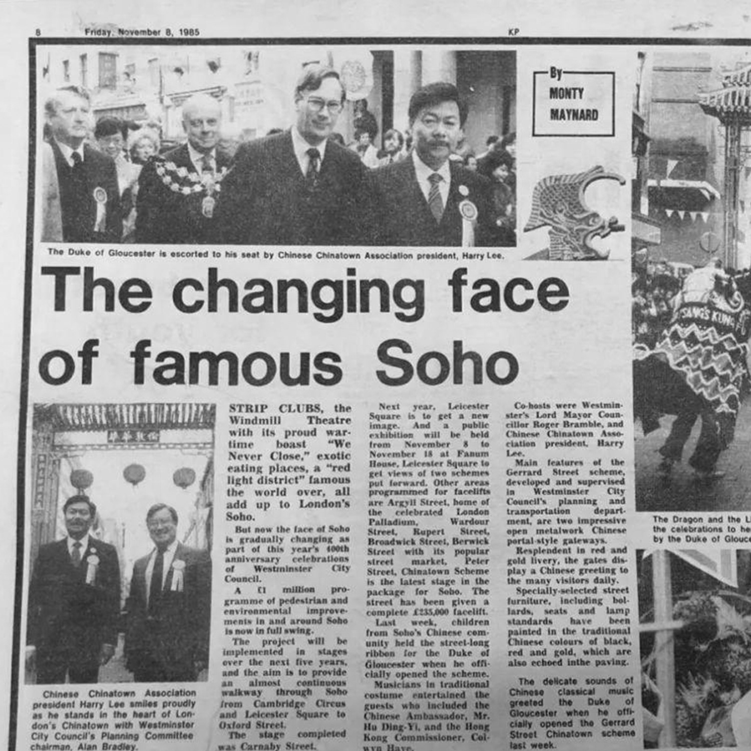
A 1985 newspaper article documenting the official inauguration of the Chinatown scheme on Gerrard Street, attended by Westminster’s Lord Mayor and the Duke of Gloucester. The event marked the transformation of Soho with the formal recognition of Chinatown.
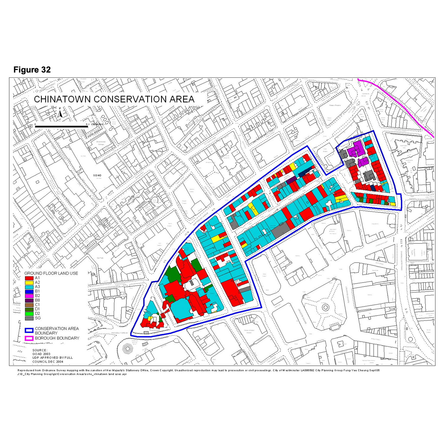
Map of the Chinatown Conservation Area in Soho, Westminster, as approved by Westminster City Council in December 2004. It shows the conservation boundary and detailed land use of buildings in the area.
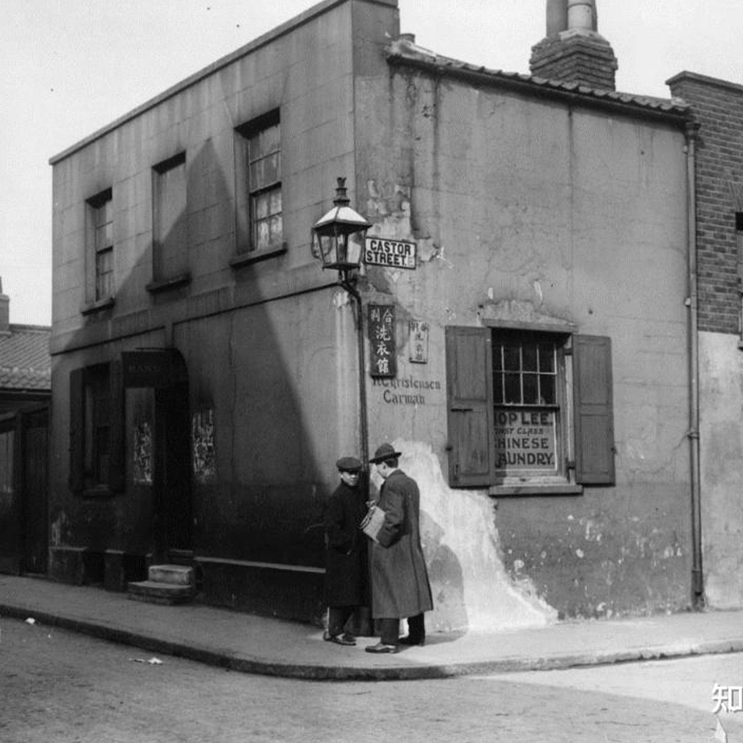
Hop Lee Chinese Laundry on Castor Street, Limehouse, circa 1917. One of the earliest photographic records of Chinese-run businesses in London’s East End.
Chinese typeface on street name signs
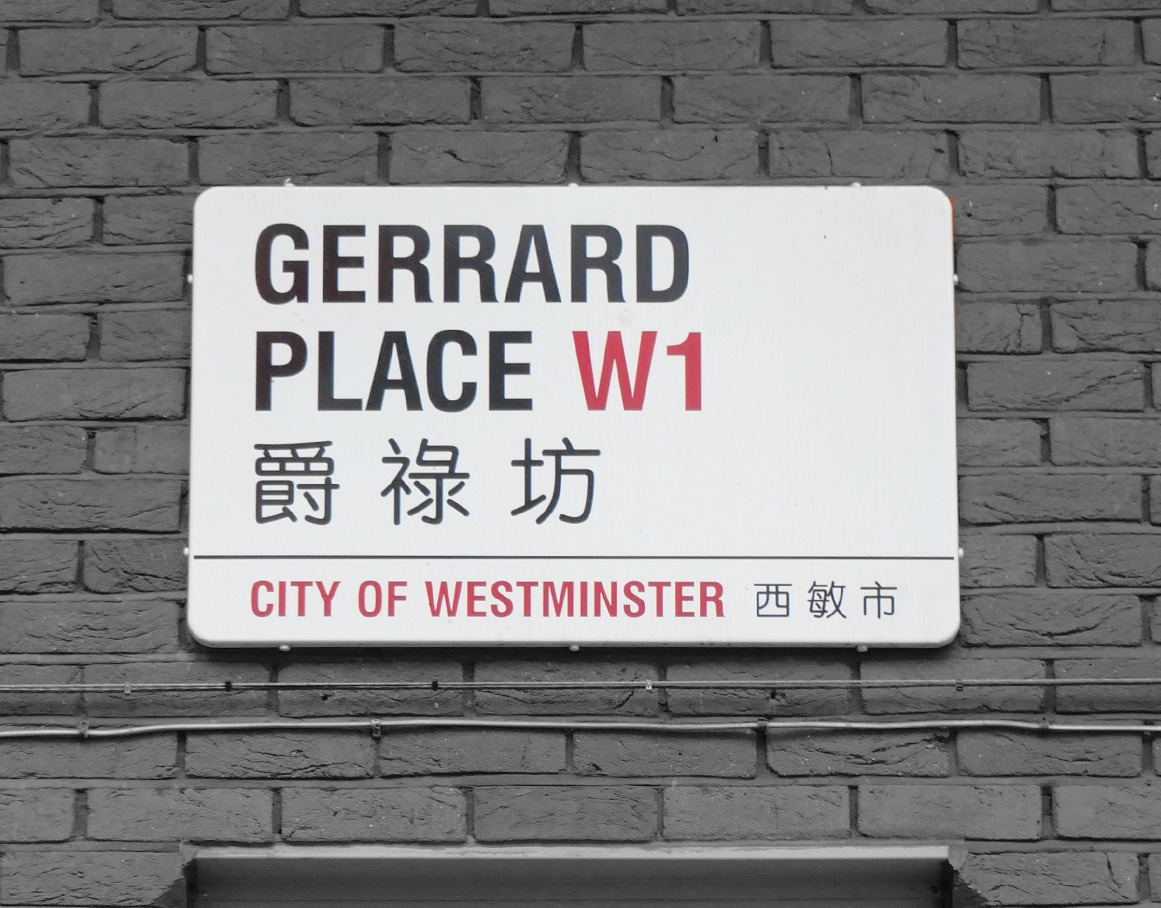
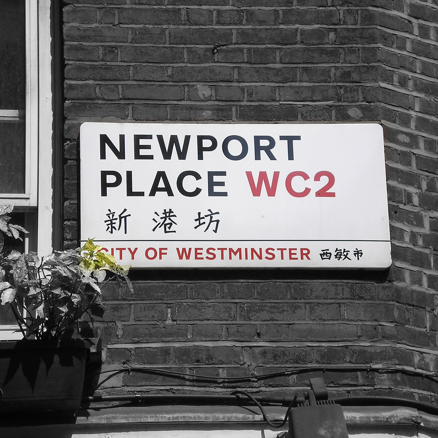
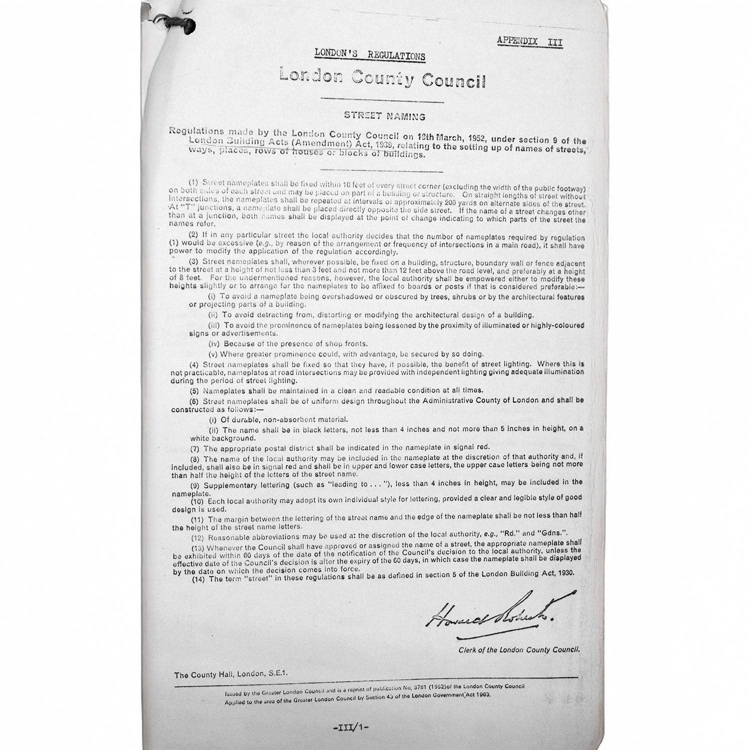
Since then, Chinatown’s bilingual street name signs have been installed. The initial Chinese text on these signs used a handwritten-style typeface with low contrast strokes, giving an appearance reminiscent of calligraphy. At that time, all nine streets in the area (such as Newport Place and Gerrard Street) adopted this script-like Chinese font. However, this cursive style did not fully comply with London’s signage guidelines. A 1968 report by a working party on street name plates stipulated that each local authority may choose its own lettering style “provided a clear and legible style of good design is used”. While the Chinatown handwritten font arguably met the basic legal requirement of legibility, national guidance introduced later raised the bar. In 1993, the Department of Transport issued Circular Roads 3/93, a guidance document recommending that sans-serif lettering be used on reflective nameplates because many serif fonts do not perform well against reflective backgrounds. Although this guidance was not legally binding, by its standards the Chinatown cursive Chinese font was not ideal in terms of clarity and readability for street signs.

Gerrard Street's bilingual street sign (2005), one of the earliest examples in London's Chinatown under Westminster Council's bilingual signage policy.
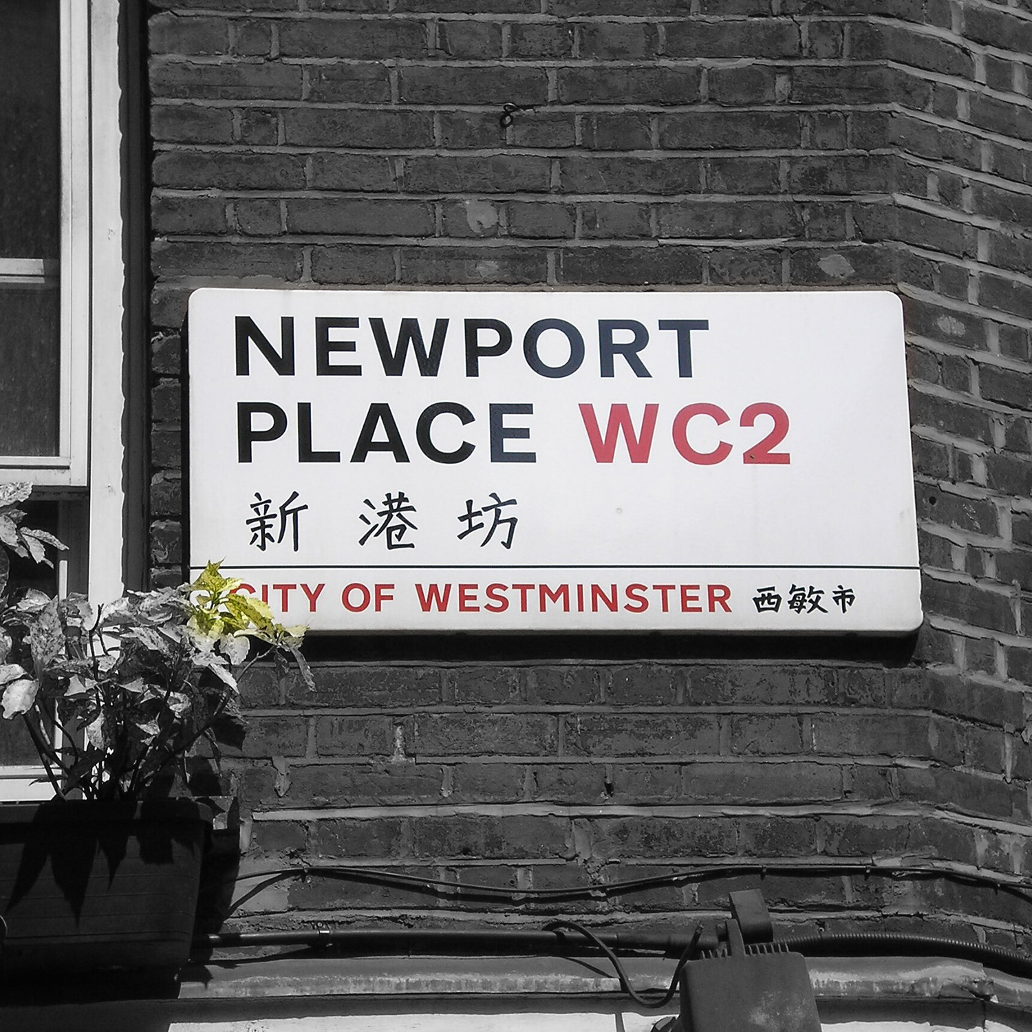
Newport Place's bilingual sign (2009).
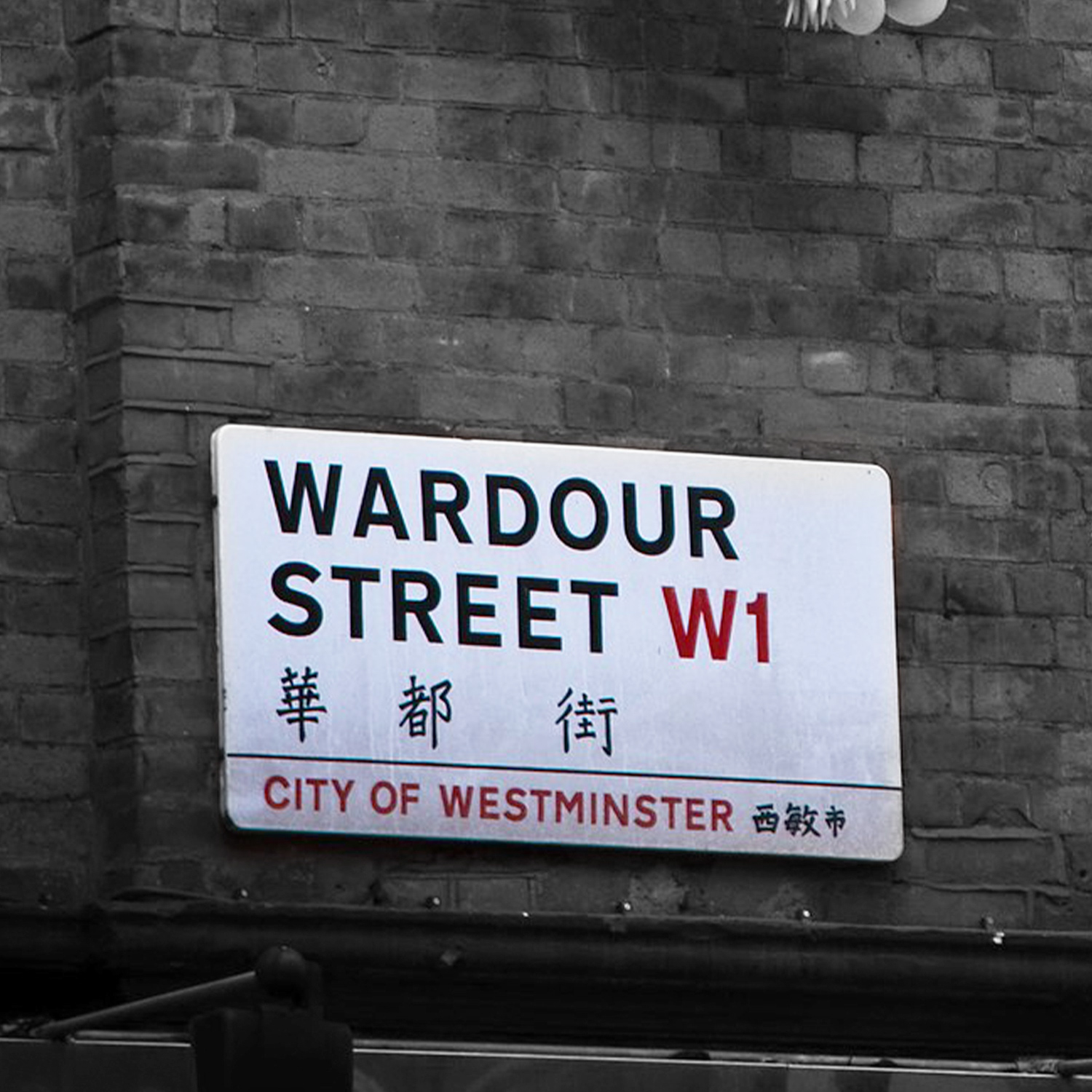
Wardour Street's bilingual sign (2010).

A 1952 London County Council regulation document outlining standards for street name signage, including legibility and positioning.
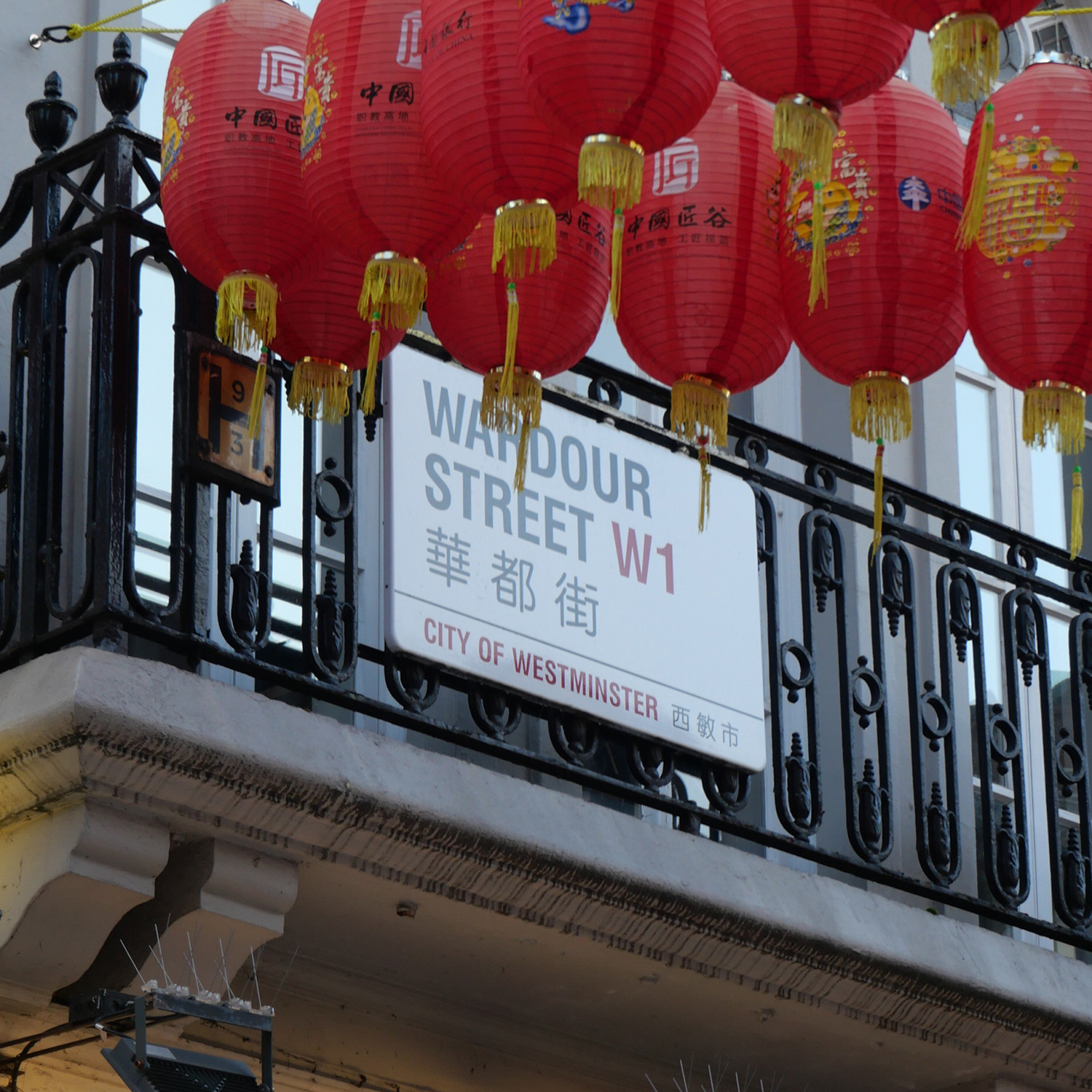
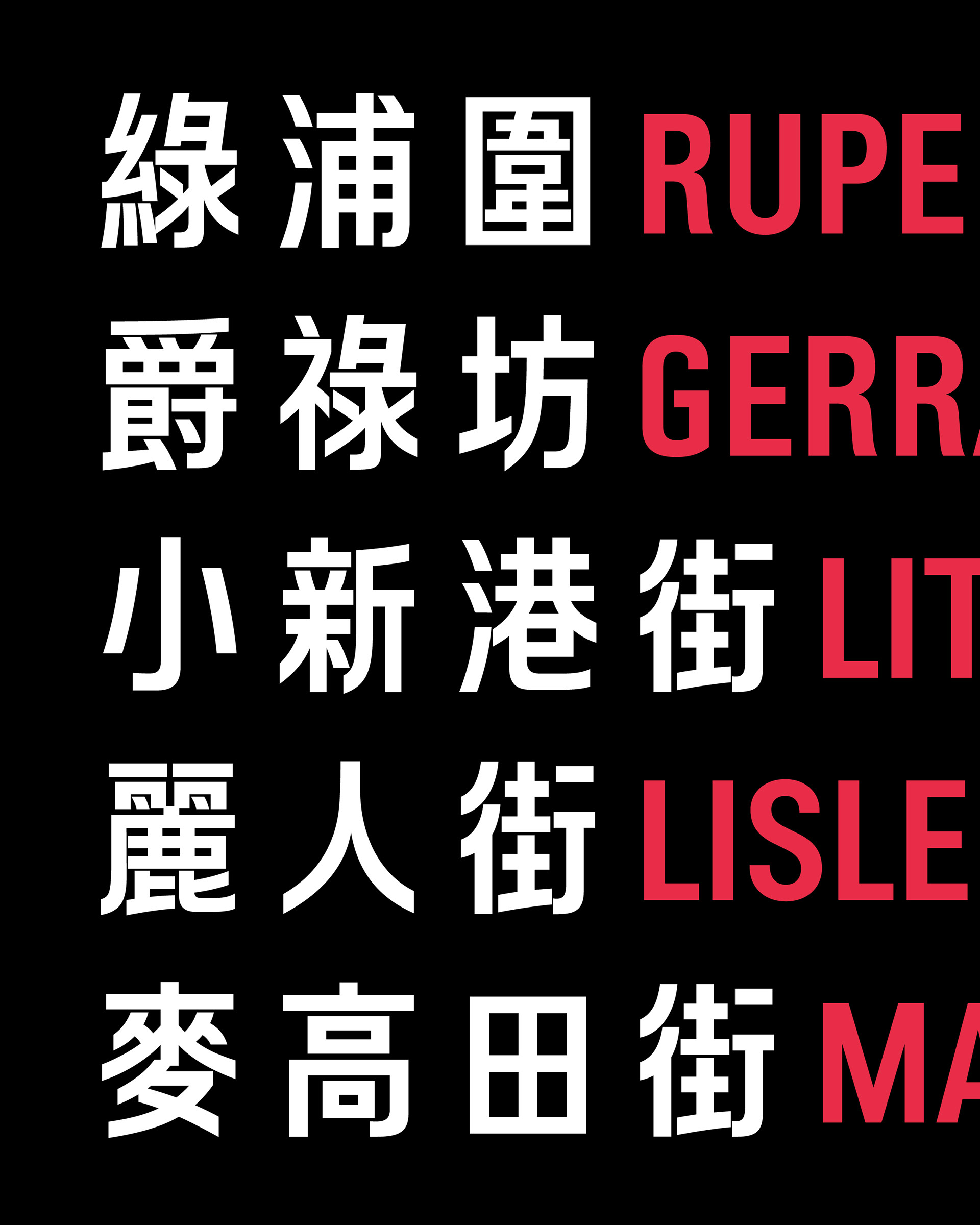
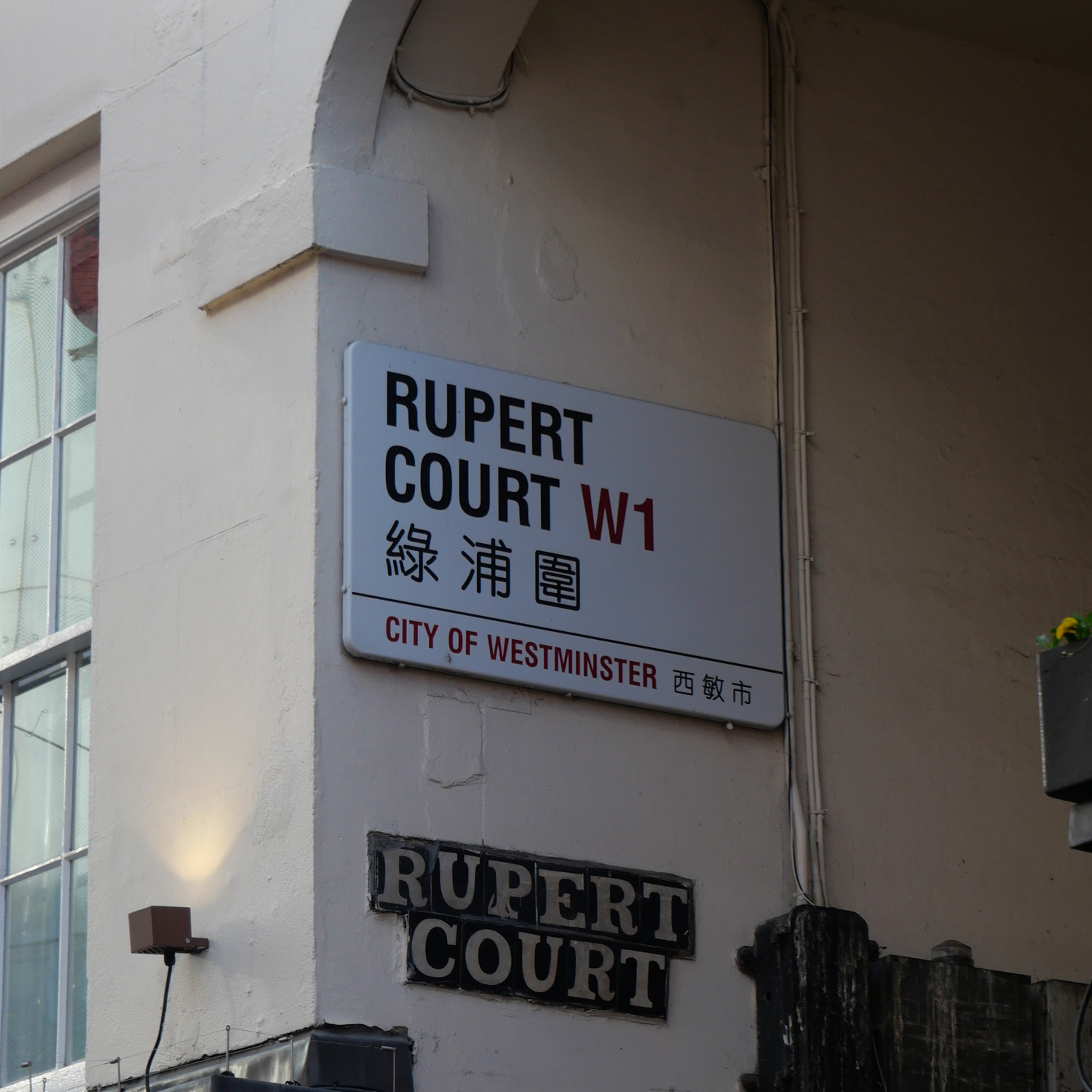
Perhaps as a response to these concerns, around 2010, the Chinese font on Chinatown’s street signs was changed to a modern rounded typeface called Hua Wen Zhong Yuan. This font was developed and licensed by Changzhou SinoType Technology Co. in China, a company founded in 1991 by type designer Curt Huang. SinoType’s “Hua Wen” font series (which includes STHeiti, STSong, etc.) features uniformly thick strokes and smoothly rounded corners, exemplifying a contemporary rounded style that is friendly and highly legible. While the intention was to improve legibility and aesthetics, the new lightweight, rounded Chinese font still did not visually harmonise well with the English font on the signs. The Chinese and English texts appeared mismatched; the shapes and stroke weights of the Chinese characters differed too much from the bold English letters, resulting in a lack of cohesion between the two languages on the street nameplates.

Wardour Street's bilingual sign (2025).​​​​​​​

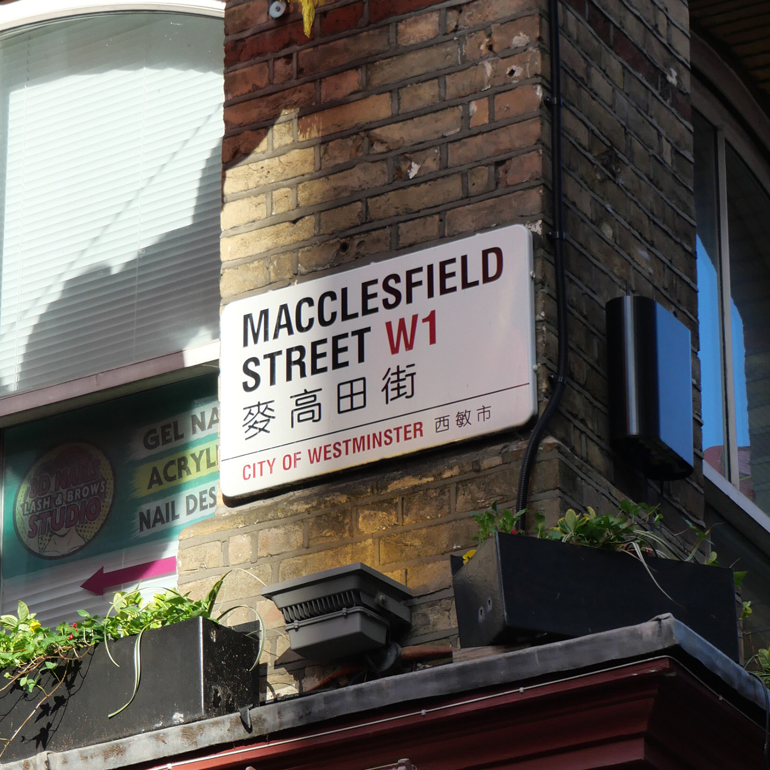
Macclesfield street's bilingual sign (2025).
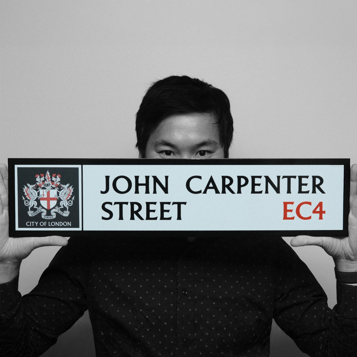
Evolution of the English typeface
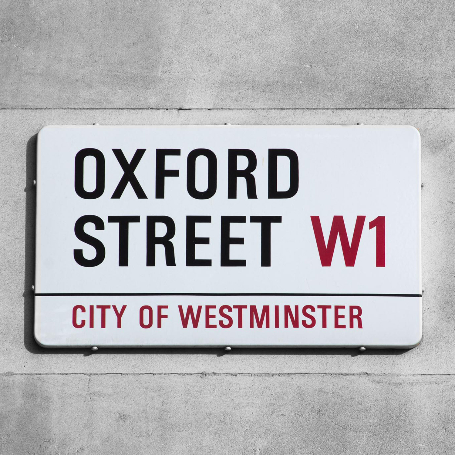
As mentioned, each borough in London often employs its own distinctive style for street name signs. For example, the City of London uses the Albertus typeface (designed by Berthold Wolpe and recently revived by Toshi Omagari) for its street signs. Since 1967, the City of Westminster has used a bespoke sans-serif lettering for its street nameplates. This type was originally created by Sir Misha Black’s team at the Design Research Unit (DRU) and was based on Adrian Frutiger’s Univers font, with adjustments to stroke weight to enhance legibility. In recent years, designer Luke Prowse digitised and refined Westminster’s 1960s lettering under the name “Oxford Street”, a font released by K-Type that pays homage to the iconic West End street. The Oxford Street font (a bold condensed sans-serif) has become synonymous with Westminster’s signage. Early Chinatown signs, accordingly, used Westminster’s custom lettering rather than the standard Transport font used on UK road signs. However, Westminster’s bespoke typeface had no Chinese counterpart, which prompted the question: What if that font were extended or adapted to include Chinese characters? In other words, how might one achieve a cross-script script harmonisation between the Latin and Chinese scripts for Chinatown’s signs?

Designer Toshi Omagari holding a modernised version of a City of London sign, featuring the historic Albertus typeface.
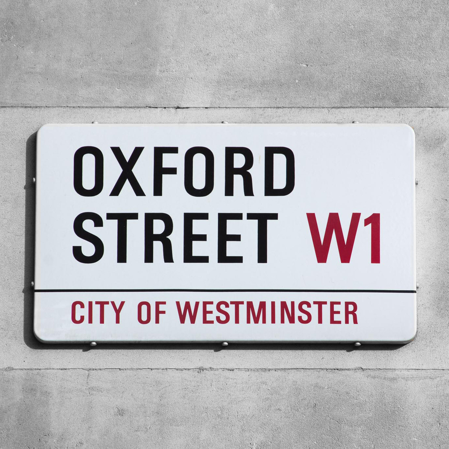
Oxford Street’s official Westminster street sign, using the red-and-black typographic scheme and Oxford typeface.
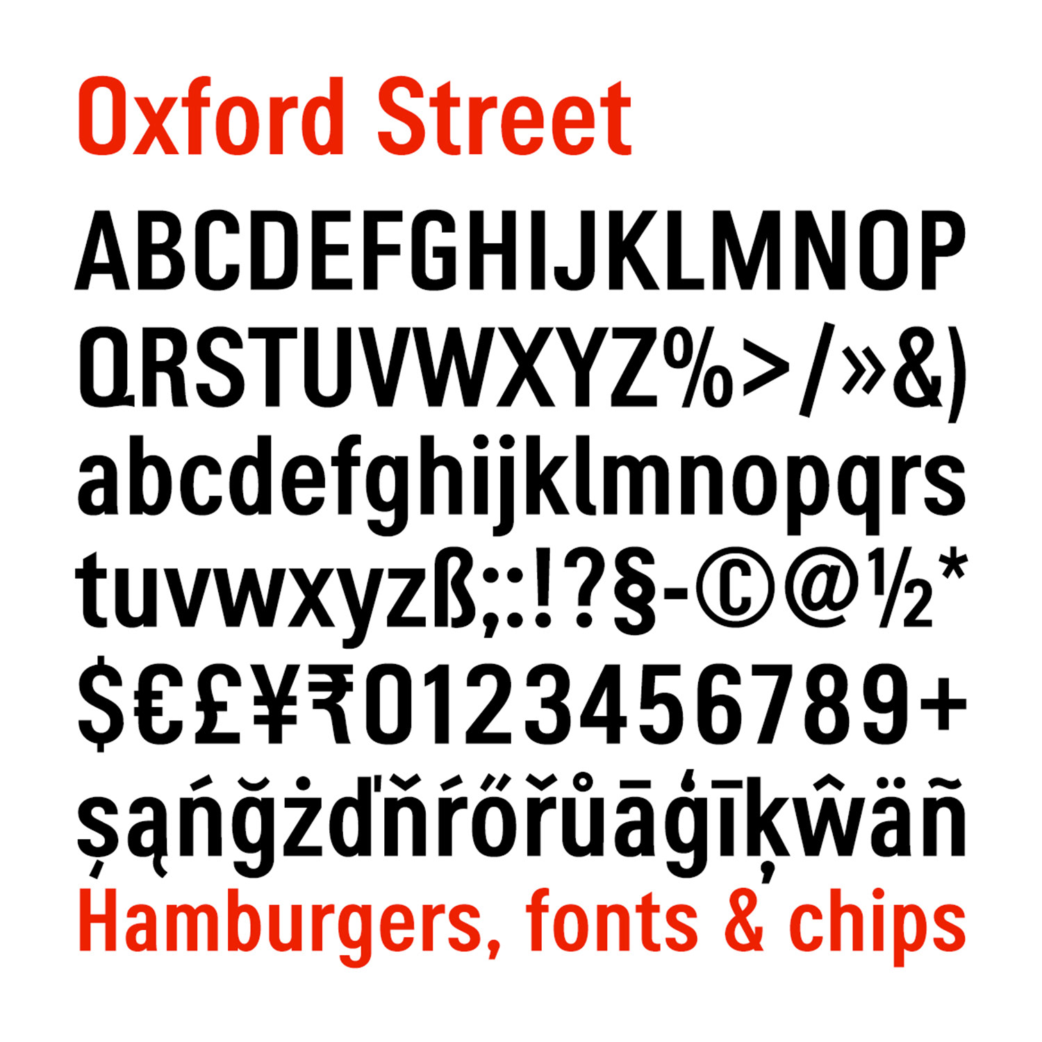
Digital specimen of the Oxford typeface by K-Type, designed to emulate the original City of Westminster street nameplates.
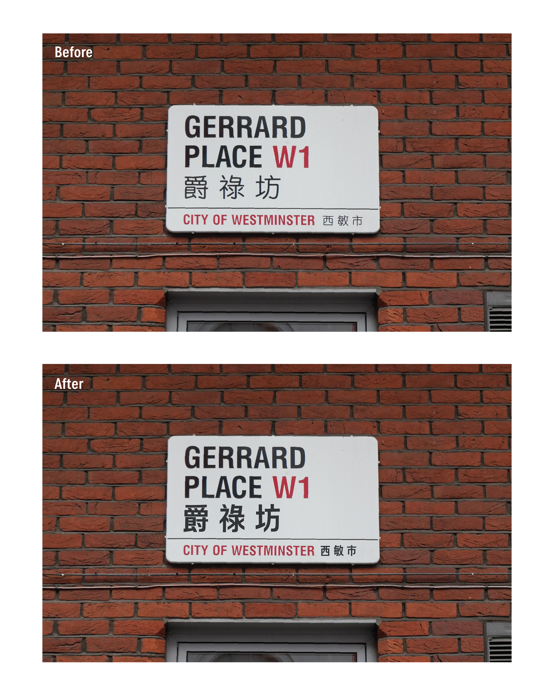
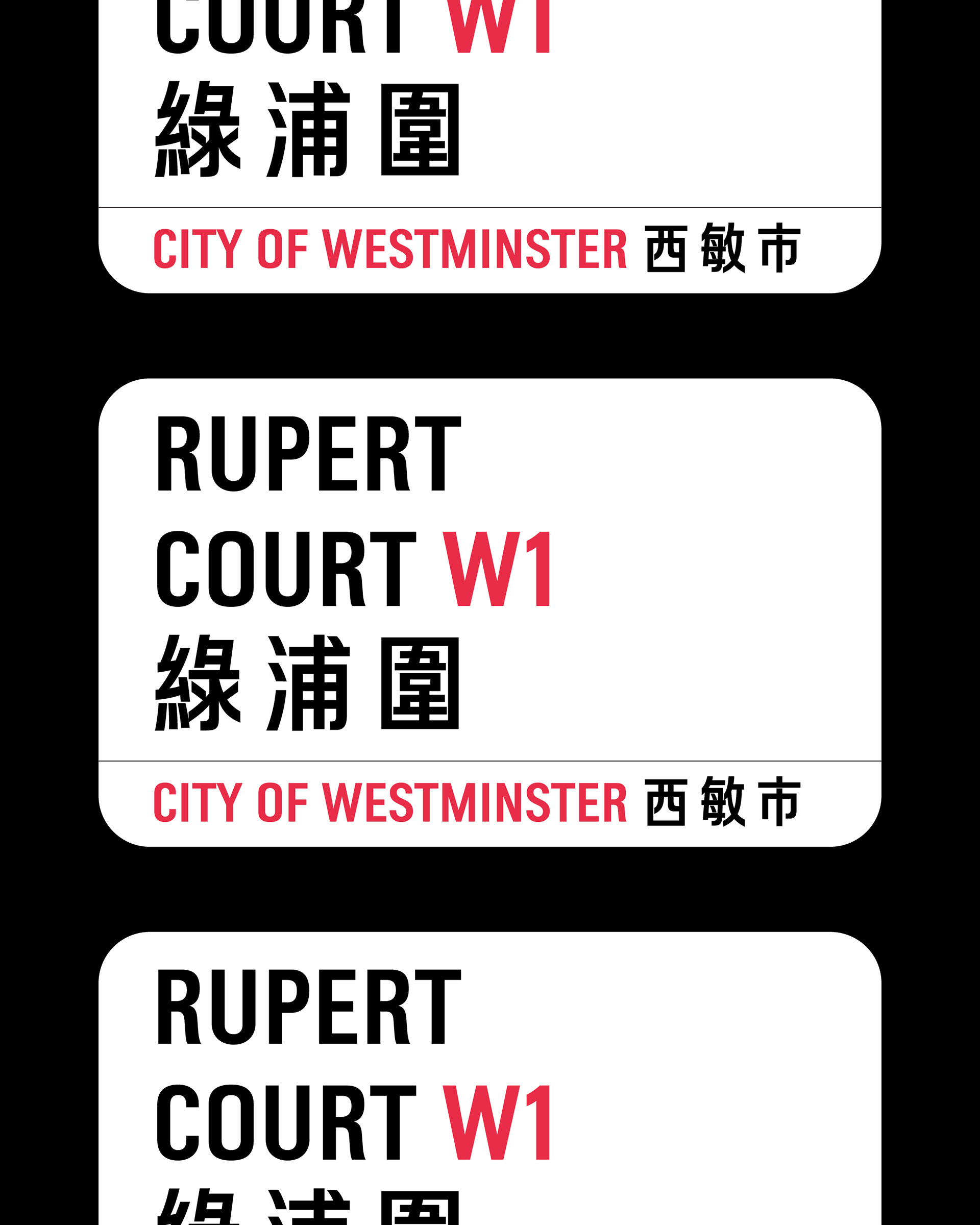
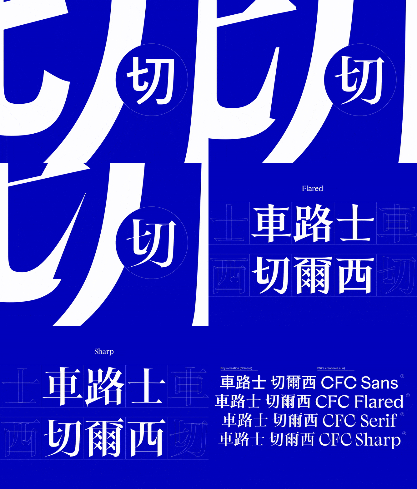
A Chinese companion to the Oxford Street typeface
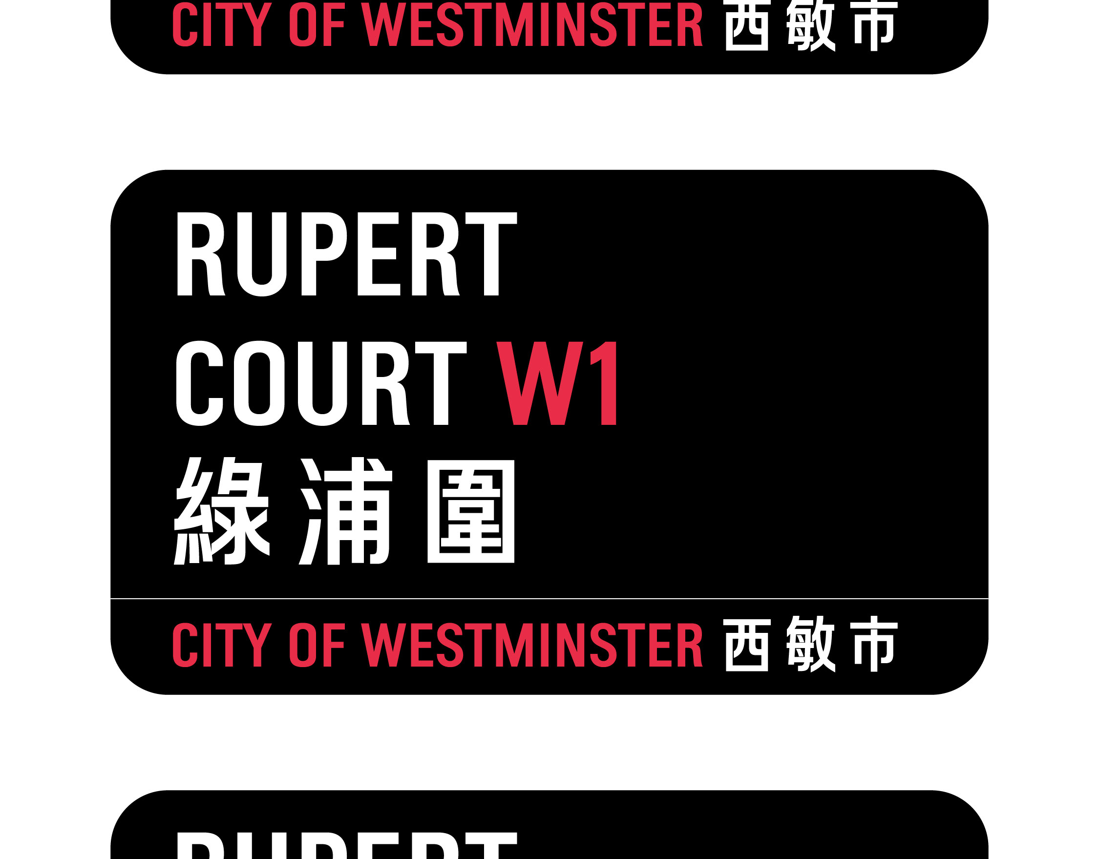
Designing a Chinese typeface to complement the Oxford Street font involves three considerations, which I call a '3-ly theory': Visually, culturally, and technically.
Visually: The Oxford Street font, like the DIN and Transport typefaces, is relatively narrow and features flat stroke endings. Therefore, a matching Chinese font could employ a comparable sans-serif style with uniform stroke weight. By slightly narrowing the width of Chinese characters and using flat horizontal and vertical stroke terminals, the Chinese letters can echo the elongated, clean look of the English letters. It is also worth noting that UK street name signs use all-capital English letters, so Chinese characters should occupy a similar visual height and weight range. Adjusting the overall height and vertical stroke alignment of the Chinese characters to centre their visual weight improves long-distance legibility, ensuring the Chinese names remain clear from afar just like their English counterparts.
Culturally: London’s Chinatown signs use Traditional Chinese characters. Any extension of the design needs to respect this choice, which likely honours the heritage of the community (many of whom have roots in Hong Kong and other regions using traditional script). Thus, the Chinese font should use traditional character forms to culturally align with the community’s expectations and to maintain consistency with the existing signage.
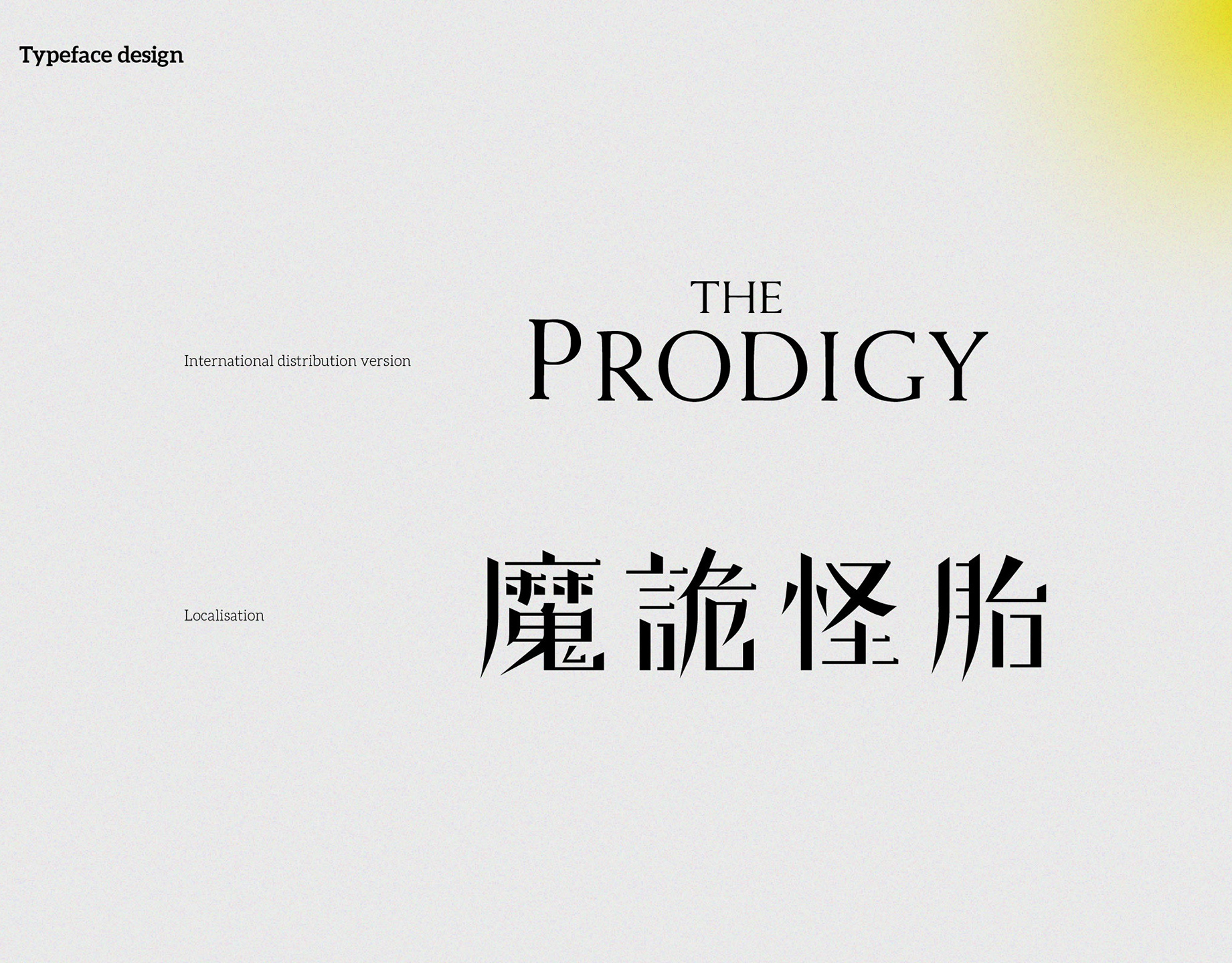
Technically: For a good typographic fit, one would define the Chinese font’s metrics to align with the English. For instance, I decided to use 900-unit em square; the Chinese characters’ body frame should be roughly 93% of the text frame, matching the cap height of the English letters. The baseline of the Chinese font should be adjusted to sit comfortably alongside the English baseline on the sign. By fine-tuning these proportions and spacing, the resulting Chinese characters would have sizing and positioning that pair well with the Oxford Street alphabet, creating a harmonious bilingual nameplate.
Conclusion
The above exploration is essentially a conceptual mockup project, an idea sparked by observing that the street sign typography in Chinatown could be improved for greater consistency. This exercise in typographic problem-solving reflects a designer’s drive for improvement and contribution to the community. Chinatown went without bilingual street signs for decades; then they were introduced, and later the Chinese font was changed. This evolution shows that design can adapt to cultural and functional needs over time. Hopefully, one day we will see a truly well-matched Chinese typeface on London’s Chinatown street signs, one that further celebrates the unique heritage of the area and highlights the charm of London’s multicultural cityscape.
References
Belohlavek, C. (2014, September 18). Pan-CJK Partner Profile: SinoType. Adobe Typekit Blog. https://blog.typekit.com/2014/09/18/pan-cjk-partner-profile-sinotype/
Hall, A. (2022, February 11). London street name fonts. We Made This. https://wemadethis.co.uk/blog/2022/02/street-name-fonts/ 
Haynes, S. (2023). Lunar New Year in London: Celebration, change & Chinatown. London Museum (Museum of London). https://www.londonmuseum.org.uk/blog/lunar-new-year-london-celebration-chinatown/ 
K-Type. (n.d.). Oxford Street [Font specimen page]. K-Type. https://www.k-type.com/fonts/oxford-street/ 
Westminster City Council. (n.d.). Street name plate licensing. (Paragraph: “The iconic enamel signs were designed by… in 1967… feature a red and black letter typeface unique to the City of Westminster.”). https://www.westminster.gov.uk/licensing/city-promotions-events-and-filming/street-name-plate-licensing

Affiliated projects

Back to Top