Role: Creative and Art Director, Project Manager
For generations, Chadwicks Butchers has been more than just a local meat shop; it’s been a cornerstone of the Balham community. This family-run business, steeped in tradition and renowned for its quality, is now embarking on a new chapter. The rebranding of Chadwicks Butchers encompasses every aspect of their presence, from the storefront to the website, brochures, social media ads, and team uniforms. Here’s the story of this transformative journey.
A Legacy of Quality Since 2002
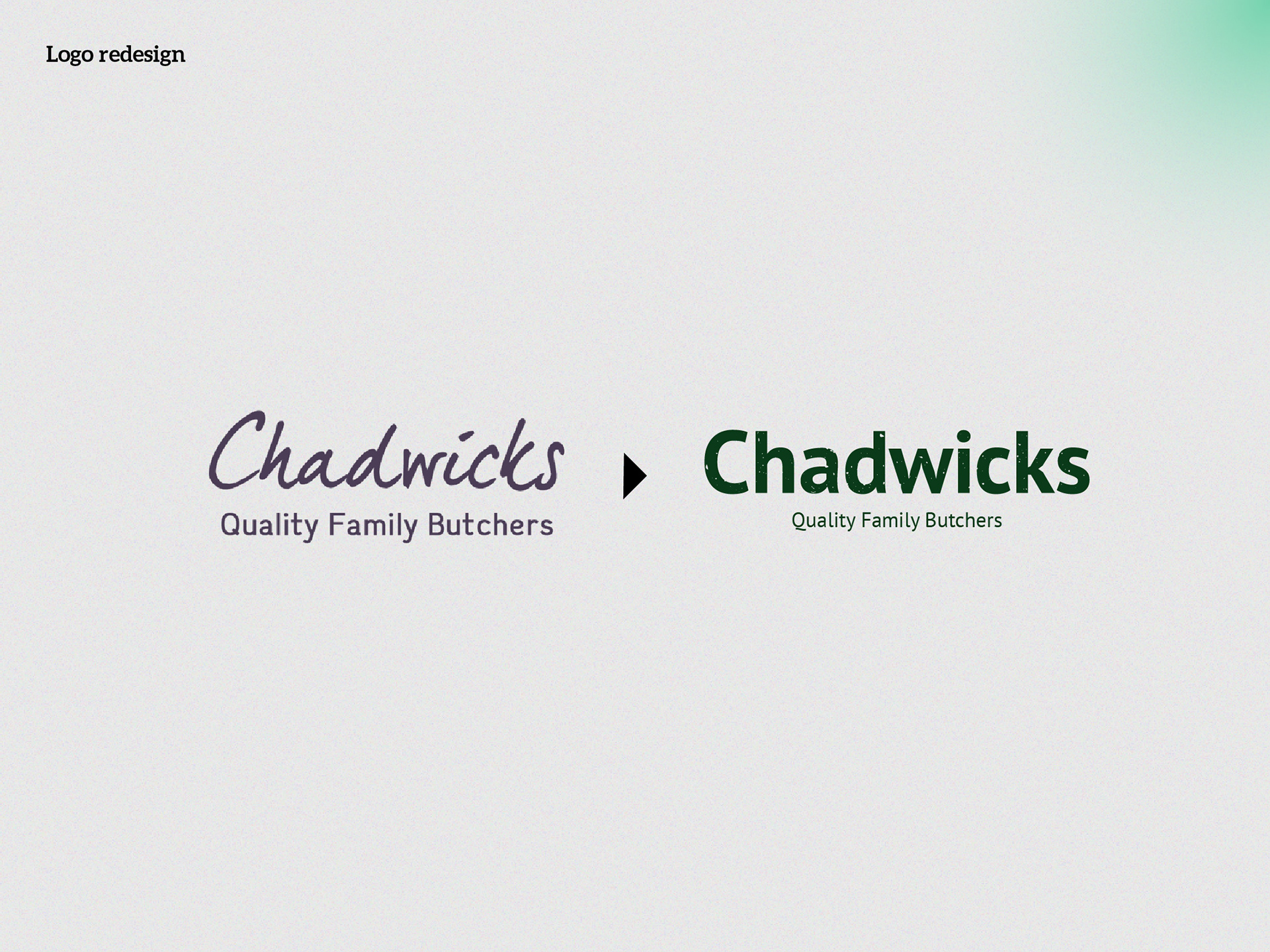
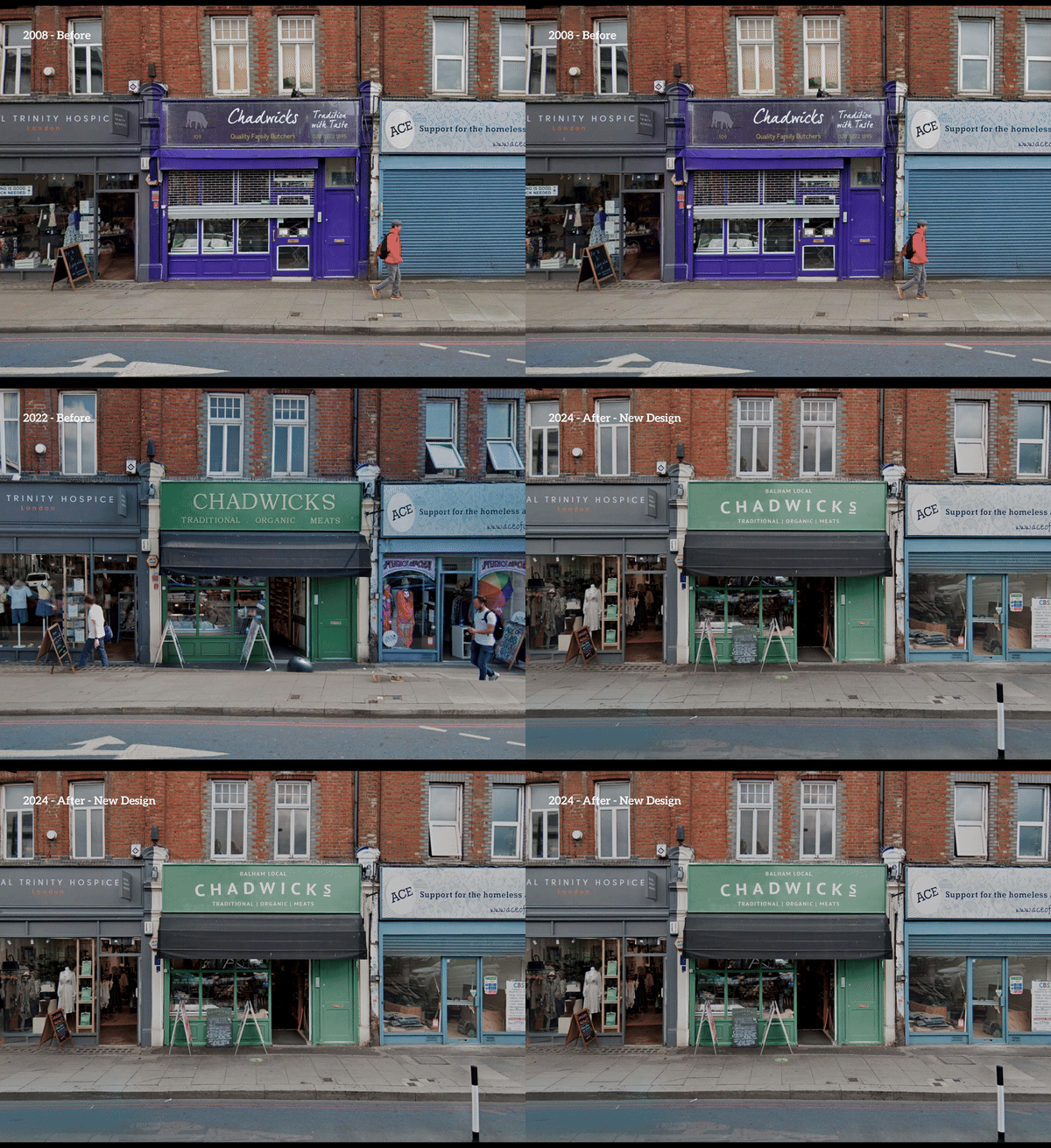
Since opening their doors in 2002, Chadwicks Butchers has proudly served Balham with the finest cuts of meat. Their original storefront, adorned in purple with a handwritten logo, evoked a quaint charm. However, as times changed, so did the need for a refreshed image. The old logo, though beloved, no longer captured the modern professionalism Chadwicks embodies. It was time for a change that reflected their reliability and expertise.
The Bold New Look
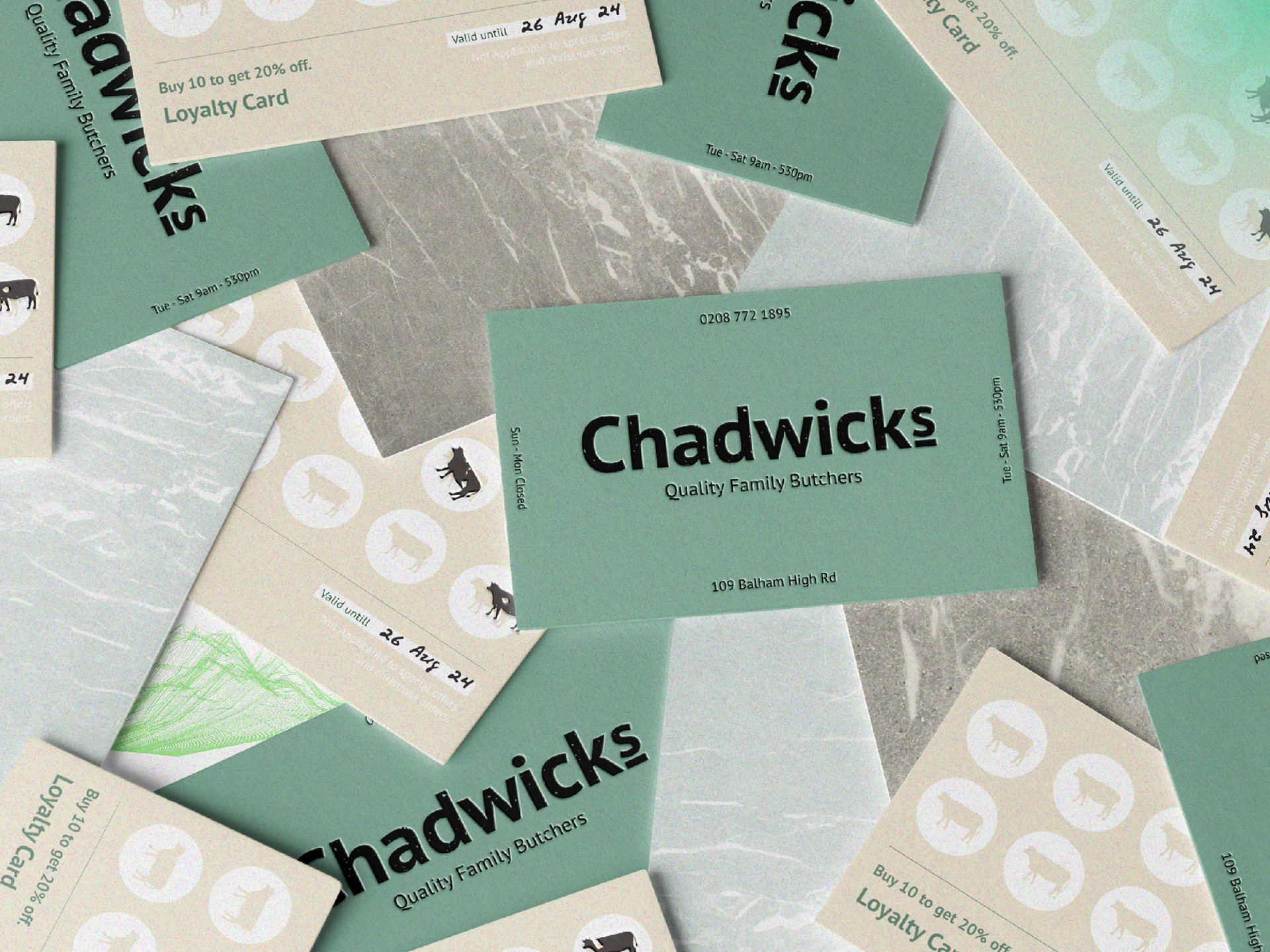
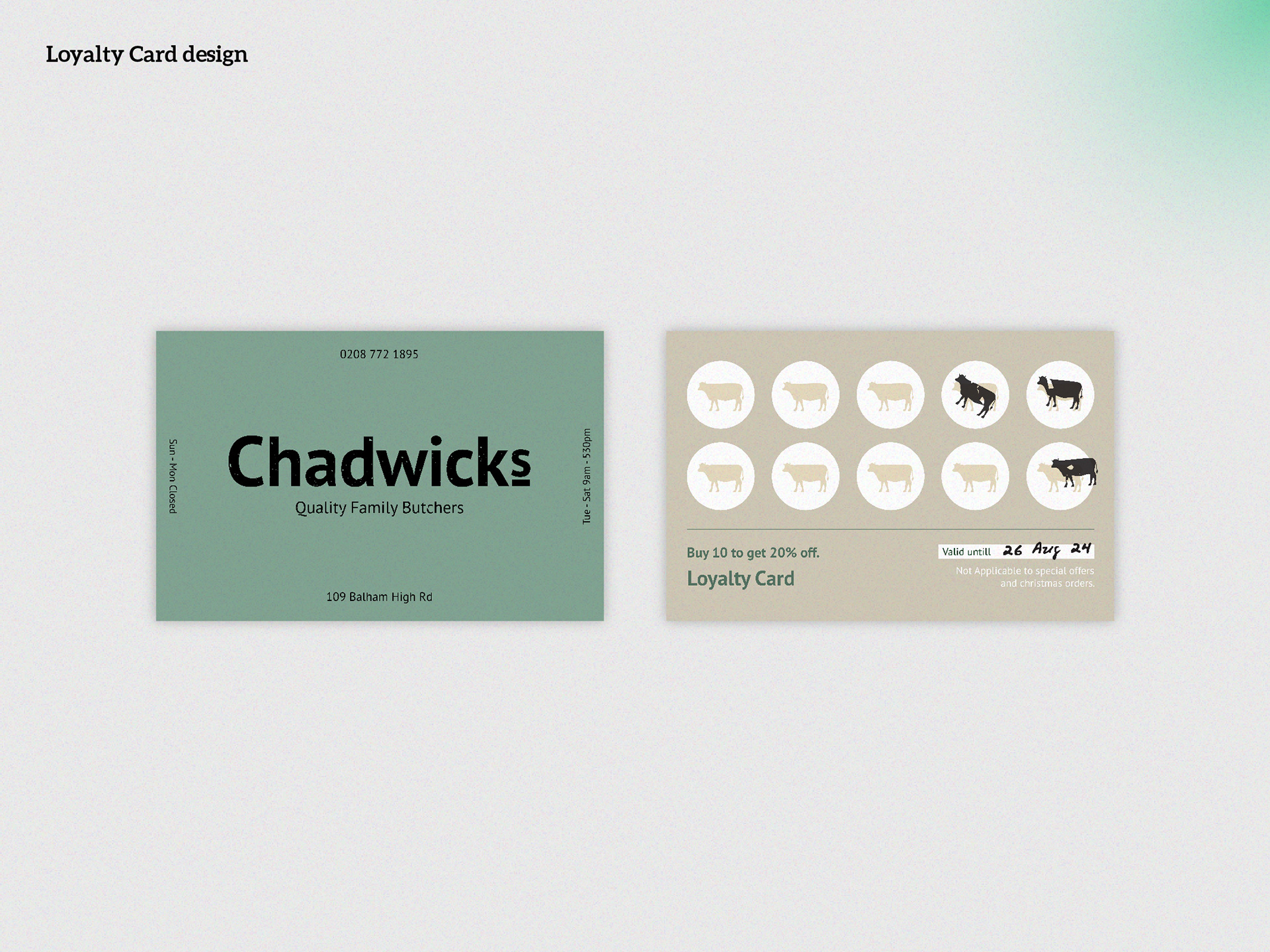
Enter the new Chadwicks Butchers logo: a bold, firm sans-serif typeface that exudes trust and reliability. This updated design isn’t just a logo; it’s a statement that Chadwicks is a professional, trustworthy family business. Alongside this, a loyalty card system replaces traditional business cards, rewarding customers with a 20% discount after ten purchases—a testament to their commitment to customer satisfaction.
Refreshing the Storefront
Chadwicks’ storefront has seen transformations over the years, from the original purple to a dark green introduced eight years ago. This latest rebranding tones down the green and incorporates warm white accents, giving the facade a modern yet welcoming feel. The new arch design elements add a youthful touch, ensuring the shop stands out while maintaining its rich heritage.
Communicating Value Through Flyers and Brochures
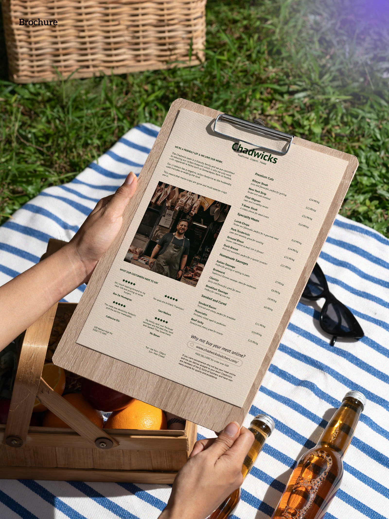
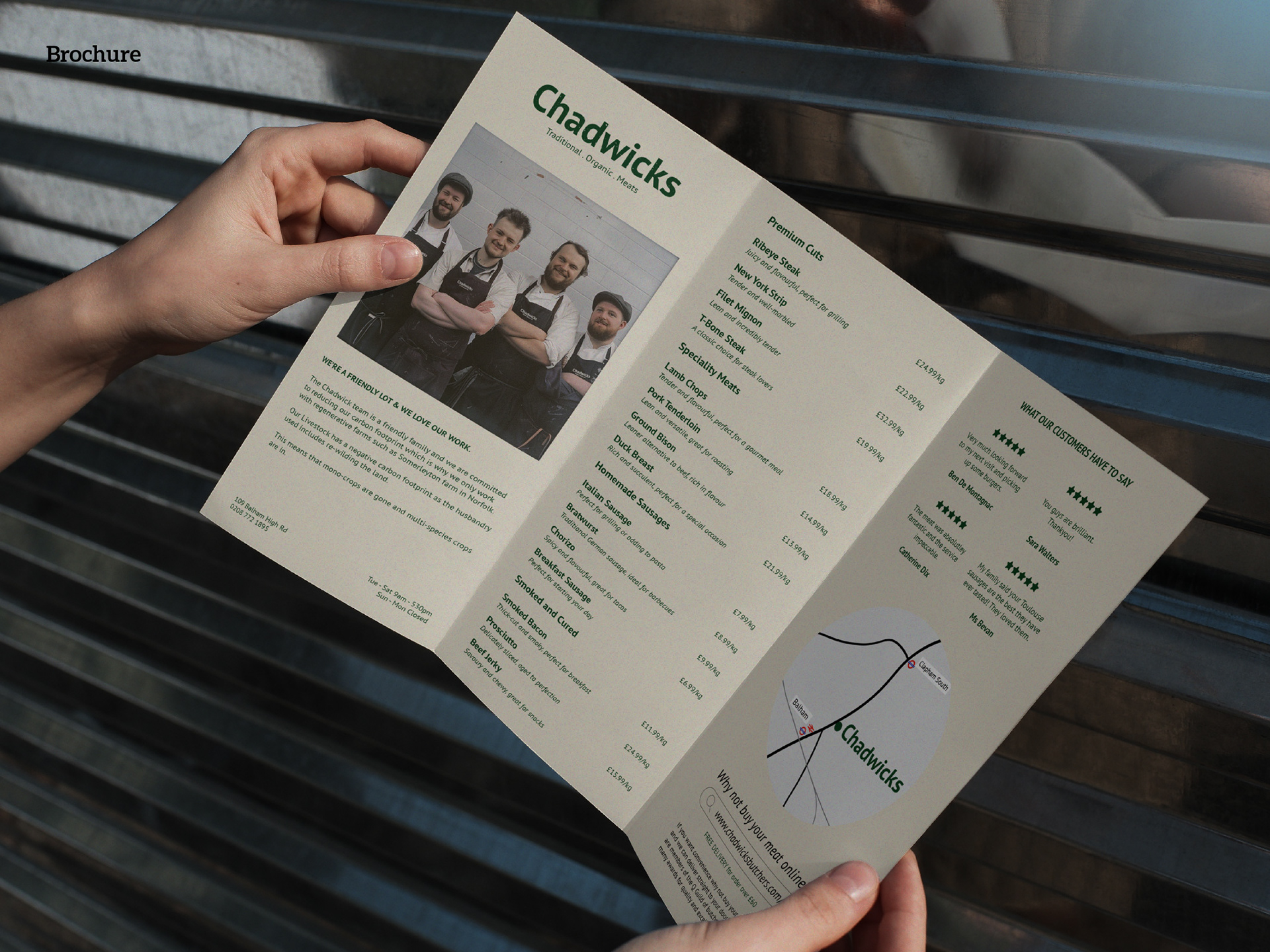
Understanding the importance of clear communication, the new flyers and brochures are designed to inform rather than overwhelm. They provide potential customers with a straightforward understanding of Chadwicks' values and price ranges. This careful balance ensures that while the materials are modern, they still reflect the authenticity and trustworthiness that long-time customers cherish.
A Modern, Inviting Website
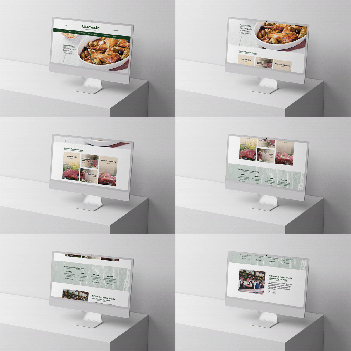
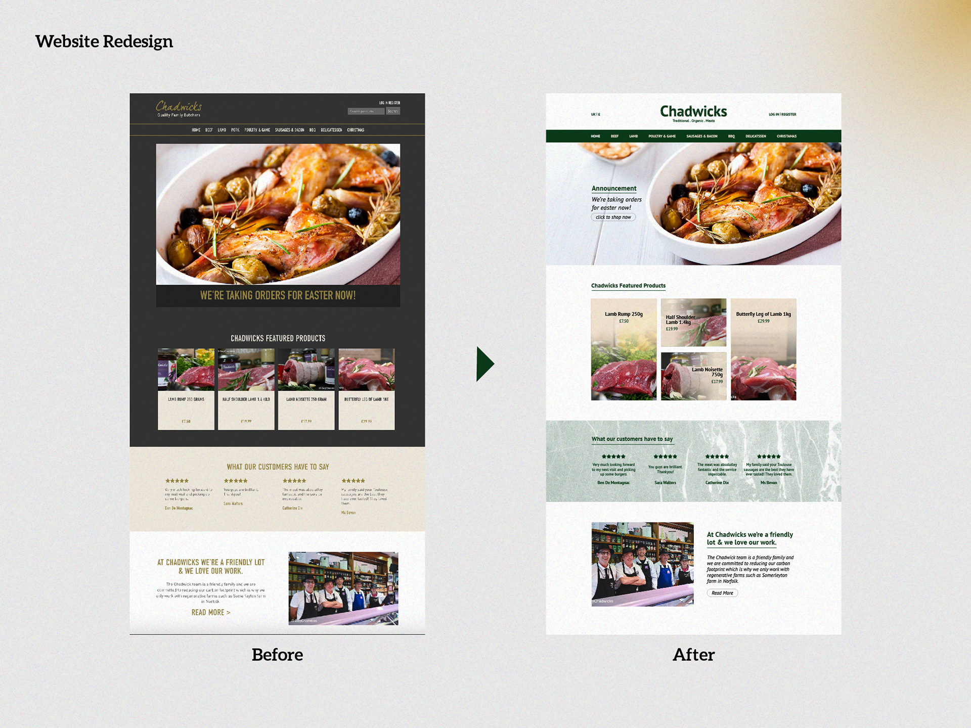
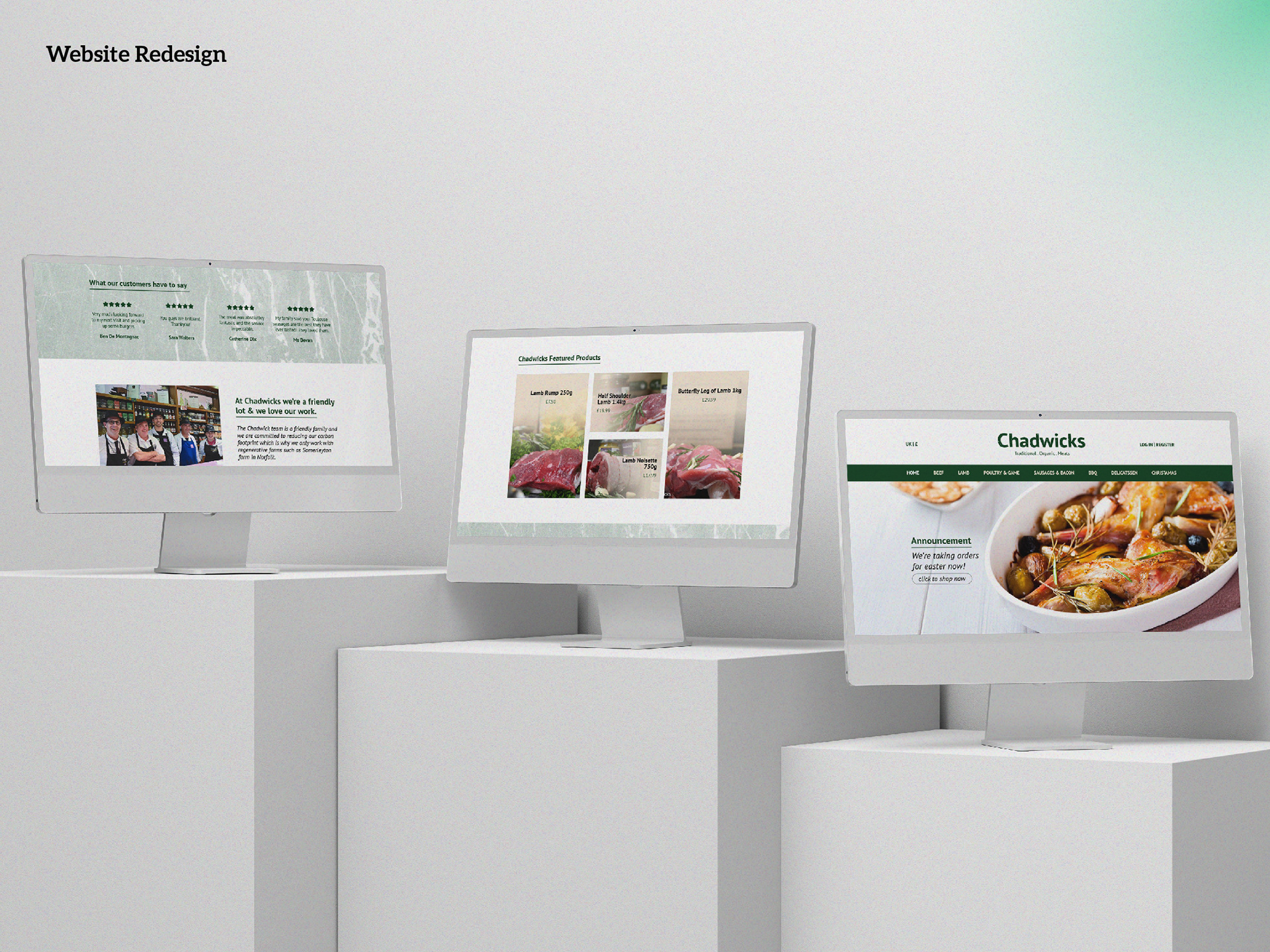
Chadwicks' previous website, with its all-caps headlines and dark backgrounds, felt overwhelming. The new design introduces more white space, making navigation a breeze and creating a calm, inviting atmosphere. By replacing dark backgrounds with a fresh palette of white, green, and yellow, the website now mirrors the freshness of the products they offer. The overall experience is more relaxed, ensuring customers feel welcome and unhurried.
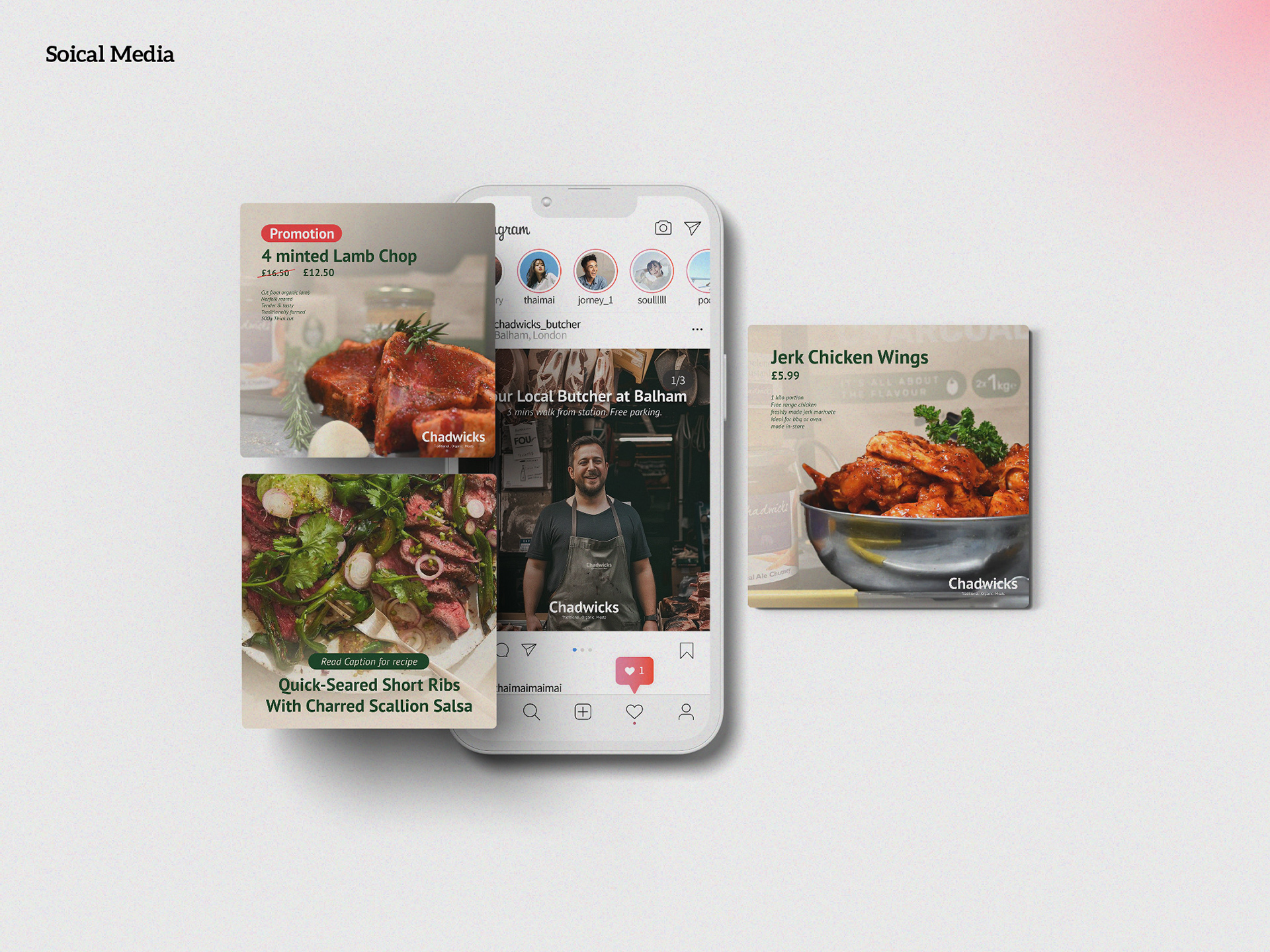
Engaging Social Media Presence
Finally, a robust social media template sets the stage for ongoing engagement. These templates, based on the new font, colour scheme, and layout, allow for dynamic promotion and recipe posts. This ensures that Chadwicks can continuously connect with their community, sharing not just products, but stories and culinary inspiration.
Embracing the Future
The rebranding of Chadwicks Butchers is about more than just aesthetics. It’s about preserving a beloved institution's legacy while embracing the future. This thoughtful rebranding respects the past and welcomes the new, ensuring that Chadwicks Butchers remains a cherished part of Balham for years to come.
With these changes, Chadwicks Butchers is not just adapting to the times; they are setting the standard for what a modern, community-focused butcher’s shop can be.
Credit
Client: Chadwicks Butchers (Mockup)
Role: Creative and Art Director, Project Manager
Role: Creative and Art Director, Project Manager
🚀 Let's create something big together! 🚀
Contact Roy Chan at roychancch@gmail.com
Follow us on Behance | Instagram |
More about us on moodmenfont.com
Contact Roy Chan at roychancch@gmail.com
Follow us on Behance | Instagram |
More about us on moodmenfont.com