
How to Pair Latin and Traditional Chinese Fonts for Global Brands
A practical guide to pairing Latin typefaces with Traditional Chinese for global brands
Key Findings:
Pairing Latin and Traditional Chinese typefaces is not simply about matching serif with Song or Ming, or sans serif with Hei Ti. A successful pairing requires both scripts to share a coherent brand identity while respecting their distinct writing systems.
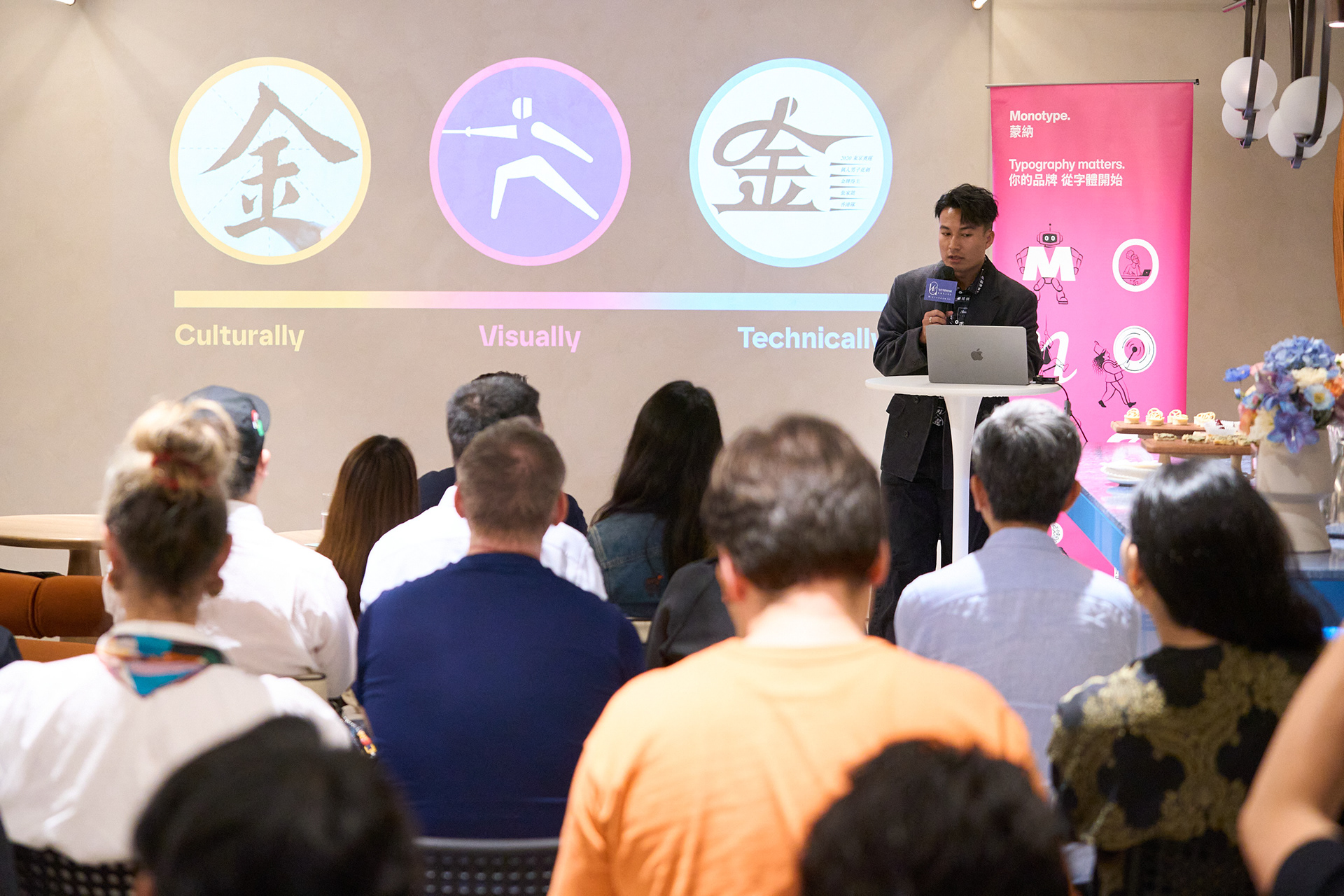
Based on Roy Chan's 3-ly Harmonisation Model, effective multiscript typography considers three essential dimensions:
- Visual harmonisation: Aligning letterform construction, stroke contrast, internal spacing and overall typographic personality.
- Cultural harmonisation: Respecting writing traditions, character structures, reading directions and regional glyph variations.
- Technical harmonisation: Balancing optical size, stroke weight and contrast to ensure consistency across print, digital and environmental applications.
The key is not to make Chinese typography imitate Latin, but to establish a shared visual language in which both scripts retain their individual characteristics.

In a global brand system, pairing Latin and Traditional Chinese type is rarely as simple as choosing “a Chinese sans serif to go with the Latin brand font”.
Latin and Traditional Chinese scripts come from different writing histories. They are built on different structures, occupy space in different ways, and create different reading rhythms. A Latin typeface may already define the global brand voice, while its Chinese counterpart still needs to feel native, credible and integrated on the same screen, pack, sign or campaign.
A good multiscript pairing is not about making two writing systems look identical. It is about allowing each script to remain itself, while helping both speak with one coherent brand voice. This article uses Roy Chan’s 3-ly Harmonisation Model as a practical framework for visually, culturally, and technically extending a Latin-led brand system into Traditional Chinese.
Monotype’s Chinese type library offers a practical extension point because it covers a wide range of voices, from high-contrast Song and Ming styles to monolinear Hei Ti, calligraphic designs and more expressive display faces. For global brands, that range matters. Chinese type is not a late-stage localisation detail; it is a strategic part of how a Latin-led identity travels into Traditional Chinese markets.

Start with the Latin brand typeface
For many global companies, the Latin typeface is already the centre of the brand system. It may appear across the website, app, packaging, campaigns, offices and product experiences long before the brand expands into Taiwan, Hong Kong or other Traditional Chinese contexts. A practical way to begin is therefore to understand the personality of the Latin typeface first, then identify a Traditional Chinese companion that can carry the same brand voice without losing the logic of Chinese writing.
When Latin and Chinese are not built according to the same visual logic, a direct category match can be misleading. A Latin sans serif does not automatically need any Chinese Hei Ti, and a Latin serif does not automatically need any Song or Ming style. The Chinese choice should respond to the Latin typeface in structure, space, tone and use case, while still reading naturally for Traditional Chinese audiences.
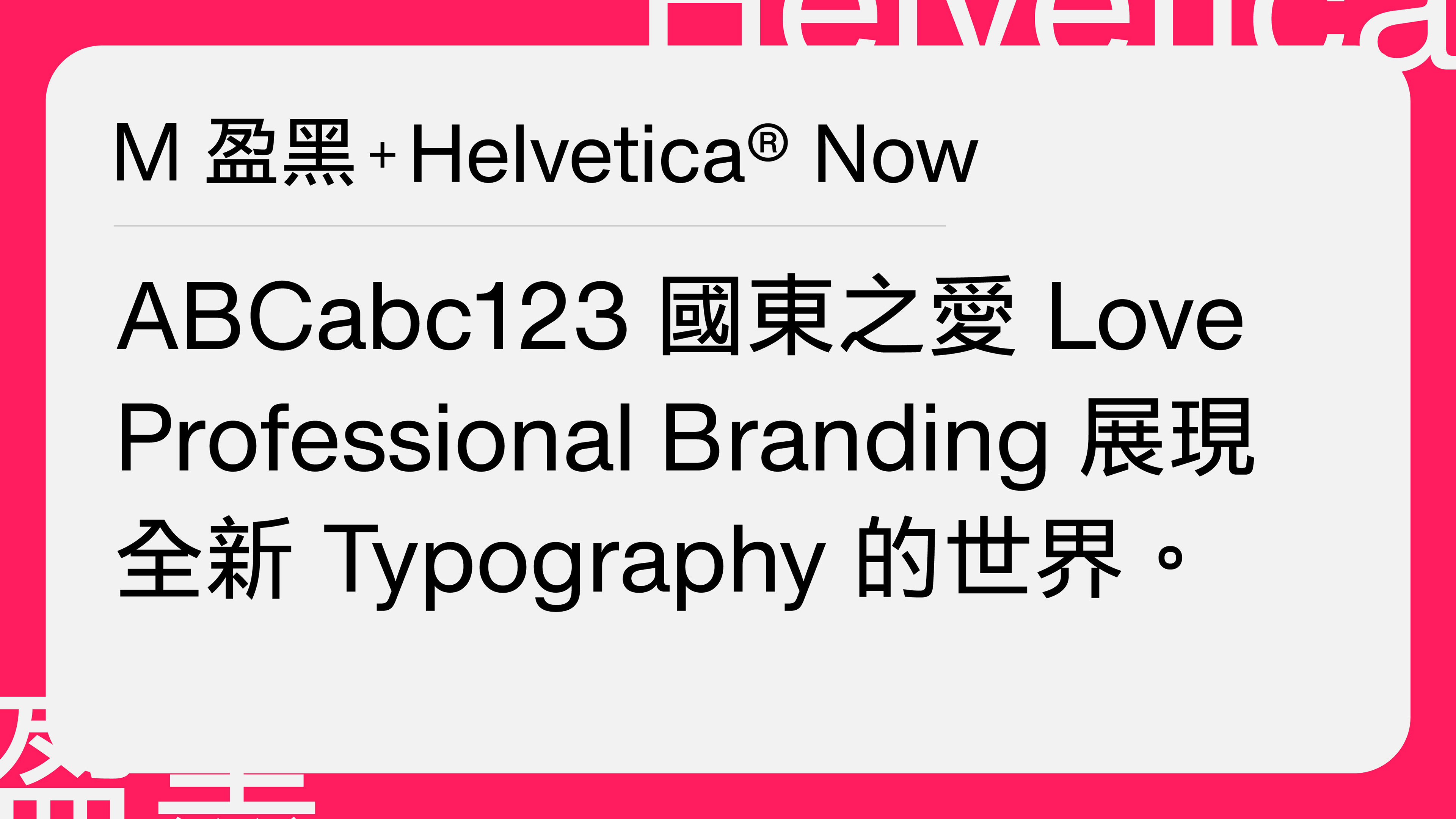
M Ying Hei™(蒙納盈黑體)is a useful example for brands that use a clear, contemporary Latin sans serif. Designed for the digital age, it brings clarity and elegance to both screen and print. Its wider Central space (中宮), the internal space at the centre of a Chinese character, gives it an openness comparable to a generous x-height in Latin. That is why it can pair naturally with corporate Latin typefaces such as Neue Helvetica®, Helvetica® Now, Avenir® Next and Gotham®.

The point is simple: pairing is not just a matter of category. It is a matter of structure, proportion, space and tone. A global brand may begin with a Latin sans serif, but the Traditional Chinese typeface still needs to work visually, culturally and technically as part of the same system.
Visually
Letterform construction
Stroke contrast
Open and closed counters
Overall impression
Culturally
Writing tool
Skeleton
Reading direction
Regional variants
Technically
Em square and optical size
Stem width
Stroke contrast ratio

Visually: Do the typefaces look related?
Visual alignment is the easiest place to begin because it is what clients, designers and customers feel first. When a Latin brand font and a Traditional Chinese typeface appear together, the question is whether they seem to belong to the same brand world.
Letterform construction
Begin with the visible shape of the Latin letters and the Chinese characters: terminals, corners, joins and endings.
In Latin type, terminals, serifs, curves, apertures and joins shape the tone of a typeface. In Traditional Chinese, horizontal strokes, vertical strokes, press and throw strokes, dots and hooks carry comparable personality. They can feel crisp, soft, rational, elegant or calligraphic.
If the Latin brand typeface has clean strokes and simple endings, the Chinese companion can often be a rational Hei Ti with clear construction. If the Latin design has a more humanist skeleton, visible modulation or a stronger sense of written movement, the Chinese choice may need to retain more calligraphic energy.
Stroke contrast
Stroke contrast is one of the most useful clues in a pairing. Monolinear or low-contrast Latin sans serifs often sit comfortably with Chinese Hei Ti designs. Latin serifs, or typefaces with strong modulation and literary texture, may need a Song, Ming or other high-contrast Chinese companion.
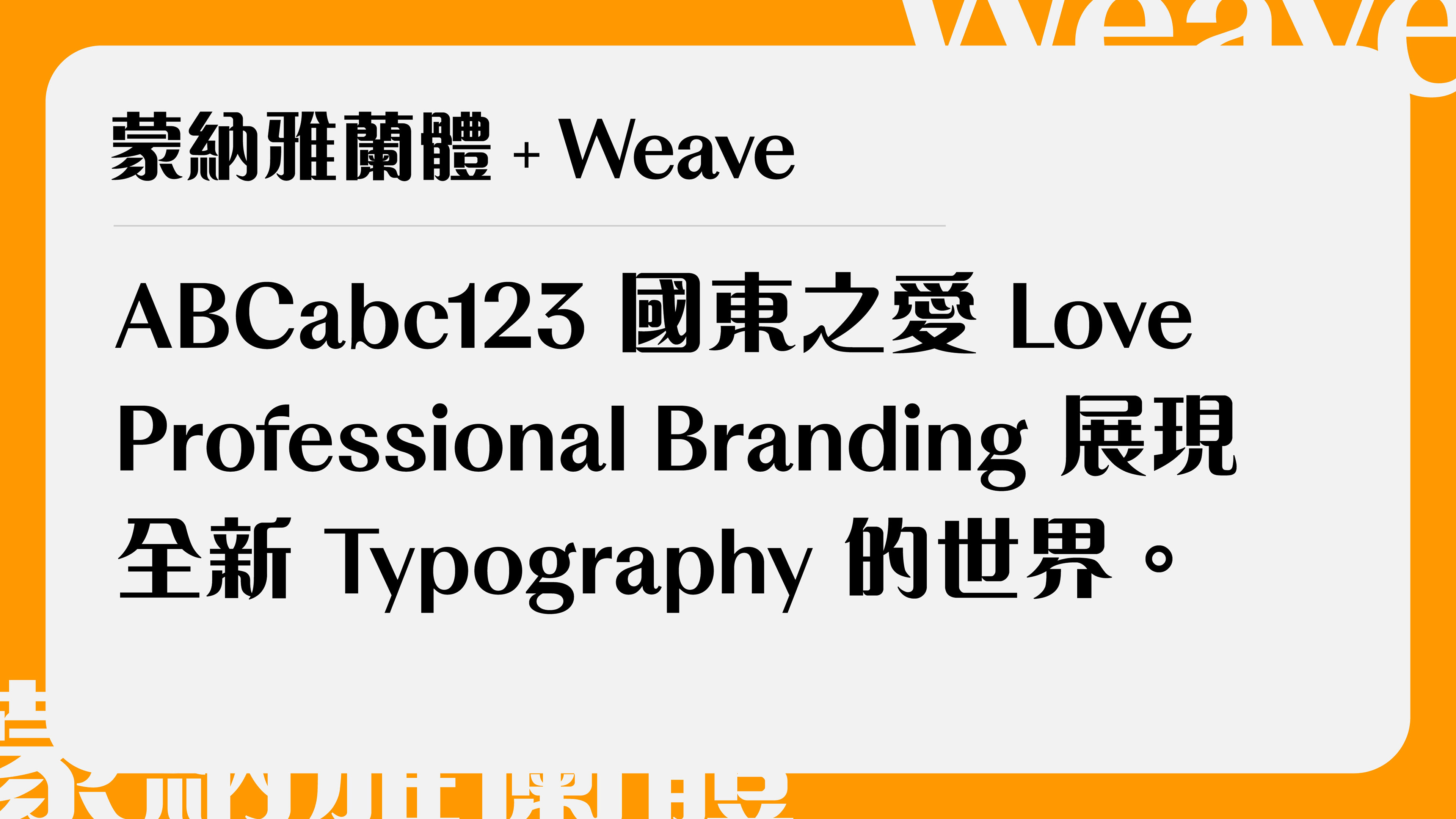
For example, MSung™(蒙納宋體) draws on the tradition of Chinese movable type from printing and calligraphic structure. Its verticals, horizontals, dots and hooks carry a different rhythm from a neutral Hei Ti. In that context, a Latin companion should not feel overly mechanical. It should have proportion, texture and detail that can hold its own beside the Chinese.

Open and closed counters
A pairing is not only about strokes; it is also about space. In Latin typography, counters, apertures and x-height shape the reading texture. In Traditional Chinese, the central space, text frame ratio and centre of gravity have a similar effect on clarity and tone.
When the Latin typeface has a generous x-height and clear counters, the Chinese typeface often needs open internal space and a balanced centre of gravity. This helps the two scripts sit together with a similar visual breath in mixed-language settings.
This is one reason M Ying Hei works well with many contemporary corporate Latin typefaces. Its modernity is not only in the stroke design; it is also in the way the character space is opened for multiscript balance.
Overall impression
After the details, return to the whole impression. A Latin typeface may feel neutral, warm, classical, premium, forceful or decorative. The Chinese companion should answer that personality, not simply match the category label.
M Razor HK™(蒙納粗銳體), for instance, has strong contrast and distinctive stroke endings. Paired with a Latin design such as Optima Nova®, the relationship is not based on sameness. It comes from a shared sense of refinement, controlled contrast and expressive terminals. This can work well for premium brands, cultural institutions, exhibitions, display typography and identities that need a more memorable voice.
Culturally: Do they respect the scripts themselves?
Cultural alignment is less measurable than visual alignment, but it is often what makes a pairing feel credible. A pair can look neat on the surface and still feel wrong if the Chinese extension ignores the cultural and historical logic of either script.
Writing tool
Latin type has its own writing traditions: broad-nib calligraphy, pointed-pen forms, inscriptional capitals, grotesques, geometric construction and more. Traditional Chinese characters carry the memory of brush writing. Even in modern Hei Ti designs, details such as stroke entry and endings, dot forms, hook direction and centre of gravity often reflect habits that come from written Chinese.
The goal of pairing is not to erase these differences, or to make Chinese behave like Latin. It is to understand the writing background of each script and find compatible voices.

Skeleton
The skeleton is the underlying structure of a typeface: the basic form that remains even before weight, contrast and detail are applied.
Latin letters sit on a baseline and build rhythm through letter width, x-height, ascenders, descenders and spacing. Chinese characters are organised within a square body and include left-right, top-bottom, enclosed and compound structures. This is why pairing cannot be judged by height or weight alone. The two skeletons must create a stable rhythm on the same page.

Reading direction
Latin-led brand systems are usually designed around horizontal reading. In contemporary Taiwan and Hong Kong, Traditional Chinese is also often set horizontally in brand, product and digital contexts, where it appears alongside Latin regularly. However, Traditional Chinese also has a strong vertical setting tradition.
A robust Chinese type choice should remain clear and stable in the directions and environments the brand actually uses. This becomes especially important for signage, editorial systems, packaging, campaign layouts and cultural communication.
Regional variants
When a Latin-led identity moves into Chinese, “Chinese support” is not specific enough. Traditional Chinese, Simplified Chinese, Japanese kanji and Korean hanja share a historical base and share some ideographs, but their glyph forms and reader expectations are not identical.
For Taiwan and Hong Kong audiences, using the right regional form is part of professional brand behaviour. A global brand should ask whether the typeface supports the right Chinese, for the right readers, in the right market.
Technically: Can they work together in real layouts?
Technical alignment turns an intuitive choice into a working typographic system. It helps a brand move from “this Chinese font looks close to our Latin font” to “these typefaces can perform consistently across product interfaces, packaging, motion, retail, documents and campaigns”.
Em square and optical size
Two typefaces set at the same point size can look very different. Latin letters are affected by x-height, cap height, ascenders and descenders, while Chinese characters usually occupy more of the em square.
In practice, pairing requires optical adjustment. Designers should judge visual height, perceived scale and reading texture, not only the values shown in the design software.
Stem width
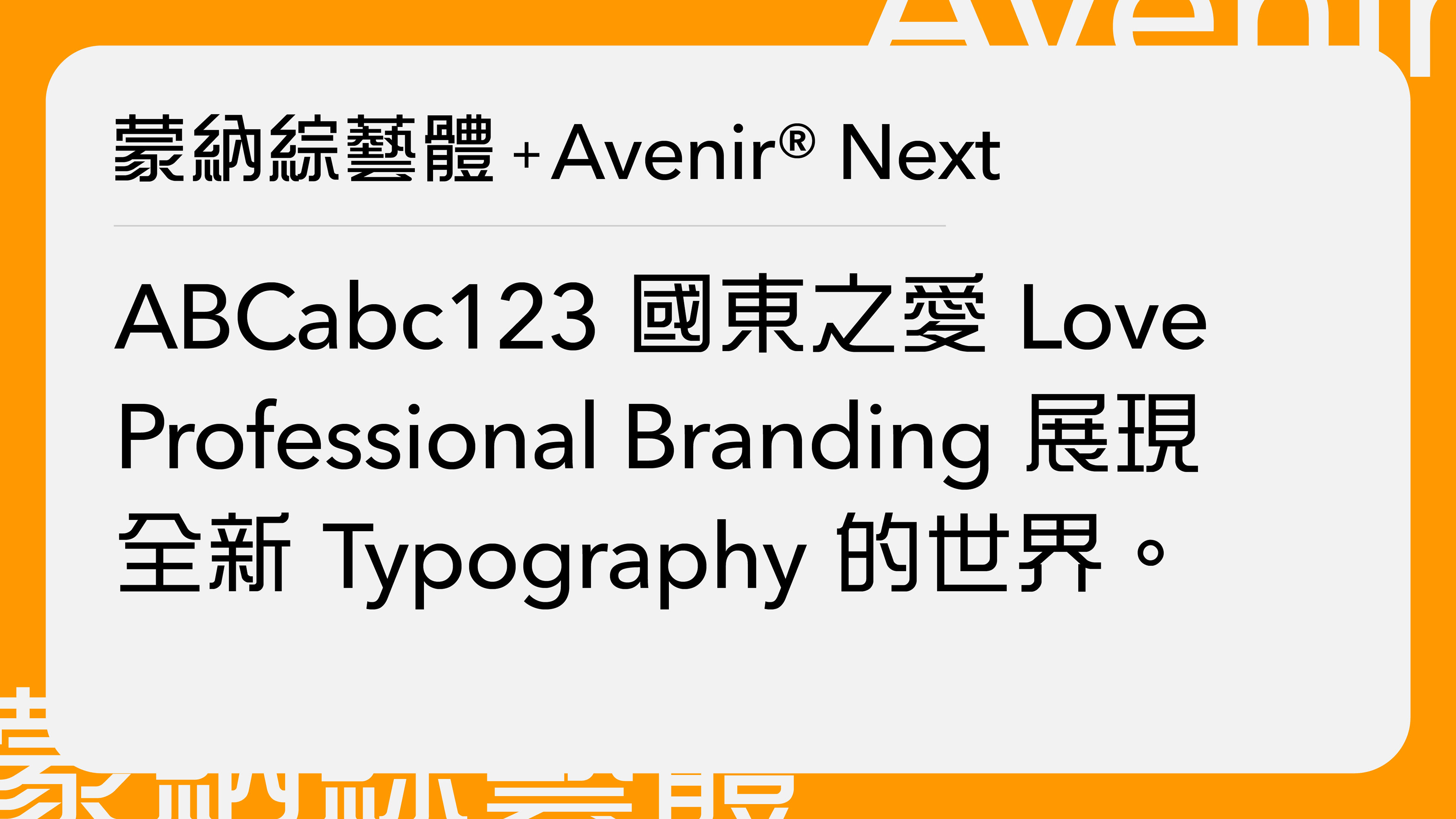
Traditional Chinese characters contain more strokes and therefore often have higher visual density than Latin letters. The same weight name, such as Regular or Bold, does not always produce the same perceived weight across scripts.
A practical method is to set the Latin typeface first, then adjust the weight of the Chinese typeface until both feel balanced in the same line, paragraph and interface. The right answer may be one weight lighter or heavier than expected.
Stroke contrast ratio
High stroke contrast can add elegance, editorial character and brand distinction. It can also reduce clarity at small sizes, especially on screens or in busy information environments.
That is why pairing decisions should always be tied to use case. Body text, product interfaces, brand headlines, large-scale posters and retail signage do not ask the same thing from type. A pairing that feels beautiful in a campaign headline may need adjustment for navigation, legal copy or app UI.
Four practical pairing directions
Bringing the three levels together gives brand teams a clearer way to brief, evaluate and refine Traditional Chinese type choices for a Latin-led brand system.
1. Digital products and corporate brands
Start with a clear, contemporary Latin sans serif such as Neue Helvetica®, Helvetica® Now, Avenir® Next or Gotham®, then look for a modern Chinese sans serif such as M Ying Hei™. This direction suits websites, apps, navigation systems, dashboards and brand systems with high information density.
2. Lifestyle, retail and experience brands
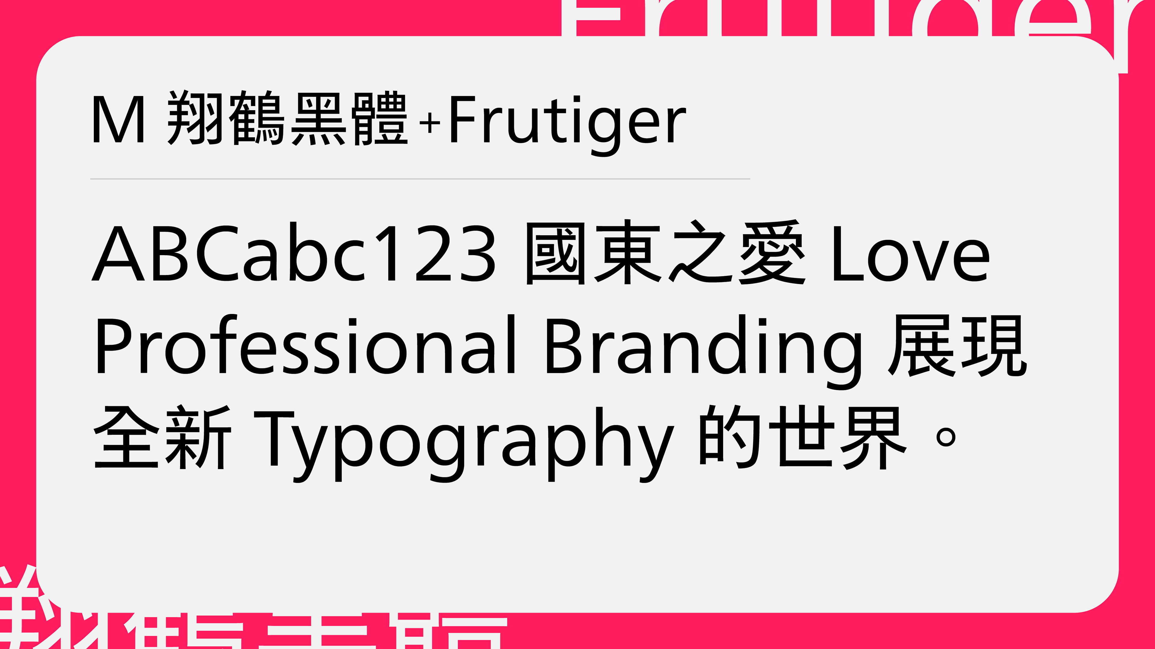
For Latin systems built around Neue Frutiger® or a similarly humanist sans serif, M XiangHe Hei® TC(翔鶴黑體) is a useful Traditional Chinese direction. The pairing is functional and approachable, with enough humanist character to support retail environments, events, hospitality, loyalty programmes and lifestyle communications.
3. Culture, publishing and content-led brands
If the Latin side uses an editorial serif such as Times New Roman®, the Chinese side should usually offer a comparable sense of proportion, rhythm and craft. A Song or Ming-style design such as MSung or another high-contrast Traditional Chinese text face can work when the brand needs editorial authority, cultural depth or a more literary tone.
4. Technology, architecture and modern enterprise brands
Futura® with M Stiff Hei™(蒙納剛黑體) can create a precise, modernist tone. The geometric logic of Futura can sit comfortably beside the square, direct structure of the Chinese Hei Ti voice. This direction is suited to technology, architecture, product design and corporate identities that want to express clarity, efficiency and modernity.
Conclusion: a good pairing does not make Chinese follow Latin
The purpose of Latin–Traditional Chinese pairing is not to make Chinese imitate the Latin brand font, or to force two writing systems into the same shape. It is to let each script stand confidently on its own, while allowing both to contribute to one brand voice.
Visual alignment helps customers sense that the typefaces belong together. Cultural alignment protects the integrity of the writing systems and the expectations of local readers. Technical alignment ensures that the decision survives real-world use: small screens, large posters, packaging, dashboards, wayfinding, documents and every other touchpoint a global brand must manage.
When these three levels are considered together, extending a Latin-led identity into Traditional Chinese becomes more than a matter of localising type. It becomes a strategic decision in multiscript brand design.
In the next article, we will look more closely at the full logic behind the 3-ly Harmonisation Model, and how visual, cultural and technical decisions can shape more coherent multiscript brand systems.
Frequently Asked Questions (FAQ)
1. How do you choose a Chinese font to pair with a Latin typeface?
Start by understanding the Latin typeface's personality, including its letterform construction, stroke contrast, proportions and spacing. Then identify a Traditional Chinese typeface with compatible characteristics. Rather than simply matching font categories, evaluate how both scripts work together visually, culturally and technically.
2. What Traditional Chinese fonts pair well with Helvetica?
M Ying Hei™ (蒙納盈黑體) is a suitable companion for Helvetica®, Helvetica® Now and other contemporary Latin sans serifs. Its relatively open central space (中宮), balanced proportions and clean construction help establish visual harmony in corporate branding, websites and digital interfaces.
3. Should Latin serif fonts always be paired with Chinese Song or Ming typefaces?
Not necessarily. Although Latin serifs and Chinese Song or Ming typefaces can share characteristics such as stroke contrast and literary expression, pairing should also consider proportions, construction and overall personality. The objective is to create a coherent typographic voice rather than simply match classifications.
4. Why is cultural understanding important in multiscript typography?
Latin and Chinese scripts developed through different writing traditions, resulting in distinct letterform structures, proportions and conventions. Understanding these differences helps designers preserve each script's cultural identity while creating a unified brand experience. Regional glyph variations are particularly important when designing for Traditional Chinese audiences in Hong Kong and Taiwan.
5. How do you balance Latin and Chinese fonts in the same layout?
Two typefaces set at the same point size or weight may appear visually different. Designers should evaluate their optical size, perceived stroke weight, internal spacing and overall density. Adjusting size and weight based on visual perception, rather than relying solely on numerical values, helps both scripts appear balanced.
6. What is the 3-ly Harmonisation Model?
The 3-ly Harmonisation Model, developed by type designer Roy Chan, is a framework for evaluating multiscript typography through three dimensions: visual, cultural and technical harmonisation. It helps designers and global brands create consistent typographic identities across writing systems without compromising the distinctive characteristics of each script.

About the Author:
Roy Chan was Senior Creative Type Consultant at Monotype Hong Kong, specialising in Chinese type design, multiscript font pairing and brand typography. He has developed two Traditional Chinese typefaces and studied typeface design master at the University of Reading, where his research focused on “Hong Kong Type” in early nineteenth-century Chinese movable type. Roy has received the DFA Hong Kong Young Design Talent Award and an honourable mention in the Morisawa Type Design Competition, and currently serves as ATypI Country Delegate for Hong Kong.
Roy Chan was Senior Creative Type Consultant at Monotype Hong Kong, specialising in Chinese type design, multiscript font pairing and brand typography. He has developed two Traditional Chinese typefaces and studied typeface design master at the University of Reading, where his research focused on “Hong Kong Type” in early nineteenth-century Chinese movable type. Roy has received the DFA Hong Kong Young Design Talent Award and an honourable mention in the Morisawa Type Design Competition, and currently serves as ATypI Country Delegate for Hong Kong.


